Design with AI
Generate a new design based on this screen using your own content.
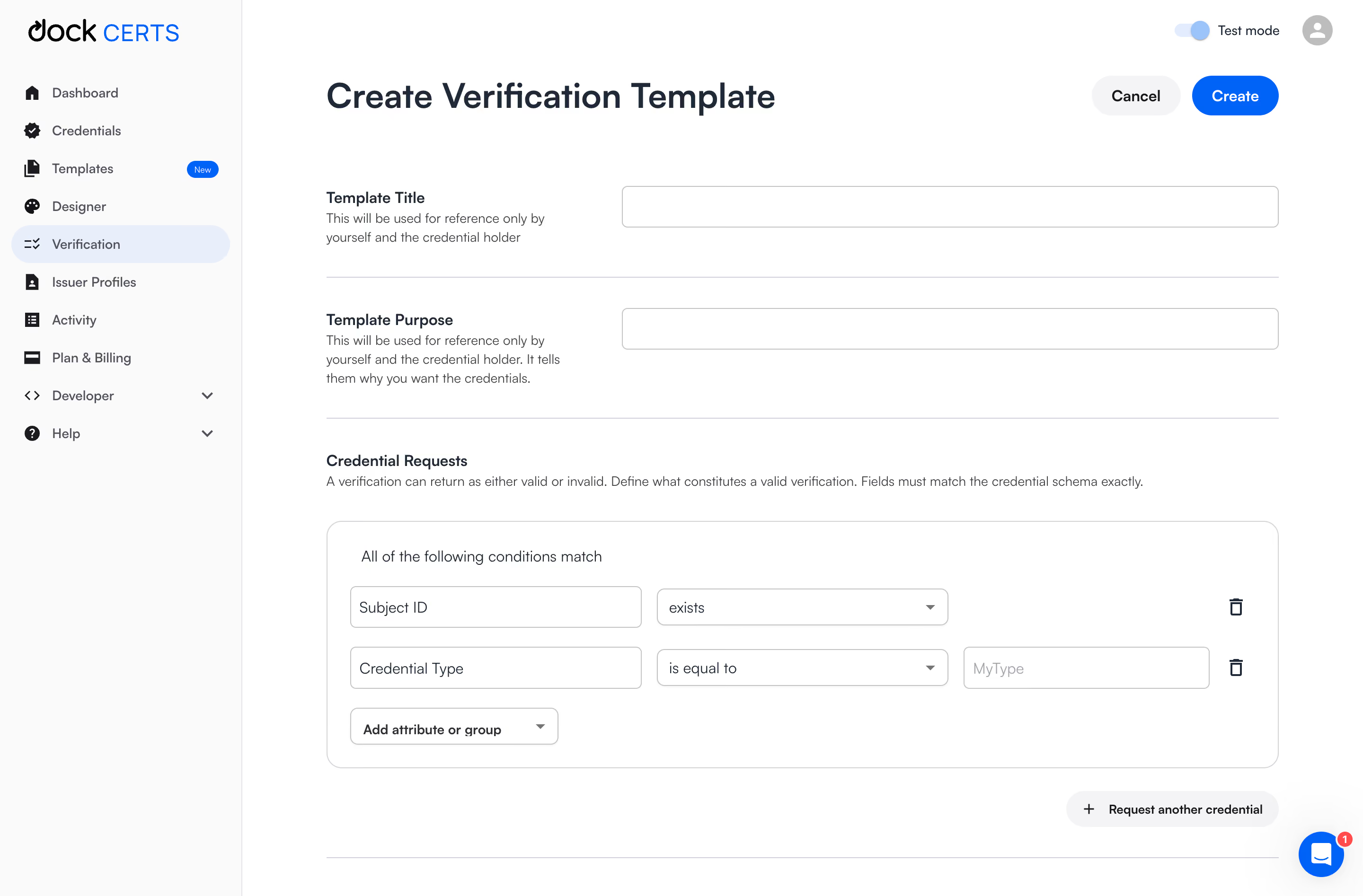
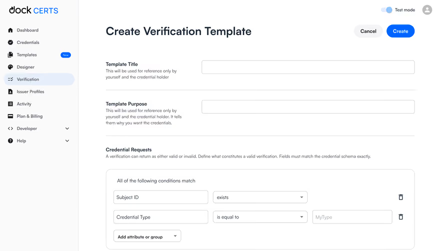
# Design from Reference: Dock Create Verification Templates
Create an original, high-fidelity visual design inspired by the reference. Prioritize composition, typography, colors, spacing, and component styling over technical implementation.
## Reference
- **Product:** Dock
- **Category:** Add & Edit
- **Screenshot:** https://cdn.prod.website-files.com/5e9dc792e1210c5325f7ebbc/6acad91981d0b61fedf68e56_6acad88db2165b6c7f00f86b_cms-3751698a46a67a2a3c837a5b.webp
Analyze the screenshot first. If inaccessible, request it rather than guessing.
## Content
{{content.instructions}}
{{content.data}}
Preserve essential messaging and factual accuracy. Adapt structure and copy length for visual balance; never invent product claims.
## Visual Design
### Overall aesthetic
- **Style:** White verification-template builder with blue actions, subdued sidebar, and structured condition editor.
### Page composition
- **Canvas:** 2880 × 1894 image px; CSS estimates assume an unverified 2× capture.
- **Sidebar:** Approximately 255 CSS px wide.
- **Main:** Large page heading and Cancel/Create actions; title/purpose rows; credential-request condition group.
- **Condition area:** Wide rounded panel with attribute, operator, value, and delete controls.
- **Footer area:** Request another credential pill aligned right.
### Information hierarchy
- **Primary:** Create Verification Template title.
- **Metadata:** Template title and purpose precede validation rules.
- **Rules:** Bold Credential Requests heading and explanatory sentence.
- **Action:** Blue Create at upper right; Cancel subdued.
### Typography
- **Family:** Rounded neutral sans serif; exact family unverified.
- **Page title:** Approximately 36 CSS px, semibold.
- **Section labels:** Approximately 16px, semibold.
- **Body/fields:** Approximately 14px with 22px line-height.
- **Precision:** Font sizes and 2× scale are estimates.
### Colors & surfaces
- **Canvas:** #FFFFFF.
- **Sidebar:** #FAFAFA.
- **Neutral controls:** #F4F4F5.
- **Selected navigation:** #E7EEFB.
- **Primary text:** #1C2938.
- **Action blue:** #0064FF.
- **Borders:** Approximately #C4C4C4, with lighter separators.
- **Precision:** Flat values sampled from screenshot.
### Components
- **Metadata rows:** Labels/helper text left, wide outlined input right.
- **Condition group:** Approximately 16px radius under assumed 2×, 24px padding.
- **Rule rows:** Attribute input, operator dropdown, optional value input, and trash icon.
- **Actions:** Add attribute or group dropdown; Request another credential pill.
- **Top:** Test-mode toggle and profile.
- **Help:** Blue chat bubble with small notification badge.
### Visual rhythm
- **Spacing:** Broad horizontal rules divide metadata groups.
- **Alignment:** Repeated label/input columns establish hierarchy.
- **Rules:** Equal-height controls and consistent gaps create a readable builder.
- **Whitespace:** Large open gaps distinguish page metadata from logic.
### Responsive
- **Observed:** Desktop only.
- **Recommendation:** Stack labels above inputs and let rule rows wrap into labeled vertical groups.
- **Logic:** Keep grouping and delete controls unambiguous on narrow screens.
### Adaptation guidance
- **Preserve:** Metadata-first setup, clear condition grouping, blue creation action, and restrained forms.
- **Content:** Use actual credential schema and operators.
- **Behavior:** Rule evaluation, nested groups, and submission are not demonstrated.
Use this context to reproduce the reference's visual language: layout, typography, colors, spacing, borders, radii, and distinctive elements. The screenshot takes priority if descriptions conflict.
## Direction
{{preferences.fidelityInstructions}}
## Output
{{output.instructions}}
Deliver a polished, cohesive design with precise alignment, hierarchy, and spacing. Produce the requested visual artifact, not just a description. If unsupported, explain the limitation.