




```html

Thank you! Your submission has been received!
Oops! Something went wrong while submitting the form.
Get SaaSFrame Pro
Monthly
$18
Quarterly
$48
Yearly
$180
Upgrade to access this feature
Browse all screens & flows
Filter and search screens & flows
Access Figma files
Access mobile versions
Bookmark screens & flows
Join now
Customer.io Landing Page

Customer.io
Customer engagement platform for tech-savvy marketers
Designed by
No items found.

Bookmark
Bookmark
Design with AI
Thank you! Your submission has been received!
Oops! Something went wrong while submitting the form.
# Design from Reference: Customer.io Landing Page
Create an original, high-fidelity visual design inspired by the reference. Prioritize composition, typography, colors, spacing, and component styling over technical implementation.
## Reference
- **Product:** Customer.io
- **Category:** Landing Page
- **Screenshot:** https://cdn.prod.website-files.com/5e9dc792e1210c5325f7ebbc/6acad472886583e9d96b7069_6acad37211963fdadfb5bea6_cms-61db84c92bb06092c35b4163.webp
Analyze the screenshot first. If inaccessible, request it rather than guessing.
## Content
{{content.instructions}}
{{content.data}}
Preserve essential messaging and factual accuracy. Adapt structure and copy length for visual balance; never invent product claims.
## Visual Design
### Overall aesthetic
- **Character:** A substantial customer-engagement marketing page balancing dark teal brand storytelling, bright product demonstrations and a near-black trust section. Pale lime actions, fine geometric outlines and richly layered interface artwork provide a distinctive technical identity.
- **Image basis:** The 2880 × 17906 source was inspected throughout at 1400 px wide in seven readable crops. Dimensions below are approximate inspection pixels; a roughly double-density CSS capture is plausible but unverified.
- **Design language:** Light, large sans-serif headlines contrast with compact uppercase eyebrows and detailed product imagery. Flat section backgrounds carry most structure; shadows are concentrated inside illustrative UI.
### Page composition
- **Header and hero:** A roughly 1168 px centered content area places the logo and product navigation left, with sign-in and paired demo/trial actions right. The left-aligned hero headline occupies two large lines above a short paragraph and two pill actions; nested angular outlines fill the right side.
- **Platform overview:** On the same dark teal surface, a tall collage of campaign, data and analytics tiles sits left of a heading, paragraph and three icon-led product descriptions. A full-width customer-logo band ends this dark opening.
- **Engagement features:** A white section opens with centered eyebrow, headline, paragraph and outlined action. Two large illustration cards sit above three smaller feature cards, covering workflow, channels, editor, analytics and testing.
- **Data section:** A warm near-white region pairs a large left heading with right-side copy and action. A broad source-to-destination illustration connects four source tiles through a central hub to a grid of app icons. Six icon/text benefits form a three-column, two-row grid beneath.
- **Trust section:** A near-black region contains a centered introduction, three pastel customer-result cards, an explanatory block beside six operational metrics, two large awards/integrations cards and a full-width security card.
- **Closing and footer:** A pale green gradient CTA banner overlaps the transition back to teal. Three footer link columns and a large brand symbol precede a darker contact/social band and a final row of badges, legal links and status.
### Information hierarchy
- **Hero:** Approximately 92 px light-weight text dominates the opening; its second line shifts through green tones. The lime demo pill is stronger than the outlined trial action, with small reassurance items beneath.
- **Product narrative:** Eyebrows identify each theme; roughly 50 px headings explain its purpose. Larger product illustrations provide supporting evidence rather than dense inline specifications.
- **Proof:** Customer-result cards use logos and large stacked figures. Operational metrics are grouped into a disciplined two-column grid with thin dividing rules.
- **Trust detail:** Awards, integration icons and compliance artwork have dedicated containers. They are observed promotional content, not independently verified certifications.
- **Footer:** Uppercase group headings, muted links and separate contact/legal rows establish progressively lower-priority navigation.
### Typography
- **Display roles:** The hero is approximately 90–94 px, regular/light sans-serif with tight tracking and near 1.0 line-height. Major section headings are approximately 50 px with 52–56 px line-height.
- **Section and card roles:** Trust-card headings are around 30–32 px; feature-card headings are around 20 px medium. Customer-result and operational figures are around 46–50 px bold.
- **Reading roles:** Main supporting paragraphs are approximately 20 px with 27–28 px line-height. Feature descriptions and footer links use around 16 px with 22 px line-height.
- **Utility roles:** Eyebrows and navigation are approximately 14–16 px; reassurance and legal details are around 12 px. Font family identities and exact CSS metrics remain unverified.
### Colors & surfaces
- **Measured foundations:** Dark teal #0C373C anchors the opening and footer, with deeper #09272B in illustrative and lower bands. Near-black #141414 and card charcoal #242424 define the trust region.
- **Measured light surfaces:** White #FFFFFF, warm near-white #FBFAF9 and #FBF9F9 separate product sections. Pale lime #E2FFCC is a prominent brand and action color.
- **Accent system:** Emerald/teal accents appear in eyebrows, chart lines, connectors and hero text. Pastel pink, lavender and lime differentiate customer-result cards.
- **Depth and pattern:** Faint angular line motifs repeat in hero, cards and footer. Product artwork contains soft shadows, glowing connectors and tinted UI fragments; large section surfaces remain comparatively flat.
### Components
- **Pill actions:** Hero buttons are approximately 46 px high with fully rounded ends, a pale filled demo action and a thin pale outlined trial action. Header versions are smaller, around 39 px high.
- **Feature grid:** The two upper cards are roughly 568 px wide with modest approximately 12 px corners, centered headings and large bottom-cropped illustrations. The three lower cards share the same surface treatment at approximately 369 px width.
- **Data illustration:** Four white source tiles on the left connect through curved green lines to a circular dark hub and fifteen small destination tiles on the right. Fine grid lines form a quiet technical backdrop.
- **Benefit items:** Six benefits use small outlined square icons, medium headings and short left-aligned descriptions without enclosing cards.
- **Result cards:** Three approximately 369 px wide pastel panels use around 12 px corners and generous 38–54 px internal padding. Subtle diagonal shapes sit behind stacked metrics.
- **Trust panels:** Two half-width charcoal cards contain awards and a 5-by-4 integration-icon grid. A larger security panel pairs text and small benefit items with a five-badge illustration.
- **Closing banner:** A roughly 1168 × 261 px pale gradient panel has modest corners, large text left and two pills right. Footer social controls are small square tiles; the status indicator is a compact dark pill. Hover and focus states are not visible.
### Visual rhythm
- **Container:** Most content aligns around x116–1284 at inspection scale. Repeated half-width and third-width divisions maintain coherence across a very long page.
- **Section spacing:** Broad approximately 110–150 px top/bottom intervals separate the major narratives. Cards use smaller 30 px gutters and generous internal padding.
- **Alternation:** Left/right storytelling, centered introductions, feature grids and numerical proof create distinct reading modes. Dark teal, white, warm white and near-black bands mark major transitions.
- **Layering:** Interface collages and the overlapping closing banner are the main depth events; repeated angular motifs connect visually distant regions.
### Responsive
- **Evidence limit:** Only the wide layout is observed; responsive behavior is unverified.
- **Recommended stacking:** Place overview copy above its collage, collapse the feature and trust grids progressively, and stack the data-section title/copy before its diagram.
- **Recommended illustration:** Simplify or proportionally scale source/destination artwork so labels remain meaningful. Avoid shrinking dense product screenshots into unreadable mobile decorations.
- **Recommended actions:** Wrap paired pills, reduce hero display size fluidly and preserve comfortable text gutters. Collapse the footer groups and header navigation accessibly.
- **Recommended proof:** Keep metric labels attached to their values and preserve result-card reading order when cards stack.
### Adaptation guidance
- **Preserve:** Retain the dark teal/lime identity, light display typography, angular motifs, detailed product illustrations and alternating narrative/proof regions.
- **Build:** Use shared section containers, feature cards, metric groups, customer-result cards, pill actions and footer groups with consistent spacing tokens.
- **Content discipline:** Treat diagrams as purposeful explanations and keep operational or compliance claims tied to validated source content in a real implementation.
- **Validate:** Confirm fonts, true CSS scale, pale-on-dark contrast, narrow-screen artwork and keyboard states. The screenshot establishes appearance, not current product claims or interaction behavior.
Use this context to reproduce the reference's visual language: layout, typography, colors, spacing, borders, radii, and distinctive elements. The screenshot takes priority if descriptions conflict.
## Direction
{{preferences.fidelityInstructions}}
## Output
{{output.instructions}}
Deliver a polished, cohesive design with precise alignment, hierarchy, and spacing. Produce the requested visual artifact, not just a description. If unsupported, explain the limitation.
Category
Patterns
No items found.
Added on
April 17, 2024
Similar screens



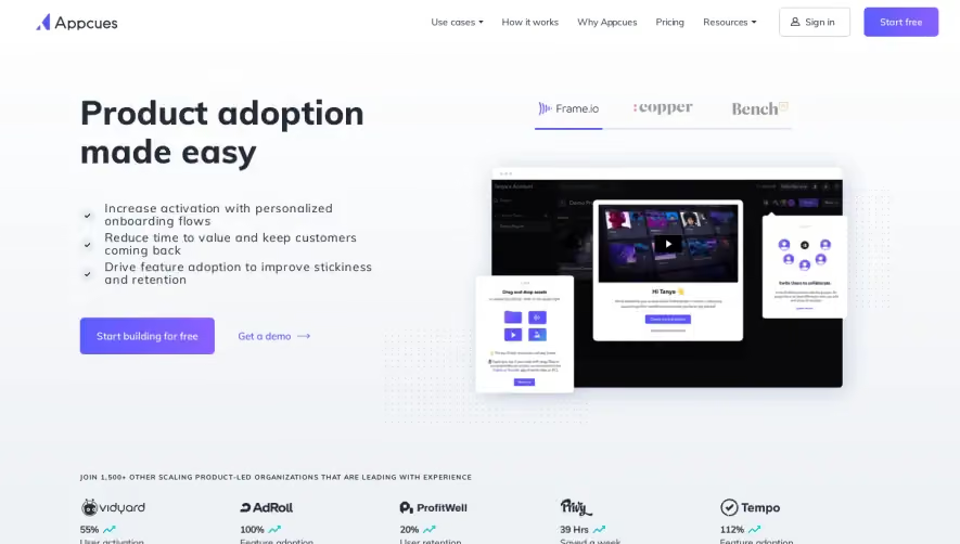



Upgrade to SaaSFrame Pro now to see similar examples.
Monthly
$18 /month
Billed $18 monthly
Browse all screens & flows
Filter and search screens & flows
Search text in screenshots
Access Figma files
Access mobile versions
Join now
Quarterly
$16 /month
Billed $48 quarterly
Browse all screens & flows
Filter and search screens & flows
Search text in screenshots
Access Figma files
Access mobile versions
Join now
Yearly
$15 /month
Billed $180 yearly
Browse all screens & flows
Filter and search screens & flows
Search text in screenshots
Access Figma files
Access mobile versions
Join now