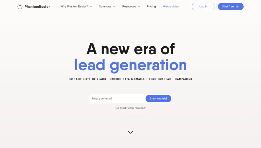
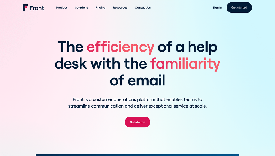
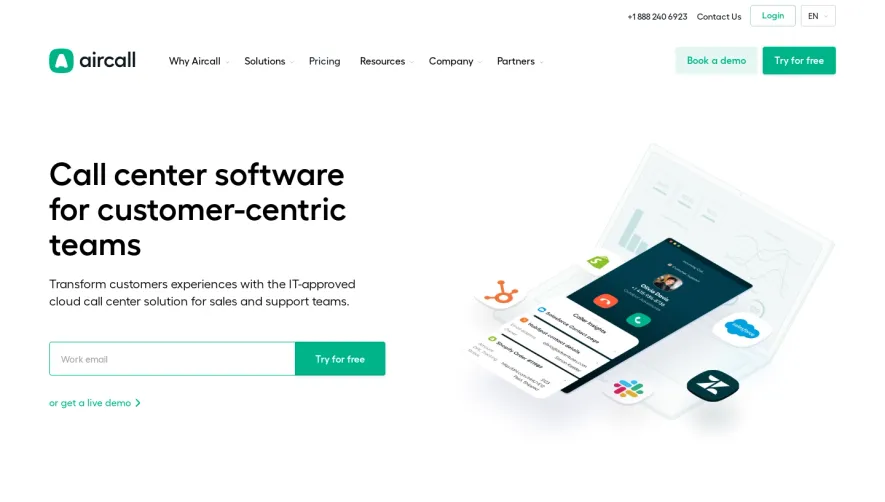
Generate a new design based on this screen using your own content.
Thank you! Your submission has been received!
Oops! Something went wrong while submitting the form.
# Design from Reference: Stage Landing Page
Create an original, high-fidelity visual design inspired by the reference. Prioritize composition, typography, colors, spacing, and component styling over technical implementation.
## Reference
- **Product:** Stage
- **Category:** Landing Page
- **Screenshot:** https://cdn.prod.website-files.com/5e9dc792e1210c5325f7ebbc/62ff1da25552a6b843934746_1660886293762--Laptop%2520Medium-1660886174499.webp
Analyze the screenshot first. If inaccessible, request it rather than guessing.
## Content
{{content.instructions}}
{{content.data}}
Preserve essential messaging and factual accuracy. Adapt structure and copy length for visual balance; never invent product claims.
## Visual Design
Use this context to reproduce the reference's visual language: layout, typography, colors, spacing, borders, radii, and distinctive elements. The screenshot takes priority if descriptions conflict.
## Direction
{{preferences.fidelityInstructions}}
## Output
{{output.instructions}}
Deliver a polished, cohesive design with precise alignment, hierarchy, and spacing. Produce the requested visual artifact, not just a description. If unsupported, explain the limitation.
Stage.so embraces a clean, ultra-modern aesthetic grounded in minimalist principles. The interface exudes confidence, combining generous white space with crisp lines and delicate shadows. The tone is both professional and inviting, striking a balance between approachable and forward-thinking—ideal for creative SaaS brands aiming to inspire trust while projecting innovation.
Layout and Structure
The homepage unfolds with a commanding hero section, showcasing a bold headline and animated product preview that instantly communicates Stage’s value. Beneath, succinct feature highlights use a grid layout for clarity, each paired with concise copy and distinctive icons. Further down, testimonials from recognizable brands lend credibility, while a sticky navigation bar keeps users oriented. The footer is meticulously structured, offering quick links, legal, and social CTAs.
Visual Elements
Custom vector illustrations and smooth micro-animations elevate the browsing experience without overwhelming it. The hero’s looping product video clearly demonstrates Stage’s workflow, reducing friction for new visitors. Subtle hover effects and geometric motifs break up sections, providing rhythm and guiding attention down the page.
Color Palette and Typography
A sophisticated palette combines calming off-whites with vibrant accents—sage green and electric blue—to highlight key actions and information. Clean, sans-serif typography (likely Inter or a similar modern font) establishes a strong hierarchy, using weight and scale variations to make headlines pop against supporting text.
User Experience Patterns
Intuitive navigation and well-placed, highly visible CTAs (“Try for free,” “Get Started”) streamline conversion. Interactive elements—like expanding modals and animated button feedback—enhance usability. The guided scroll experience ensures users discover all content without feeling overwhelmed or lost.
Unique or Notable Design Choices
Stage.so stands out with its real-time product demo front-and-center, reducing ambiguity and quickly building interest. Smooth section transitions, engaging yet subtle animations, and playful geometric accents combine for a website that feels both polished and distinctly memorable—an inspiration for any SaaS team seeking to blend creativity with clarity.