Design with AI
Generate a new design based on this screen using your own content.
# Design from Reference: Conduktor Flowchart
Create an original, high-fidelity visual design inspired by the reference. Prioritize composition, typography, colors, spacing, and component styling over technical implementation.
## Reference
- **Product:** Conduktor
- **Category:** Flowchart
- **Screenshot:** https://cdn.prod.website-files.com/5e9dc792e1210c5325f7ebbc/6acb675f994832179b5605de_6acb6573a2ab34f172945bbf_cms-8e39c9ce04ea222c1f08478a.webp
Analyze the screenshot first. If inaccessible, request it rather than guessing.
## Content
{{content.instructions}}
{{content.data}}
Preserve essential messaging and factual accuracy. Adapt structure and copy length for visual balance; never invent product claims.
## Visual Design
### Overall aesthetic
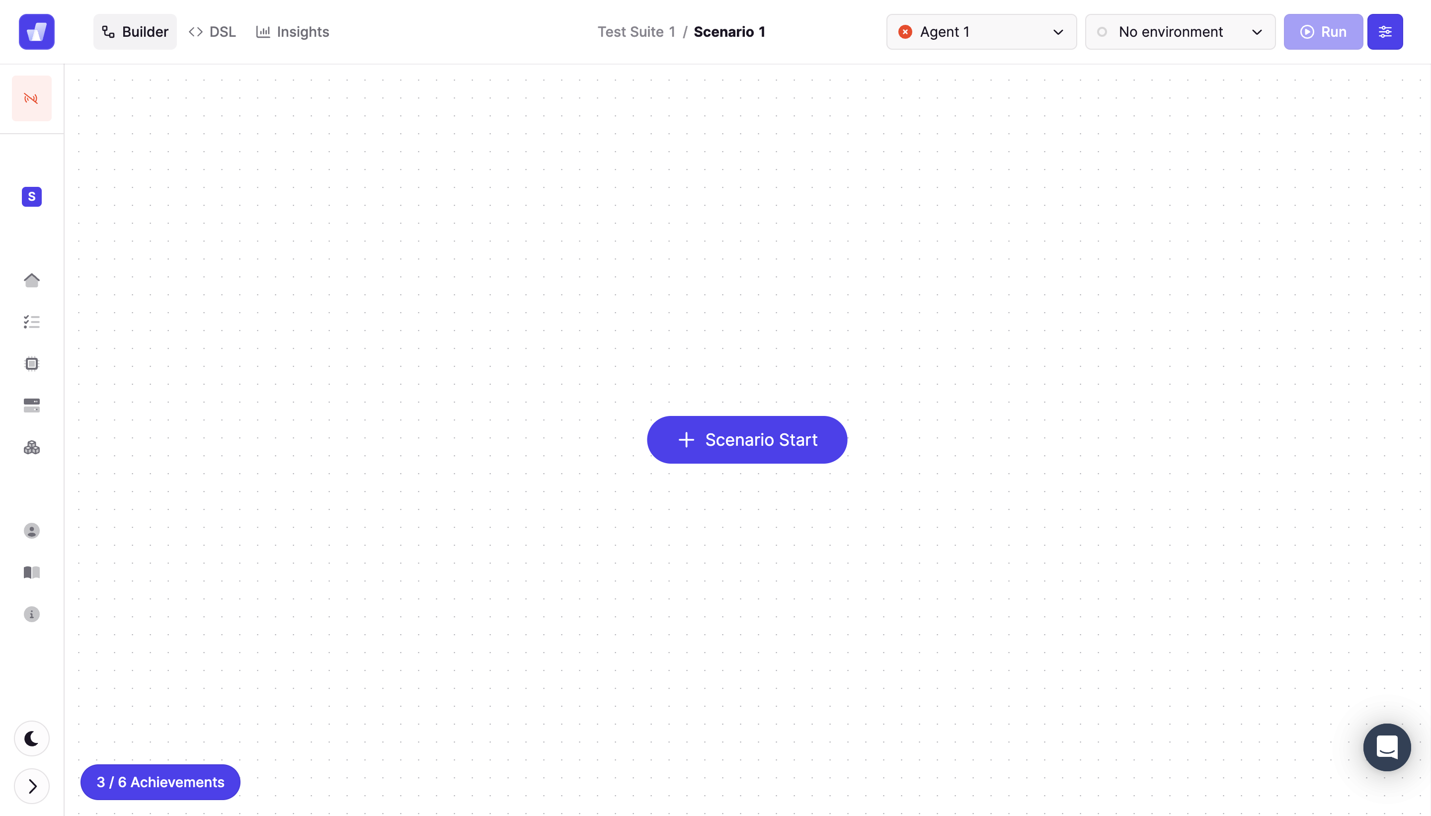
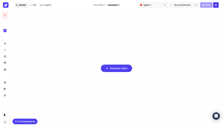
- **Style:** Minimal visual builder empty state with dotted canvas and vivid violet controls.
### Page composition
- **Canvas:** 2880 × 1642 image px; CSS estimates assume unverified 2×.
- **Structure:** Compact top toolbar, narrow icon rail, large dotted workspace.
- **Center:** Scenario Start pill.
- **Top:** Builder/DSL/Insights, scenario breadcrumb, agent/environment selects, Run, settings.
### Information hierarchy
- **Primary:** Central Scenario Start.
- **Context:** Scenario and environment controls.
- **Secondary:** Rail tools and achievements badge.
### Typography
- **Family:** Compact sans serif; exact identity unverified.
- **Controls:** Approximately 14px CSS.
- **Central action:** Approximately 18px.
- **Metadata:** Approximately 12–14px.
- **Precision:** Estimated under 2×.
### Colors & surfaces
- **Canvas:** #FFFFFF.
- **Violet:** #4E3FF1.
- **Pale controls:** #F9F8F9 and #F3F2F4.
- **Inactive violet:** #A6A0FB.
- **Precision:** Flat sampled colors.
### Components
- **Start:** Large violet pill with plus.
- **Canvas:** Fine light-gray dot grid.
- **Rail:** Small glyphs, selected square icons.
- **Header:** Outlined selects, pale Run, strong settings button.
- **Footer:** Violet achievements pill and circular theme/collapse controls.
### Visual rhythm
- **Whitespace:** Almost entire canvas empty.
- **Alignment:** Dense toolbar contrasts with isolated center action.
- **Motif:** Dots communicate spatial editing.
### Responsive
- **Observed:** Desktop only.
- **Recommendation:** Preserve pan/zoom workspace and move secondary controls to menus.
- **Start:** Keep reachable without fixed desktop coordinates.
### Adaptation guidance
- **Preserve:** Clear first-node action and quiet editing canvas.
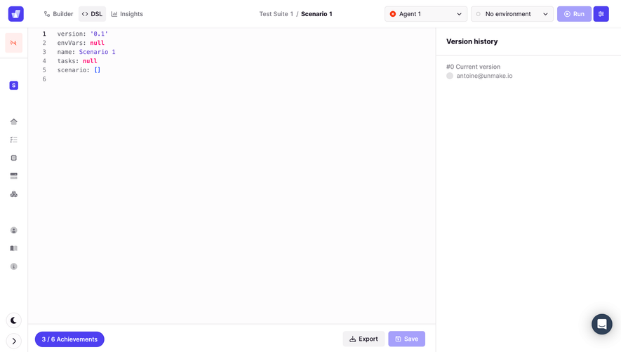
- **Scope:** Visible screen is a scenario builder, regardless of record title.
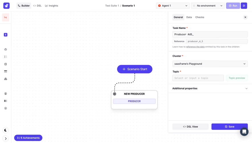
- **Behavior:** Adding/running nodes not demonstrated.
Use this context to reproduce the reference's visual language: layout, typography, colors, spacing, borders, radii, and distinctive elements. The screenshot takes priority if descriptions conflict.
## Direction
{{preferences.fidelityInstructions}}
## Output
{{output.instructions}}
Deliver a polished, cohesive design with precise alignment, hierarchy, and spacing. Produce the requested visual artifact, not just a description. If unsupported, explain the limitation.