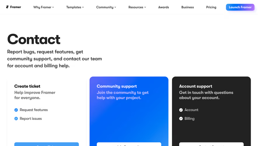
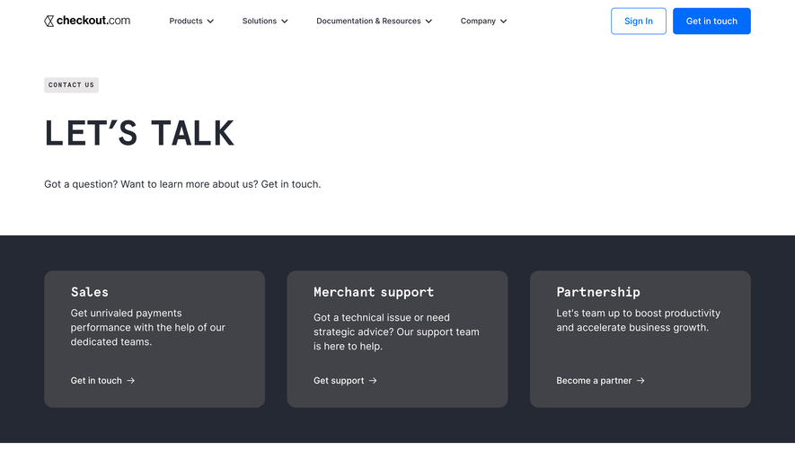
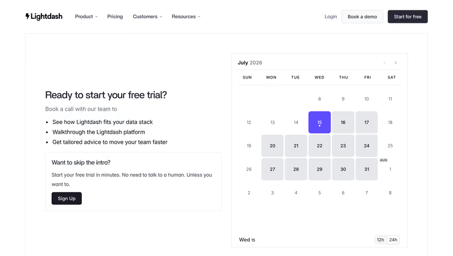
Overall Style and Aesthetic
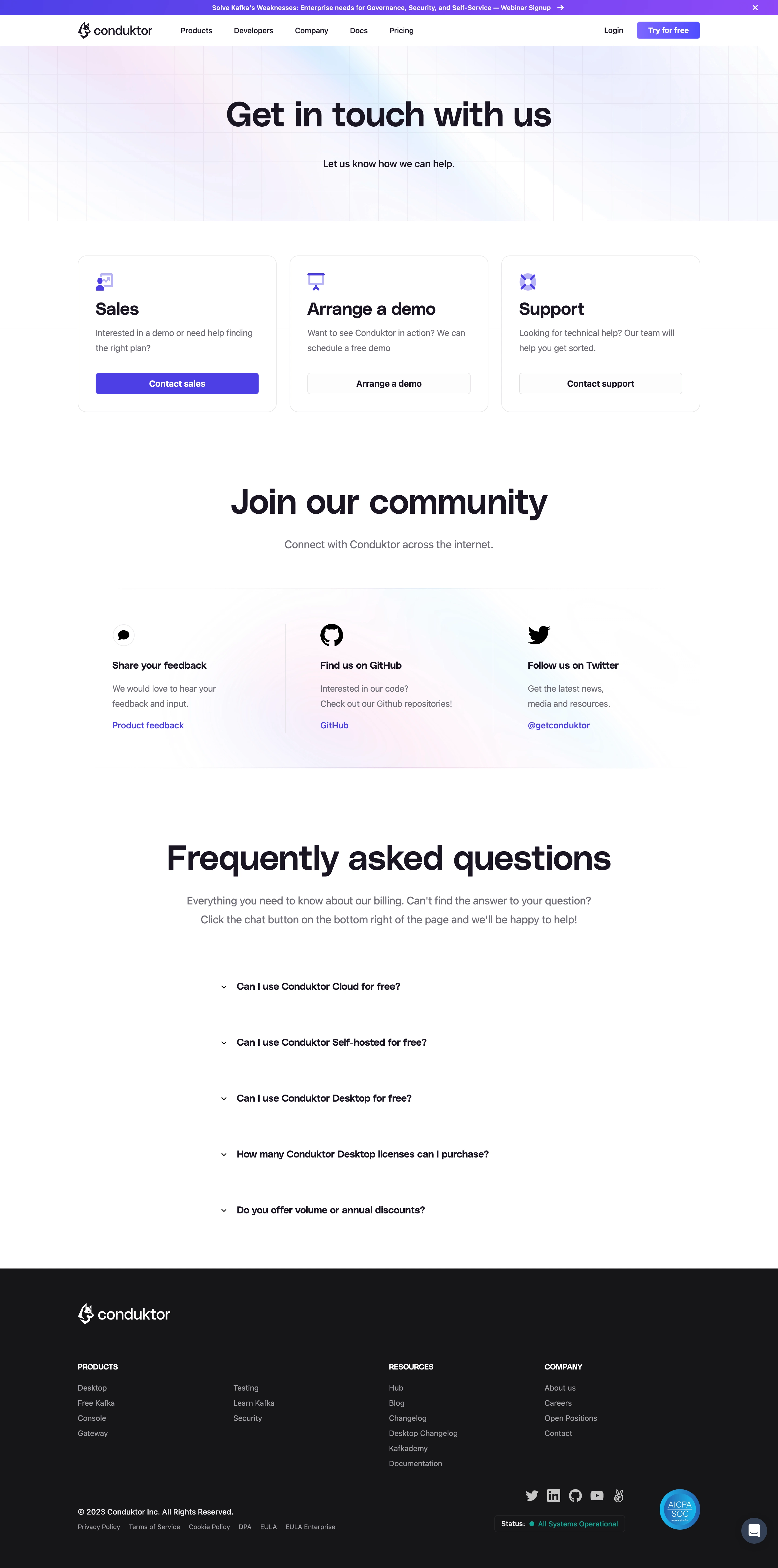
Conduktor’s contact page exudes a modern, professional atmosphere with minimalist sensibilities. The interface harnesses ample white space and understated UI elements, resulting in a clean, uncluttered presence that instantly signals trustworthiness and expertise. Hints of animation and vector artwork introduce energy and a forward-thinking vibe, while the refined layout steers clear of any distractions. Layout and Structure
The page is elegantly segmented: a compact hero section immediately invites engagement with a clear, singular headline and subtle supporting text. The content is condensed around the primary user goal—a contact form—eliminating extraneous sections often found on SaaS pages. Supplementary content, like direct contact details and resource links, is tucked strategically in the sidebar and sticky footer, keeping users focused while providing clear next steps. Visual Elements
Custom vector illustrations infuse personality and reinforce the brand’s tech-savvy appeal, while modest iconography aids scannability without visual noise. Animations are tastefully restrained to micro-interactions, enhancing engagement without overshadowing the main content. No stock photography disrupts the flow; instead, on-brand images unify the experience. Color Palette and Typography
A deep blue anchors the palette, complemented by gradients and accent hues in teal and violet. Crisp sans-serif typography, with varied font weights and a clear visual hierarchy, ensures clarity and easy readability. CTAs stand out with bold color fills, inviting swift interaction. User Experience Patterns and Notable Choices
Navigation is frictionless with a sticky, downsized header and logical menu placement. The form is short and approachable, trimmed to essentials, reducing friction for users. Footnotes neatly summarize legal and resource links. Notably, the page’s crystal-clear structure, visual continuity, and commitment to brevity reflect mature, high-conversion SaaS design thinking—inviting, yet expertly purposeful.