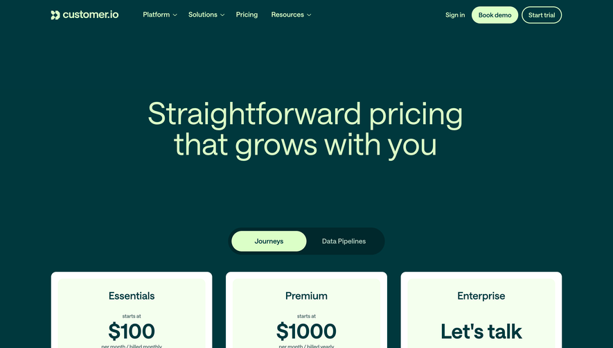
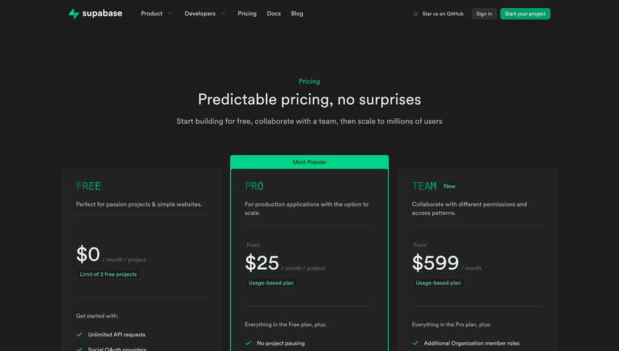
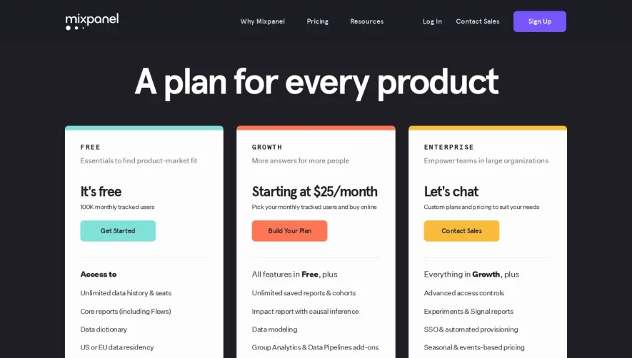
Generate a new design based on this screen using your own content.
Thank you! Your submission has been received!
Oops! Something went wrong while submitting the form.
# Design from Reference: Composer Pricing Page
Create an original, high-fidelity visual design inspired by the reference. Prioritize composition, typography, colors, spacing, and component styling over technical implementation.
## Reference
- **Product:** Composer
- **Category:** Pricing Page
- **Screenshot:** https://cdn.prod.website-files.com/5e9dc792e1210c5325f7ebbc/6acad3a4c2028efdec71af8d_6acad14a5de9841cab63c671_cms-41c6565cfed61981b7ed6e99.webp
Analyze the screenshot first. If inaccessible, request it rather than guessing.
## Content
{{content.instructions}}
{{content.data}}
Preserve essential messaging and factual accuracy. Adapt structure and copy length for visual balance; never invent product claims.
## Visual Design
Use this context to reproduce the reference's visual language: layout, typography, colors, spacing, borders, radii, and distinctive elements. The screenshot takes priority if descriptions conflict.
## Direction
{{preferences.fidelityInstructions}}
## Output
{{output.instructions}}
Deliver a polished, cohesive design with precise alignment, hierarchy, and spacing. Produce the requested visual artifact, not just a description. If unsupported, explain the limitation.
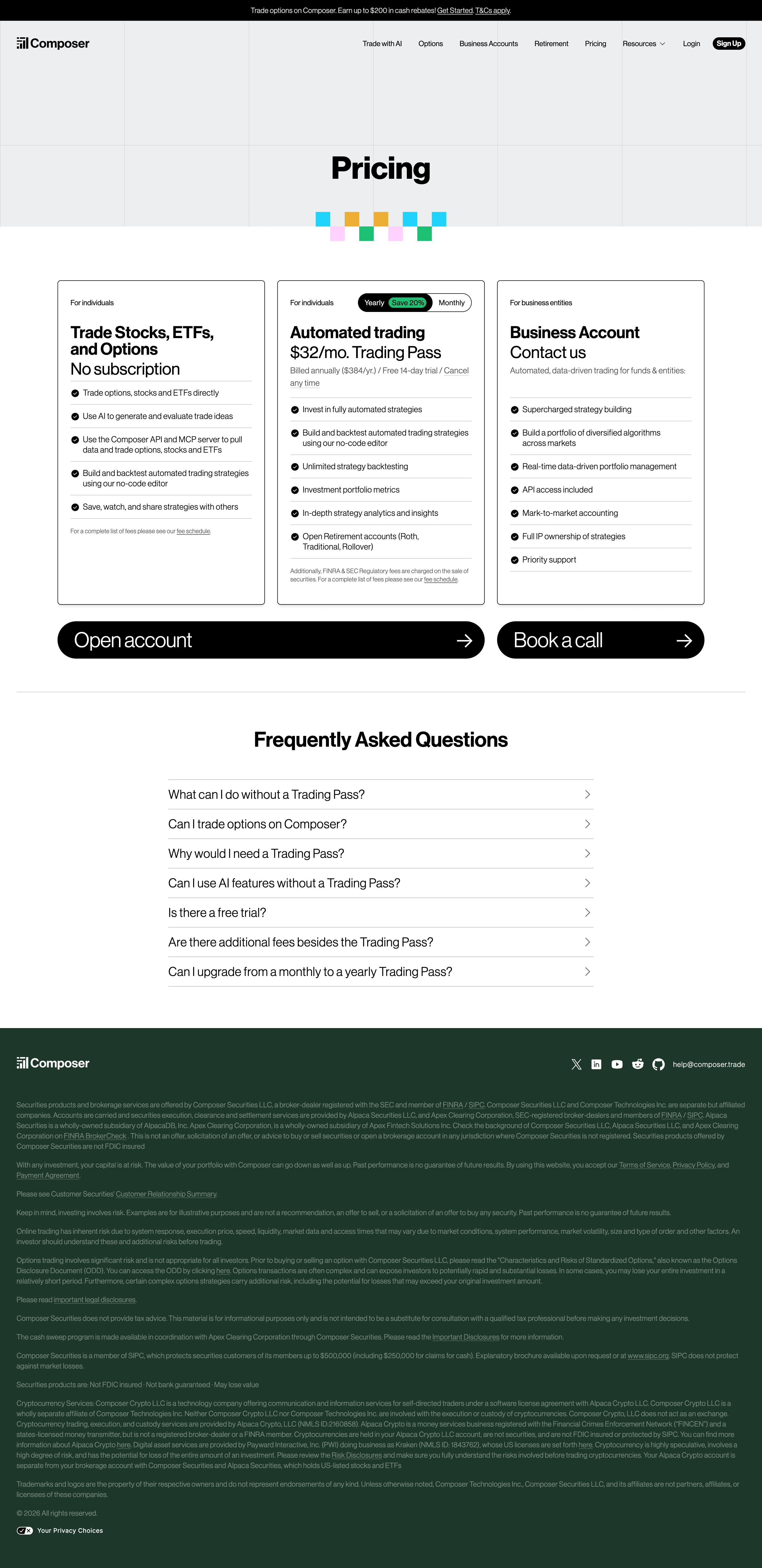
Composer's pricing page nails the basics. Dark header with a bold "Pricing" headline and those playful geometric blocks underneath add just enough personality without trying too hard. The three-tier layout below is dead simple to scan: free tier on the left, $32/mo Trading Pass in the middle, and a business tier on the right. No visual clutter.
Typography Does the Heavy Lifting
The type hierarchy here is really well handled. Plan names are large and confident, prices sit right underneath, and the feature lists use consistent bullet points with green dots. You can compare tiers in seconds. The "Save 20%" badge on the yearly toggle is subtle but effective. Not screaming at you.
Smart Use of Negative Space
What stands out is how much room everything gets to breathe. The FAQ accordion section below feels almost generous with its spacing. Those two big CTA blocks at the bottom, "Open account" and "Book a call," are impossible to miss with their full-width dark treatment and arrow icons. It's a layout that respects the reader's attention instead of fighting for it.