Overall Style and Aesthetic
Customer.io’s pricing page embodies a clean, modern SaaS aesthetic with a subtly playful edge. Ample white space and balanced alignment create a welcoming, uncluttered environment. Highlights of soft purples and accent yellows add vibrancy without overwhelming the professional, trustworthy feel—inviting but never loud. Layout and Structure
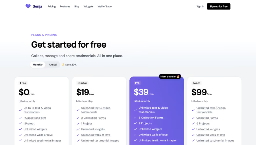
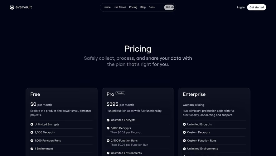
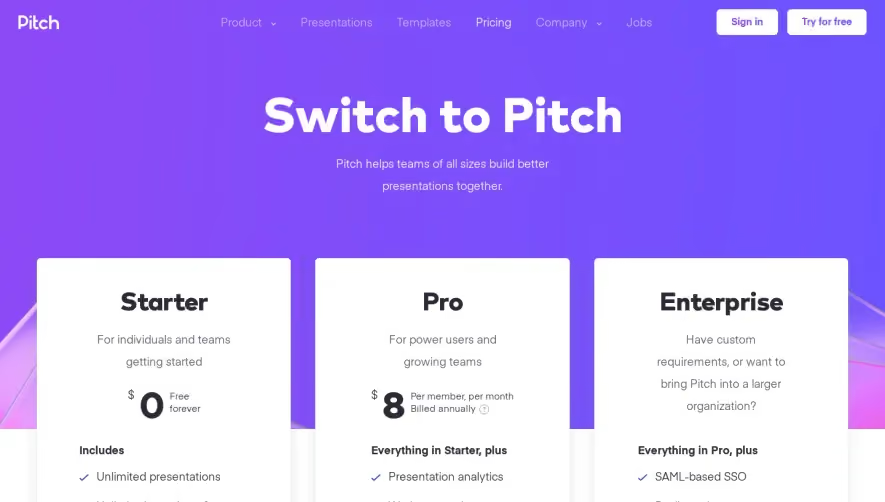
The page opens with a focused hero section: a clear, concise headline and supporting copy overlaying a minimalistic, gently-animated backdrop. Pricing tables are immediately visible, making cost transparency the focal point. Toggle options (“Monthly” vs. “Annual”) provide quick plan comparisons. Below, a comprehensive feature breakdown clarifies what’s included at each tier. Supplementary sections like FAQs and a prominent, reassuring menu-driven footer anchor the page. Visual Elements
Custom vector illustrations and pastel-hued icons give personality, reinforcing brand identity and modernity without distracting the eye. Table hover effects, gentle button animations, and strategic use of microinteractions enhance interactivity. No stock photography—every visual element feels intentional and cohesive. Color Palette and Typography
A harmonious palette: deep indigos contrasted with soft lavenders and bursts of gold for calls-to-action. Primary messaging is bold yet approachable, using geometric sans-serif fonts (such as Inter or similar), with clear hierarchy—headlines command attention, body text is exceptionally readable, and secondary details are understated but accessible. User Experience Patterns
Navigation is frictionless: sticky navigation at the top keeps users oriented, and well-placed CTAs follow every pricing plan. Forms are minimized for top-of-funnel engagement, guiding users toward trial or demo actions. Pricing tables are scannable, with hover reveals and expandable feature lists for those seeking detail. Unique or Notable Design Choices
Notably, the toggle for monthly versus annual pricing is animated and highly visible, reducing decision fatigue. Interactive plan comparison and transparent, plain-language features exude honesty. The playful yet polished illustration style sets the experience apart from sterile competitors, balancing seriousness with a customer-centric warmth.