Design with AI
Generate a new design based on this screen using your own content.
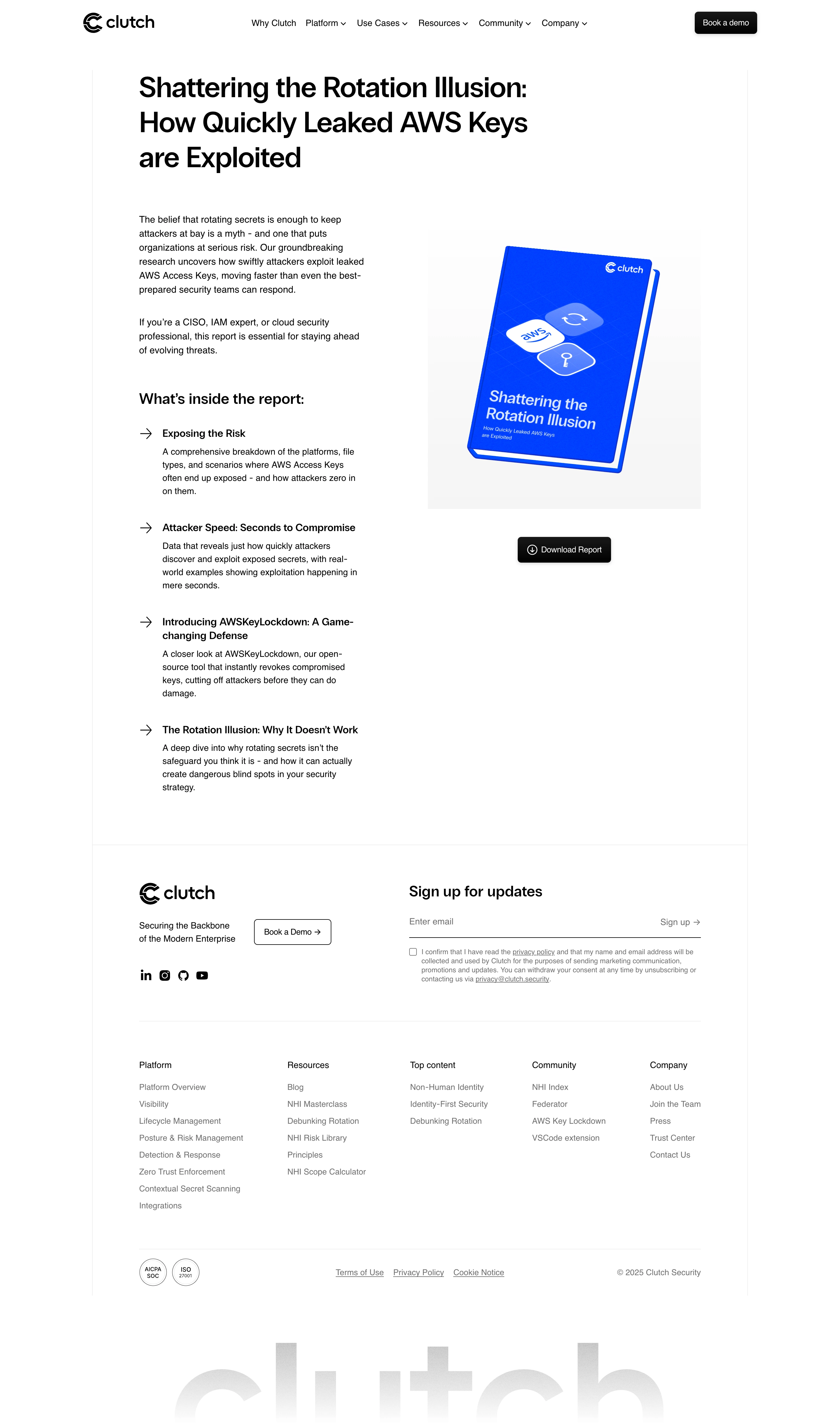
# Design from Reference: Clutch Ebook Page
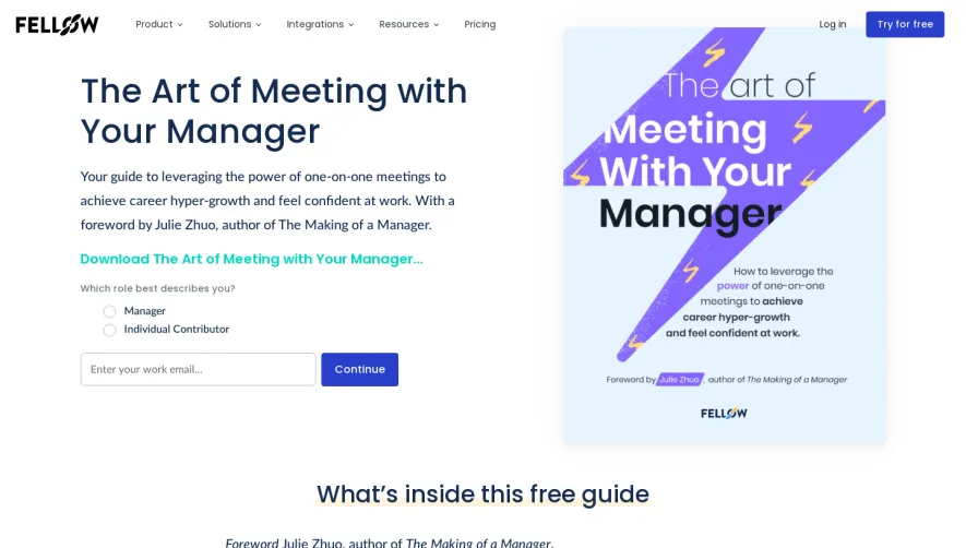
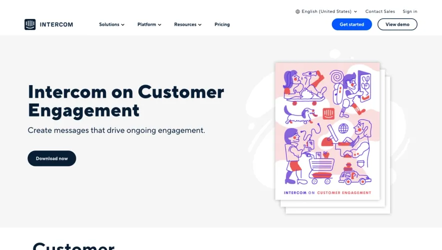
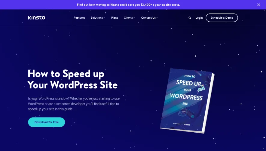
Create an original, high-fidelity visual design inspired by the reference. Prioritize composition, typography, colors, spacing, and component styling over technical implementation.
## Reference
- **Product:** Clutch
- **Category:** Ebook Page
- **Screenshot:** https://cdn.prod.website-files.com/5e9dc792e1210c5325f7ebbc/6acad45b886583e9d96b6dcf_6acad301d05a3f53c0a638e1_cms-5f3c0ee163ac3c30804bc22d.webp
Analyze the screenshot first. If inaccessible, request it rather than guessing.
## Content
{{content.instructions}}
{{content.data}}
Preserve essential messaging and factual accuracy. Adapt structure and copy length for visual balance; never invent product claims.
## Visual Design
### Overall aesthetic
- **Character:** Monochrome report-download landing page with a vivid blue ebook mockup.
### Page composition
- **Canvas:** 2880 × 4880 screenshot px. Navigation and large three-line report title precede split explanation/contents and book image/action, then newsletter and multi-column footer.
### Information hierarchy
- **Priority:** Report topic leads; four arrow-led content summaries explain value before Download Report beneath the book.
### Typography
- **Scale:** Estimated CSS at assumed 2× capture: title 48 px, section heading 24 px, body 16 px, footer 14 px. Sans serif family unverified.
### Colors & surfaces
- **Palette:** Sampled sRGB #FFFFFF, #000000, and subtle #F5F5F5/#F6F6F6. Electric blue is concentrated in the tilted ebook cover.
### Components
- **Details:** Black rounded buttons with small shadows, thin page-column borders, arrow bullets, book mockup on pale gradient, underlined newsletter field, consent checkbox, and giant faded footer wordmark.
### Visual rhythm
- **Spacing:** Estimated 1120 CSS px content width, 80 px inner side padding, and generous vertical gaps between report topics.
### Responsive
- **Adaptation:** Mobile is not shown. Stack book/action above or below concise contents and retain clear download access.
### Adaptation guidance
- **Transfer:** Preserve report-preview hierarchy. Replace research findings, security claims, and book artwork with verified target material.
Use this context to reproduce the reference's visual language: layout, typography, colors, spacing, borders, radii, and distinctive elements. The screenshot takes priority if descriptions conflict.
## Direction
{{preferences.fidelityInstructions}}
## Output
{{output.instructions}}
Deliver a polished, cohesive design with precise alignment, hierarchy, and spacing. Produce the requested visual artifact, not just a description. If unsupported, explain the limitation.