Overall Style and Aesthetic
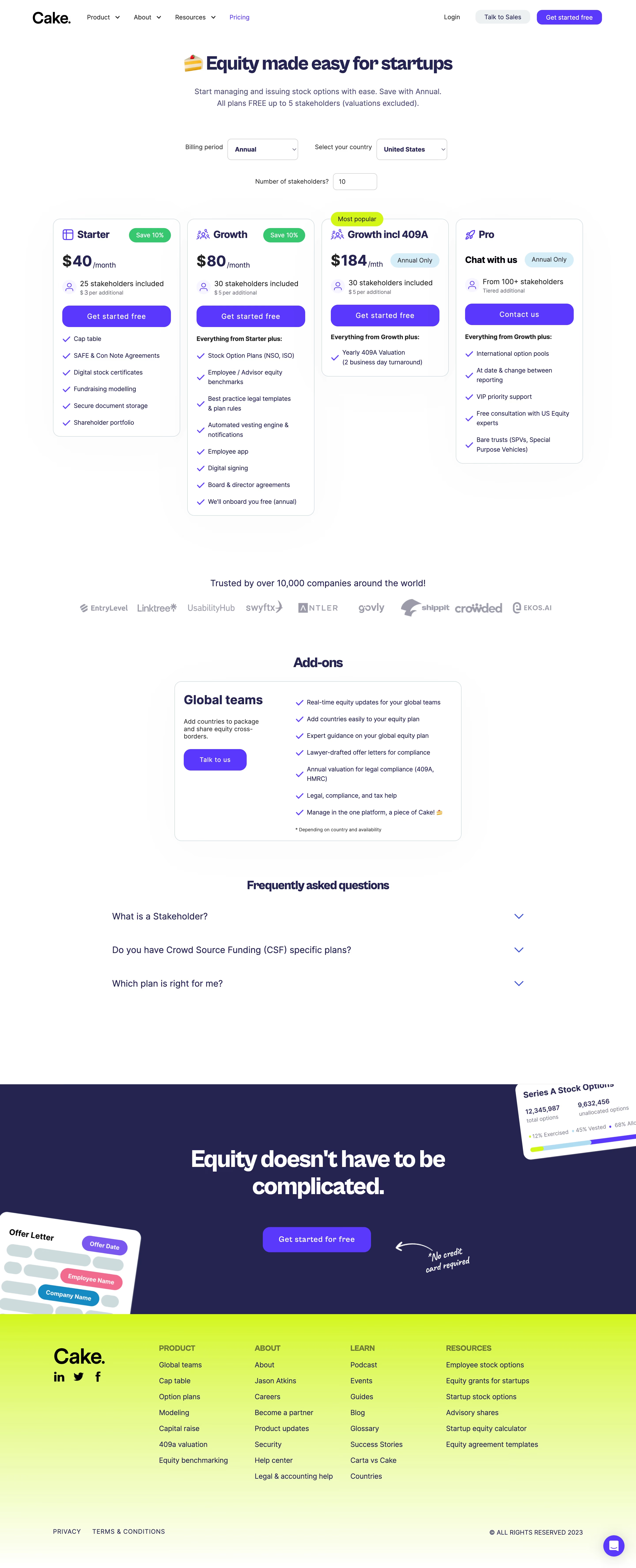
Cake Equity’s pricing page exudes a polished, modern professionalism, perfectly balancing approachability with credibility. The design feels fresh and uncluttered, using ample white space and crisp, rounded edges that contribute to a lightweight, inviting atmosphere. Subtle brand accents soften the page, making it feel welcoming without sacrificing clarity or seriousness. Layout and Structure
The structure is cleanly segmented, guiding users from a prominent hero section with a succinct value proposition, down to the heart of the page: a modular pricing table. Features are clearly bucketed beneath each pricing tier, making comparison effortless. Supplementary elements like a floating help widget and a compact, information-rich footer ensure users are never stranded or overwhelmed. Visual Elements
Engaging flat-style illustrations and playful, minimal icons pepper the page, adding splashes of personality and visual cues without becoming distracting. Micro-animations breathe life into CTAs and plan highlights, subtly drawing attention where intended. Color Palette and Typography
A breezy palette combines rich purples, energetic teals, and calming greens against a clean white backdrop. Hefty sans-serif typography underlines headings, while body text is lighter and highly legible, guiding the eye smoothly through content hierarchies. User Experience Patterns
Navigation is frictionless, with sticky header options and instantaneous plan toggling (e.g., monthly vs annual). Large, high-contrast CTAs and interactive sliders keep engagement high. Inline tooltips neatly decode feature details, making complex information easy to digest. Unique or Notable Design Choices
Notably, the pricing page offers supportive microcopy throughout, alleviating purchasing hesitations. The use of company logos and concise testimonials signals social proof, reinforcing trust. The overall tone is lively yet authoritative—a hybrid approach that feels both innovative and reassuring.