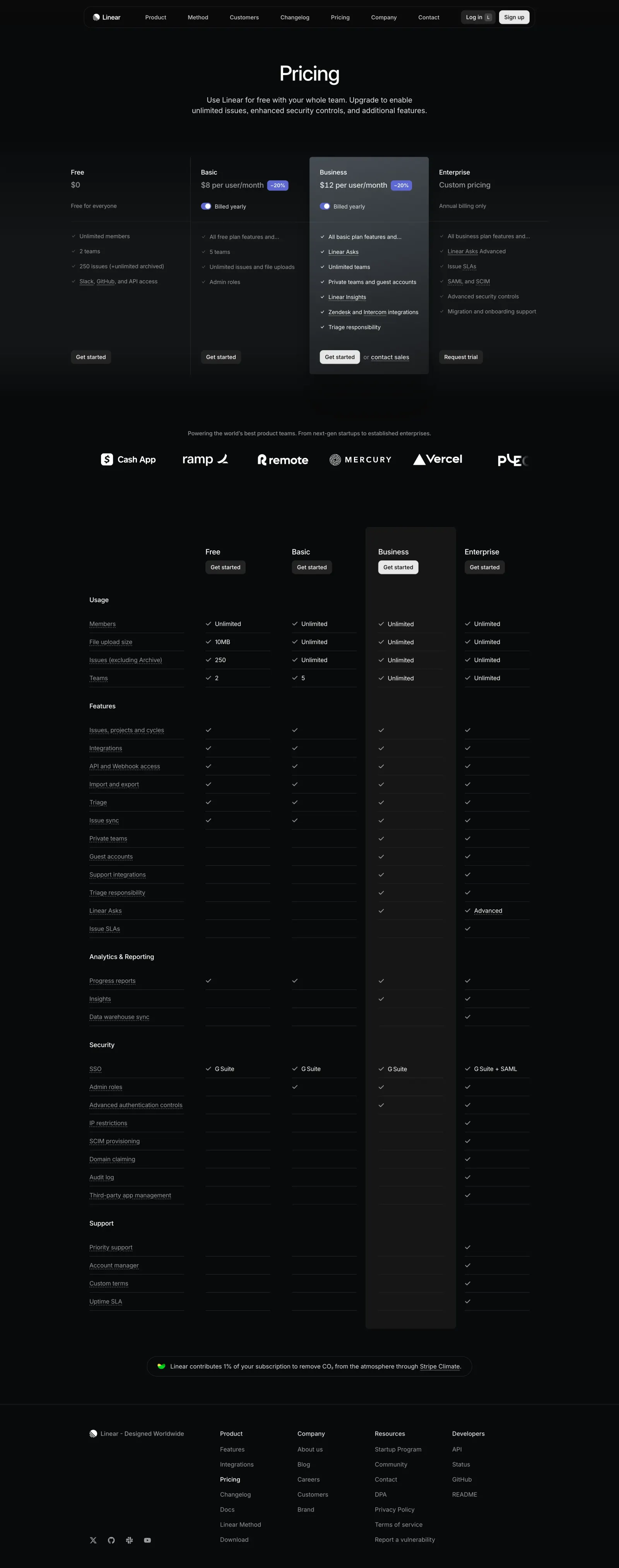
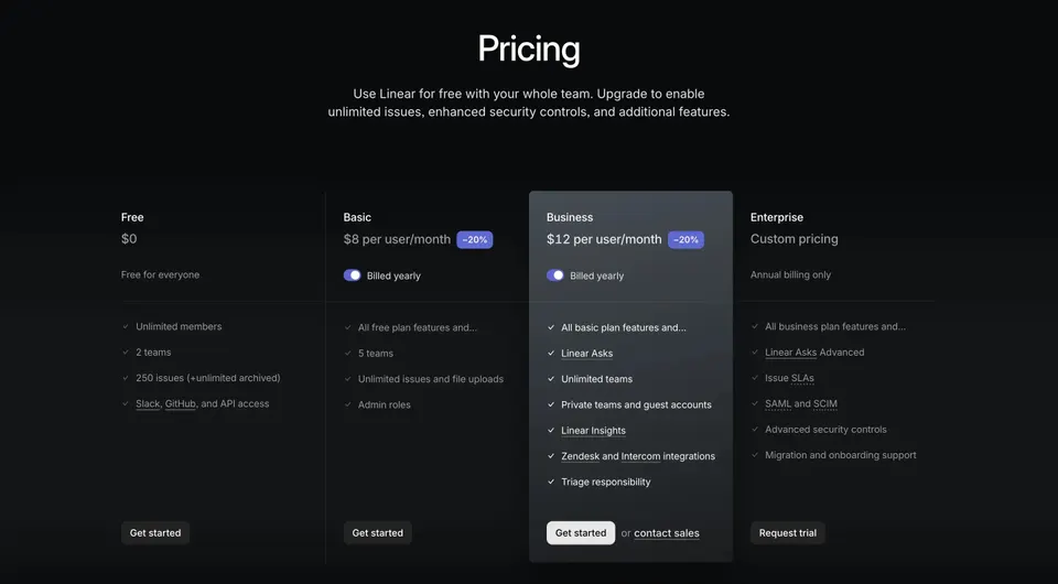
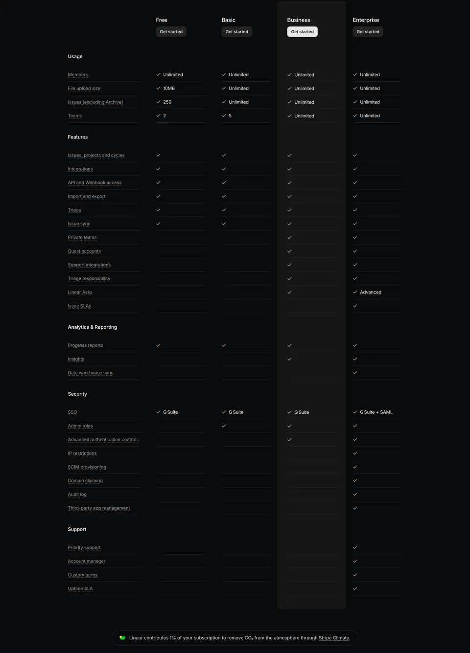
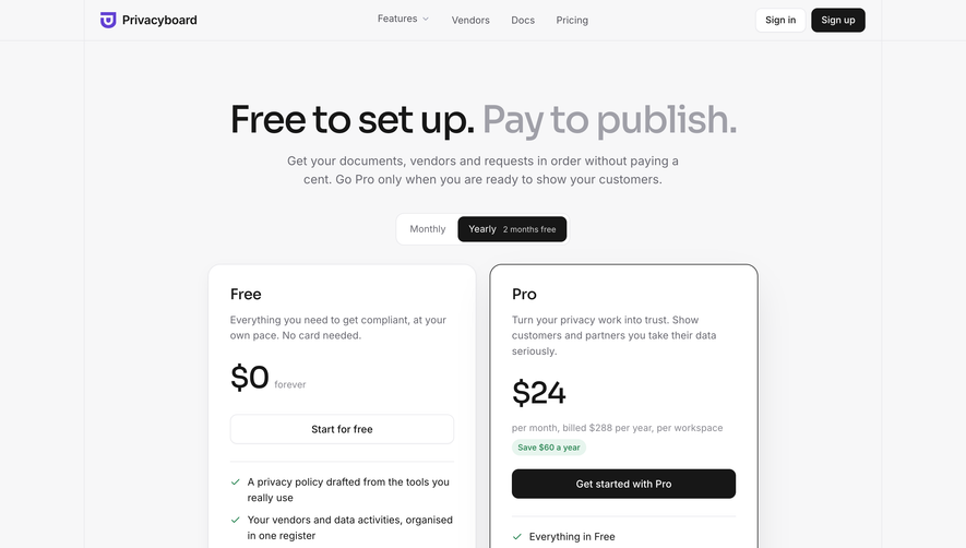
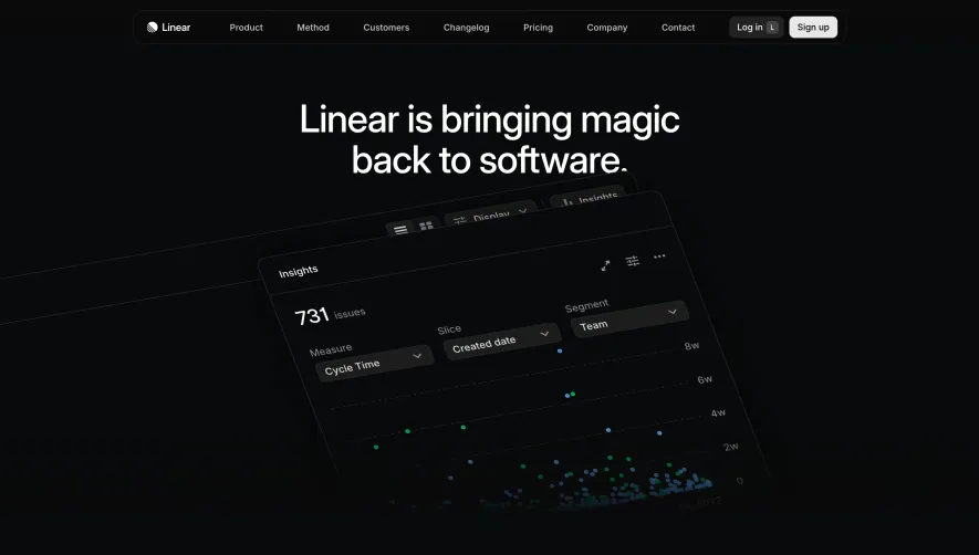
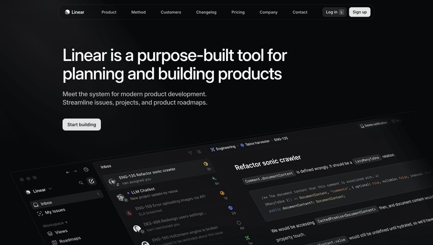
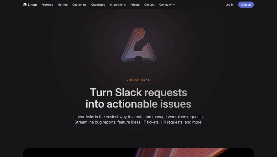
Linear’s pricing page embraces an ultra-modern, minimalist design language. The mood is sophisticated and quietly bold, favoring clarity over embellishment. Ample whitespace lets content breathe, while glassmorphism overlays and subtle drop shadows lend depth and polish. The interface exudes confidence and professionalism, reflecting a product built for discerning teams.
Layout and Structure
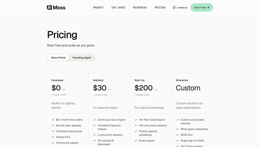
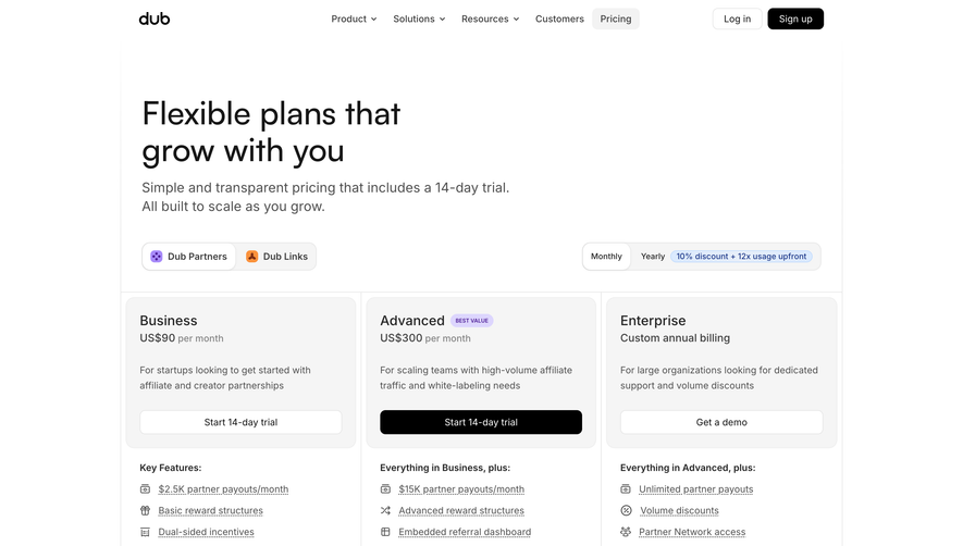
The page uses a crisp one-column layout with intuitive visual hierarchy. The headline and succinct value proposition sit at the top, immediately orienting visitors. Pricing tiers are displayed as distinct, card-like segments with toggle controls (monthly/annual) above, enabling quick comparison without clutter. A sticky “Get Started” CTA follows as you scroll, ensuring conversion paths are always accessible. Below, concise FAQs address common concerns, capped by a streamlined footer.
Visual Elements
Custom icons signal features within each pricing card, executed in clean line art for cohesion. Interactive micro-animations—such as price highlights on toggle—add delight without distraction. There’s virtually no photography or illustration, aligning with the brand’s focus on efficiency and minimalism.
Color Palette and Typography
Linear’s palette is understated: soft whites, matte charcoals, and muted accent hues create visual hierarchy without overpowering the content. The typography is sans-serif, geometric, and neutral (likely Inter), maximizing legibility. Bold, larger headings command attention, while supportive text is tastefully restrained.
User Experience Patterns
Navigation is frictionless, with a persistent header and logical page progression. CTAs are direct and omnipresent, styled for visibility but not intrusion. All forms and toggle controls use generous hit areas for mobile-friendliness—a testament to accessibility-conscious design.
Unique or Notable Design Choices
Standout moments include seamless pricing toggle transitions and ultra-crisp card delineation. The entire experience feels meticulously intentional, balancing aesthetic allure with pure usability. The page’s tone communicates trust, product maturity, and understated innovation—ideal for inspiring SaaS teams seeking to elevate their own design craft.
 SaaSFrame