Design with AI
Generate a new design based on this screen using your own content.
# Design from Reference: Café Onboarding Email
Create an original, high-fidelity visual design inspired by the reference. Prioritize composition, typography, colors, spacing, and component styling over technical implementation.
## Reference
- **Product:** Café
- **Category:** Onboarding Email
- **Screenshot:** https://cdn.prod.website-files.com/5e9dc792e1210c5325f7ebbc/6acb6da2b206c0d3f8f3a663_6acb6b8eddc9482c9278b682_cms-b1b7823519dd0980b691f566.webp
Analyze the screenshot first. If inaccessible, request it rather than guessing.
## Content
{{content.instructions}}
{{content.data}}
Preserve essential messaging and factual accuracy. Adapt structure and copy length for visual balance; never invent product claims.
## Visual Design
### Overall aesthetic
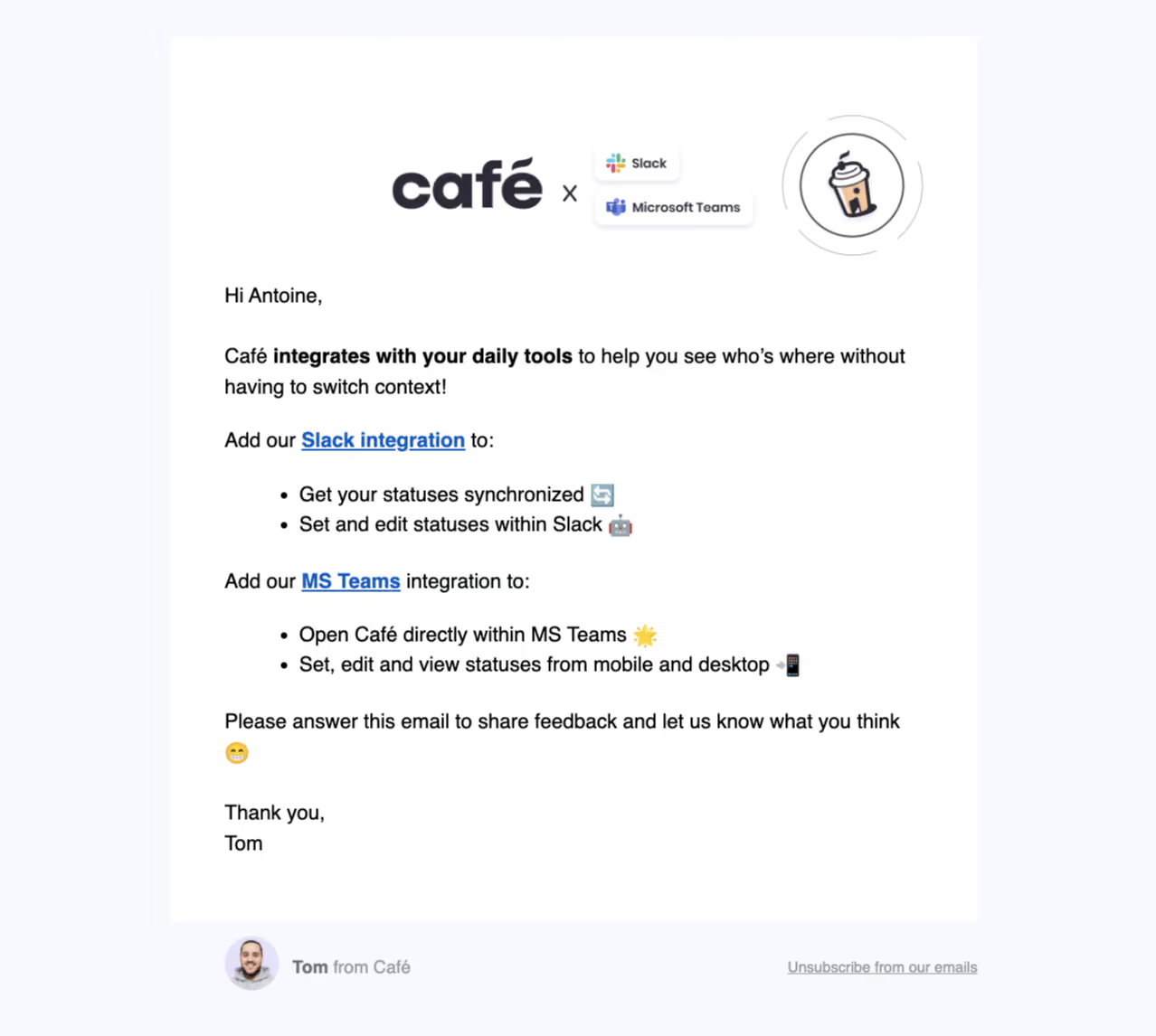
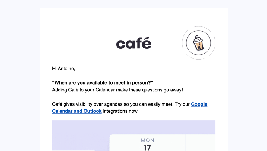
- **Character:** A friendly onboarding email combines a plain white letter panel with a branded integration graphic and occasional emoji.
- **Tone:** Large readable text, blue underlined links and a personal sign-off keep the message informal and practical.
### Page composition
- **Capture:** The source is 1278 × 1146 image pixels. Measurements describe image pixels; email CSS scale and capture zoom are unverified.
- **Sheet:** A roughly 890-pixel-wide white rectangle sits centrally on a very pale lavender-gray background.
- **Header art:** A Café wordmark pairs with Slack/Microsoft Teams badges and a circular coffee-cup illustration.
- **Body:** Greeting and introductory sentence lead to two integration groups, each with a linked name and two bullets.
- **Ending:** A reply invitation and short sign-off close the sheet; sender avatar/name and unsubscribe link sit below on the outer background.
### Information hierarchy
- **Theme:** The header illustration establishes integrations before body copy.
- **Emphasis:** Bold text highlights daily-tool integration; blue underlined service links introduce the two action groups.
- **Personal ending:** Reply invitation and signature are ordinary text, with no large filled CTA.
### Typography
- **Family:** A conventional sans serif is visible; exact identity is unverified.
- **Body:** Approximately 23–24 pixels with 34-pixel leading.
- **Emphasis:** Bold spans and underlined blue links remain body-sized.
- **Footer:** Sender and unsubscribe text are smaller, around 18 pixels, with muted contrast.
### Colors & surfaces
- **Measured base:** White #FFFFFF forms the letter; pale #F8F9FE surrounds it.
- **Measured brand ink:** Dark #2D2936 appears in the header branding; black #000000 contributes body contrast.
- **Measured soft tone:** #FBFCFE appears in near-white graphic details.
- **Accent relationships:** Blue links, multicolor provider marks and emoji supply small color accents.
### Components
- **Header graphic:** Large brand text sits beside two small shadowed provider badges and an outlined coffee illustration.
- **Lists:** Two standard bullet pairs are indented below their integration introductions.
- **Sender row:** A circular portrait aligns with bold first name and lighter affiliation.
- **Unsubscribe:** A simple underlined gray link aligns toward the right below the sheet.
### Visual rhythm
- **Insets:** Approximately 60-pixel body padding aligns paragraphs and sign-off.
- **Spacing:** Broad gaps separate the greeting, integration groups, reply invitation and signature.
- **Balance:** The header graphic is centered while all message copy is left aligned.
### Responsive
- **Observed state:** Only wide email rendering is supplied; mobile behavior is unverified.
- **Recommended sizing:** Use a fluid sheet and proportional header graphic.
- **Recommended text:** Allow bullets and links to wrap naturally, reducing outer gutters before compromising reading size.
### Adaptation guidance
- **Preserve simplicity:** Retain the letter structure and two clearly separated integration groups.
- **Email resilience:** Use client-compatible layout and image alternatives for the header graphic.
- **Content fidelity:** Treat integration statements as captured email content rather than current verified capabilities.
- **Accessibility:** Keep underlines and descriptive service links, and make footer text readable.
Use this context to reproduce the reference's visual language: layout, typography, colors, spacing, borders, radii, and distinctive elements. The screenshot takes priority if descriptions conflict.
## Direction
{{preferences.fidelityInstructions}}
## Output
{{output.instructions}}
Deliver a polished, cohesive design with precise alignment, hierarchy, and spacing. Produce the requested visual artifact, not just a description. If unsupported, explain the limitation.