Design with AI
Generate a new design based on this screen using your own content.
# Design from Reference: Appcues Onboarding Emails
Create an original, high-fidelity visual design inspired by the reference. Prioritize composition, typography, colors, spacing, and component styling over technical implementation.
## Reference
- **Product:** Appcues
- **Category:** Onboarding Email
- **Screenshot:** https://cdn.prod.website-files.com/5e9dc792e1210c5325f7ebbc/6acbc0767ce271b12870b701_6acbbfcb39e7f22db402ccf4_cms-f4c7f1d32650c5ac2520ae2d.webp
Analyze the screenshot first. If inaccessible, request it rather than guessing.
## Content
{{content.instructions}}
{{content.data}}
Preserve essential messaging and factual accuracy. Adapt structure and copy length for visual balance; never invent product claims.
## Visual Design
### Overall aesthetic
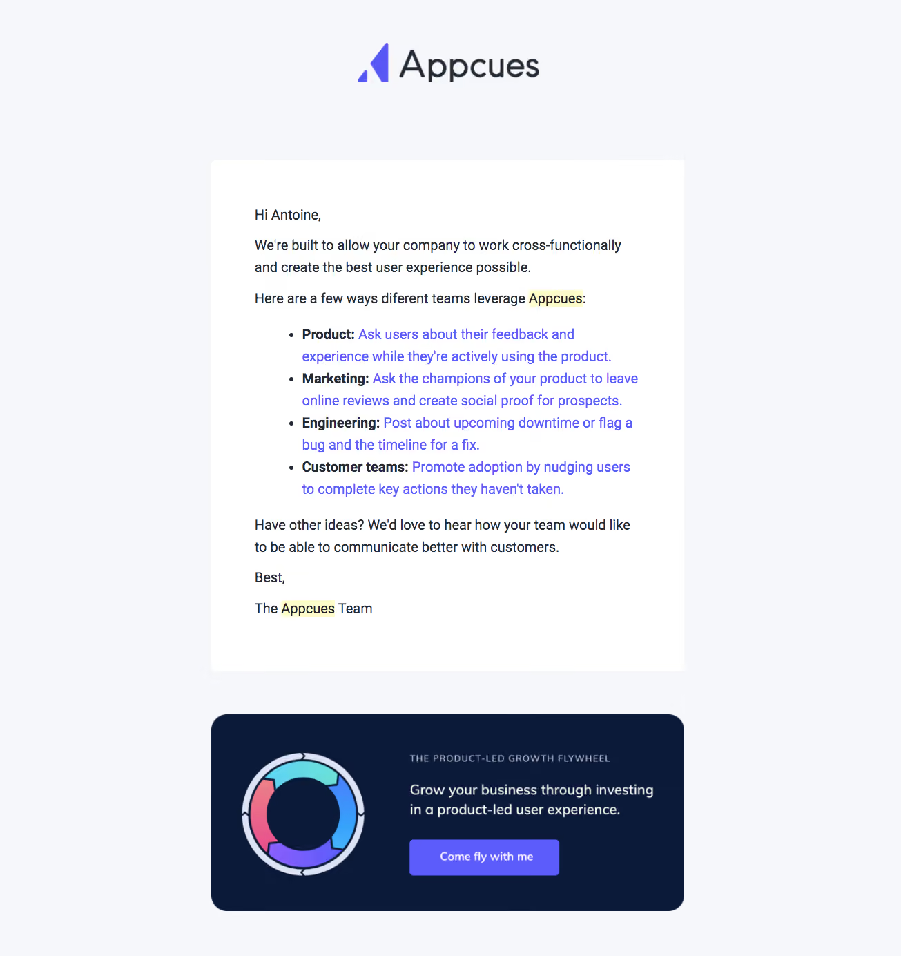
- **Character:** Branded onboarding email with a pale-gray background, white message card and dark-navy educational promotion.
- **Visual emphasis:** A large centered wordmark leads; purple links/button and a colorful circular flywheel illustration provide accents.
- **Capture:** The image measures 1305 × 1384 px. Dimensions below are image estimates; email-client/CSS scale is unverified.
### Page composition
- **Header:** Centered Appcues logo sits high above the content with broad surrounding space.
- **Message card:** A roughly 685 px-wide white rounded rectangle contains a salutation, introduction, four-item team-use list, closing invitation and sign-off.
- **Promotion:** A separate navy rounded panel below pairs a circular diagram left with eyebrow, short copy and purple action right.
- **Background:** The pale-gray canvas remains visible around both blocks; no legal/footer navigation is visible.
### Information hierarchy
- **Message:** Conversational text explains cross-functional uses before a bulleted list.
- **Team list:** Each item begins with a bold dark team label followed by a purple linked example.
- **Closing:** A short question invites further ideas, then a team signature ends the white card.
- **Secondary action:** The lower promotion offers an educational growth resource through a filled purple button.
- **Capture detail:** Pale-yellow highlights appear behind two brand-name occurrences in the prose; their origin cannot be established.
### Typography
- **Family:** Conventional sans-serif; exact identity is unverified.
- **Body:** Approximately 20–21 image px with 31–32 px leading.
- **List:** Body-sized linked text wraps across multiple lines; bold team labels provide scanning anchors.
- **Promotion:** A small uppercase tracked eyebrow precedes roughly 21–22 px light text; button caption is about 17 px.
- **Wordmark:** Large graphic lettering is distinct from the email's body type.
### Colors & surfaces
- **Measured base:** ICC-aware sRGB sampling yields #F5F7FA for the canvas and #FFFFFF for the message card.
- **Measured dark:** #0B1A38 is the promotional background; #242A35 appears in dark text.
- **Measured accent:** #5C5BFC occurs in purple brand/link/action treatment.
- **Measured secondary:** #DCE3F4 appears in diagram details; pale yellow #FFFCCC occurs in text highlights.
- **Depth:** Blocks use flat fills and rounded corners, with no strong shadow.
### Components
- **Message card:** Approximately 685 × 740 image px with 60 px-like padding and small rounded corners.
- **Bullets:** Four standard dots introduce role-specific examples with bold labels and purple linked continuations.
- **Flywheel graphic:** A thick circular segmented arrow diagram uses cyan, blue, purple and coral around a navy center.
- **Promo panel:** Approximately 685 × 285 px with larger roughly 22 px corners and a two-column layout.
- **Button:** A purple rounded rectangle approximately 215 × 52 px contains centered white text.
- **State:** No email-link activation or application action is demonstrated.
### Visual rhythm
- **Header spacing:** A large gap separates logo from the message card.
- **Card cadence:** Paragraphs and list maintain a steady text rhythm, with larger gaps around greeting and sign-off.
- **Block separation:** Around 60 px separates the white message and navy promotion.
- **Alignment:** Main prose shares a left axis; promotion text aligns separately beside the centered diagram.
### Responsive
- **Evidence limit:** Only one email rendering is available; recommendations follow.
- **Cards:** Use fluid widths and reduced mobile padding.
- **Promotion:** Stack diagram above text/button when two columns become cramped.
- **Text:** Keep role labels and linked examples readable, with natural wrapping and adequate link spacing.
### Adaptation guidance
- **Reusable pattern:** Explain cross-functional value with four concrete role examples, then offer a related educational resource.
- **Hierarchy:** Keep the conversational message primary and visually separate the secondary promotion.
- **Accessibility:** Use semantic lists, descriptive links and an alternative for the flywheel diagram.
- **Capture truth:** Do not assume the yellow text highlights are intentional brand styling without verification.
Use this context to reproduce the reference's visual language: layout, typography, colors, spacing, borders, radii, and distinctive elements. The screenshot takes priority if descriptions conflict.
## Direction
{{preferences.fidelityInstructions}}
## Output
{{output.instructions}}
Deliver a polished, cohesive design with precise alignment, hierarchy, and spacing. Produce the requested visual artifact, not just a description. If unsupported, explain the limitation.