Overall Style and Aesthetic
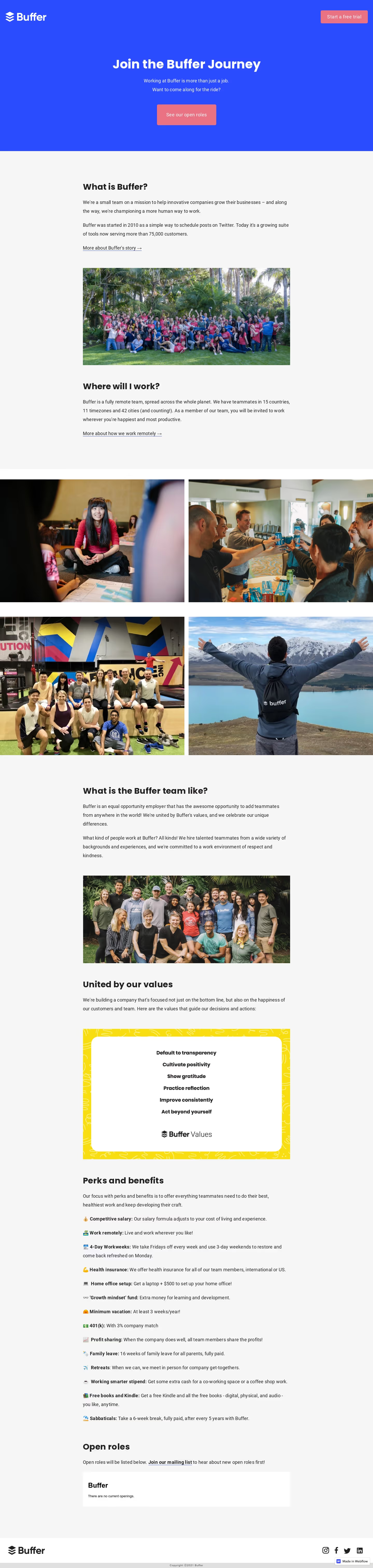
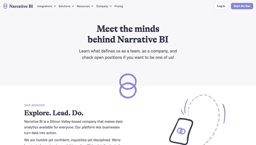
Journey by Buffer embraces a clean, modern aesthetic that skillfully combines a minimalist approach with playful, friendly touches. White space dominates, allowing content and visuals to breathe, while subtle pops of vibrant, brand-aligned colors inject personality. The site feels open, approachable, and thoughtfully curated—exuding both professionalism and warmth. Layout and Structure
The site’s layout is structured yet inviting. A spacious hero section with expressive typography and concise messaging immediately captures attention. Scrolling reveals well-defined content blocks: social proof, content highlights, and resource spotlights replace traditional feature or pricing sections. There’s a strong editorial bent, with stories and testimonials interwoven throughout, emphasizing authenticity and connection. Visual Elements
Custom vector illustrations and playful iconography drive the visual experience, enhancing comprehension and adding whimsy without distraction. Subtle animation effects—like hover states and gentle transitions—guide interaction organically. The imagery feels bespoke and on-brand, supporting Buffer’s unique voice and mission. Color Palette and Typography
The palette balances crisp whites and off-whites with accent colors like teal, coral, and soft violet—creating focus and facilitating a clear visual hierarchy. Typography is bold yet friendly: prominent headlines in a distinctive sans-serif font, paired with clean, readable body text. Strategic use of weight and size creates hierarchy and rhythm, supporting effortless scanning. User Experience Patterns
Navigation is streamlined to core journeys, with a sticky, minimalist header that recedes as you scroll. Thoughtfully placed calls to action emerge throughout: “Start Reading” and “Subscribe” buttons are visually distinct, driving engagement without overwhelm. Scroll interactions are silky-smooth, maintaining user flow and encouraging deep exploration. Unique or Notable Design Choices
Noteworthy is the editorial storytelling approach—visitor attention is guided through personal stories rather than traditional product features, building emotional resonance. Subtle microinteractions and a cohesive illustration system elevate user delight. Overall, the tone is inclusive, transparent, and purpose-driven—making Journey by Buffer an inspiring example for SaaS web design that connects on both functional and emotional levels.