
Thank you! Your submission has been received!
Oops! Something went wrong while submitting the form.
Get SaaSFrame Pro
Monthly
$18
Quarterly
$48
Yearly
$180
Upgrade to access this feature
Browse all screens & flows
Filter and search screens & flows
Access Figma files
Access mobile versions
Bookmark screens & flows
Join now
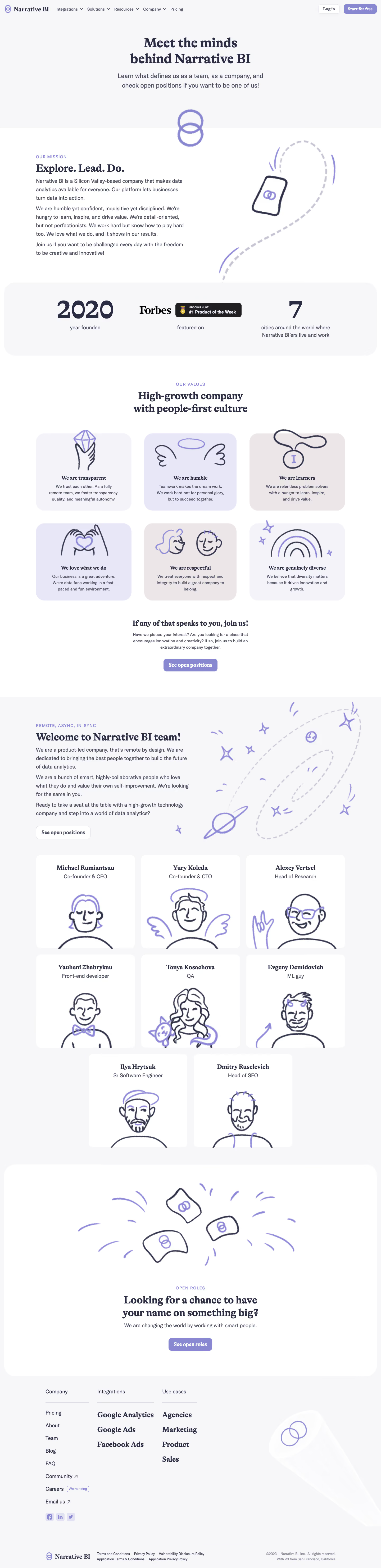

Narrative BI Team Page

Narrative BI
Actionable Analytics for Growth teams
Designed by


Bookmark
Bookmark

Design with AI
Thank you! Your submission has been received!
Oops! Something went wrong while submitting the form.
# Design from Reference: Narrative BI Team Page
Create an original, high-fidelity visual design inspired by the reference. Prioritize composition, typography, colors, spacing, and component styling over technical implementation.
## Reference
- **Product:** Narrative BI
- **Category:** Careers Page
- **Screenshot:** https://cdn.prod.website-files.com/5e9dc792e1210c5325f7ebbc/6acbbecd39e7f22db4028a16_6acbbe14d6be908889c51c21_cms-60141573b48fd94b5012d655.webp
Analyze the screenshot first. If inaccessible, request it rather than guessing.
## Content
{{content.instructions}}
{{content.data}}
Preserve essential messaging and factual accuracy. Adapt structure and copy length for visual balance; never invent product claims.
## Visual Design
### Overall aesthetic
- **Character:** Soft editorial team page combining bold serif headings, lavender surfaces and playful hand-drawn portraits/illustrations.
- **Evidence and scale:** Screenshot measures 1440 × 5927 image pixels. Sizes estimate 1× CSS capture; actual DPR and font identities are unverified. All sections through the footer were inspected.
### Page composition
- **Header/hero:** Brand/navigation and account actions sit above centered two-line team heading and supporting copy on pale lavender ground.
- **Mission/proof:** Split mission text and sketched path/phone illustration lead to a broad rounded statistics/recognition band.
- **Values:** Centered introduction precedes six illustrated cards in a three-column, two-row grid, then a recruitment action.
- **Team:** Pale section introduces remote work with orbit artwork and eight white portrait cards in three rows, final two centered.
- **Open roles/footer:** Large rounded white recruitment panel contains flag artwork, headline and action. Footer has three link groups, large decorative brand beam and lower legal/brand row.
### Information hierarchy
- **Display:** Heavy serif hero/section headings establish an editorial voice.
- **Supporting copy:** Sans-serif paragraphs and uppercase lavender eyebrows provide a quieter explanatory layer.
- **Cards:** Value titles and member names use serif emphasis; roles/body remain sans-serif.
- **Recruitment:** Repeated open-position actions create a clear route after values and team evidence.
### Typography
- **Hero:** Approximately 50–52px CSS bold serif with compact leading.
- **Section headings:** Around 38–42px serif; card names/titles around 22–24px bold serif.
- **Body:** Approximately 18–20px sans-serif with 30px leading in narrative sections; cards around 15–16px with 23px leading.
- **Utilities:** Navigation around 15px, eyebrows around 14px uppercase tracked. Exact serif/sans families are unverified.
### Colors & surfaces
- **Measured foundation:** White #FFFFFF and pale lavender #F7F6F9 dominate.
- **Measured card shades:** #F3F2F8, #ECE6E9 and #E7E7F6 distinguish value surfaces.
- **Measured foreground:** Dark navy-gray #2A2C44 and muted #4A4C61 support headings/body.
- **Accent:** Muted lavender outlines, doodles and buttons remain low saturation; imagery adds almost no strong color.
### Components
- **Actions:** Lavender filled or white outlined rounded rectangles around 48px high, bold serif labels and 12px radii.
- **Proof band:** Broad pale rounded container with large year/city numbers and recognition logos across three columns.
- **Value cards:** Approximately 360 × 290px CSS, large 32px radii, oversized line-art symbols above centered title/body.
- **Team cards:** White rounded cards around 375 × 350px, centered name/role and large sketched character portrait cropped at bottom.
- **Open-role panel:** Nearly full-width white rounded shell with generous padding and a centered flag/doodle illustration.
- **Footer:** Three grouped columns with thin heading rules; mixed serif/sans links and small social squares; large pale brand-shaped beam on the right.
### Visual rhythm
- **Container:** Most narrative content spans roughly 1170px centered, with side gutters near 135px.
- **Grid spacing:** Approximately 24–48px gaps between value/team cards.
- **Section cadence:** Broad 80–120px breaks distinguish mission, values, team and recruitment.
- **Illustration continuity:** Looped brand mark, dashed paths, orbit/stars, flags and portraits share a loose pencil-like stroke.
### Responsive
- **Observed limit:** Desktop only; menus, hiring links and mobile behavior are unobserved.
- **Recommended grids:** Reduce value/team columns progressively, retaining portrait and title scale.
- **Recommended narrative:** Stack split sections and simplify large decorative paths/beam.
- **Recommended type/footer:** Scale serif headings fluidly and collapse footer groups without shrinking links.
### Adaptation guidance
- **Preserve personality:** Use a consistent hand-drawn illustration language and soft lavender palette alongside editorial serif emphasis.
- **Build employer story:** Move from mission/proof to values, people and open roles.
- **Implementation:** Provide semantic headings, image alternatives, focus and readable contrast. Team names/roles, recognition and company statistics are captured historical content requiring separate verification before reuse.
Use this context to reproduce the reference's visual language: layout, typography, colors, spacing, borders, radii, and distinctive elements. The screenshot takes priority if descriptions conflict.
## Direction
{{preferences.fidelityInstructions}}
## Output
{{output.instructions}}
Deliver a polished, cohesive design with precise alignment, hierarchy, and spacing. Produce the requested visual artifact, not just a description. If unsupported, explain the limitation.


Category
Patterns
No items found.


Added on
February 4, 2023
Similar screens
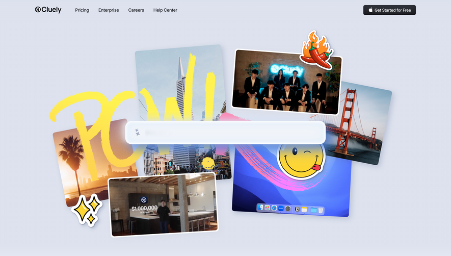


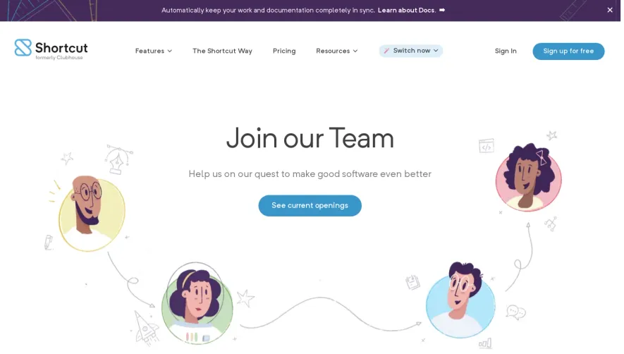

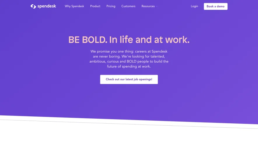

Upgrade to SaaSFrame Pro now to see similar examples.
Monthly
$18 /month
Billed $18 monthly
Browse all screens & flows
Filter and search screens & flows
Search text in screenshots
Access Figma files
Access mobile versions
Join now
Quarterly
$16 /month
Billed $48 quarterly
Browse all screens & flows
Filter and search screens & flows
Search text in screenshots
Access Figma files
Access mobile versions
Join now
Yearly
$15 /month
Billed $180 yearly
Browse all screens & flows
Filter and search screens & flows
Search text in screenshots
Access Figma files
Access mobile versions
Join now