Design with AI
Generate a new design based on this screen using your own content.
# Design from Reference: Blobr Add API Source
Create an original, high-fidelity visual design inspired by the reference. Prioritize composition, typography, colors, spacing, and component styling over technical implementation.
## Reference
- **Product:** Blobr
- **Category:** Add & Edit
- **Screenshot:** https://cdn.prod.website-files.com/5e9dc792e1210c5325f7ebbc/6acb6d9eb206c0d3f8f3a573_6acb6b8910423f7ec1f5e12d_cms-167f2da8aba85a73b0bb07b7.webp
Analyze the screenshot first. If inaccessible, request it rather than guessing.
## Content
{{content.instructions}}
{{content.data}}
Preserve essential messaging and factual accuracy. Adapt structure and copy length for visual balance; never invent product claims.
## Visual Design
### Overall aesthetic
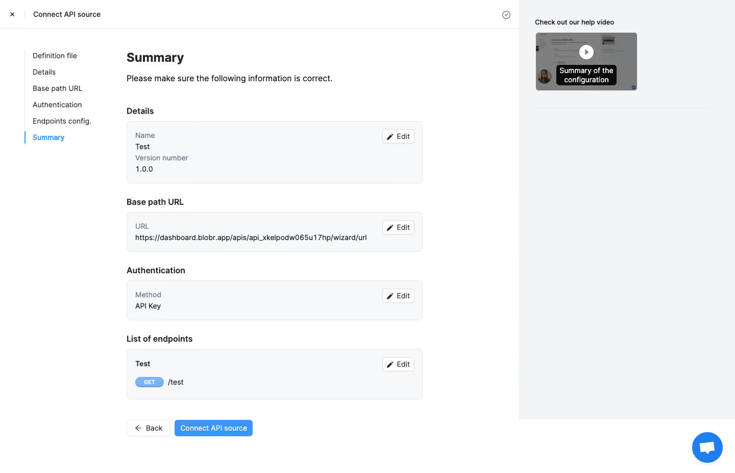
- **Character:** Practical API-connection review with editable summaries and contextual help.
### Page composition
- **Canvas:** 1440 × 926 screenshot px. Header, six-step left rail, central Summary, and pale right help-video column.
### Information hierarchy
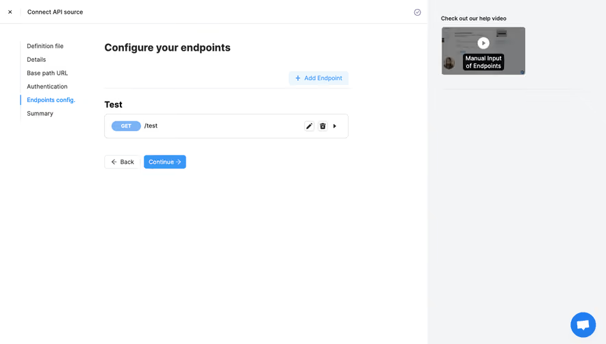
- **Priority:** Summary is active; details, base URL, authentication, and endpoints appear as separate review cards before Back/Connect API source.
### Typography
- **Scale:** Approximate screenshot heading 26 px bold, body 16 px, labels 14 px. Sans serif family/CSS scale unverified.
### Colors & surfaces
- **Palette:** Sampled sRGB #FFFFFF, sidebar #F3F4F5, cards #F7F8FA, borders #E4E7EB, gray #7F7F7F, dark #0A0A0A. Blue identifies active step and connection action.
### Components
- **Details:** Cards use 8 px corners, thin borders, compact pencil Edit buttons, blue GET badge, and short endpoint path; help video has play overlay.
### Visual rhythm
- **Spacing:** Central column about 580 screenshot px wide with 24–30 px section intervals and 16 px card padding.
### Responsive
- **Adaptation:** Mobile is not shown. Collapse step rail and place help below the summary.
### Adaptation guidance
- **Transfer:** Preserve review-before-connect and per-section editing. Use actual configuration and avoid exposing credentials.
Use this context to reproduce the reference's visual language: layout, typography, colors, spacing, borders, radii, and distinctive elements. The screenshot takes priority if descriptions conflict.
## Direction
{{preferences.fidelityInstructions}}
## Output
{{output.instructions}}
Deliver a polished, cohesive design with precise alignment, hierarchy, and spacing. Produce the requested visual artifact, not just a description. If unsupported, explain the limitation.