Design with AI
Generate a new design based on this screen using your own content.
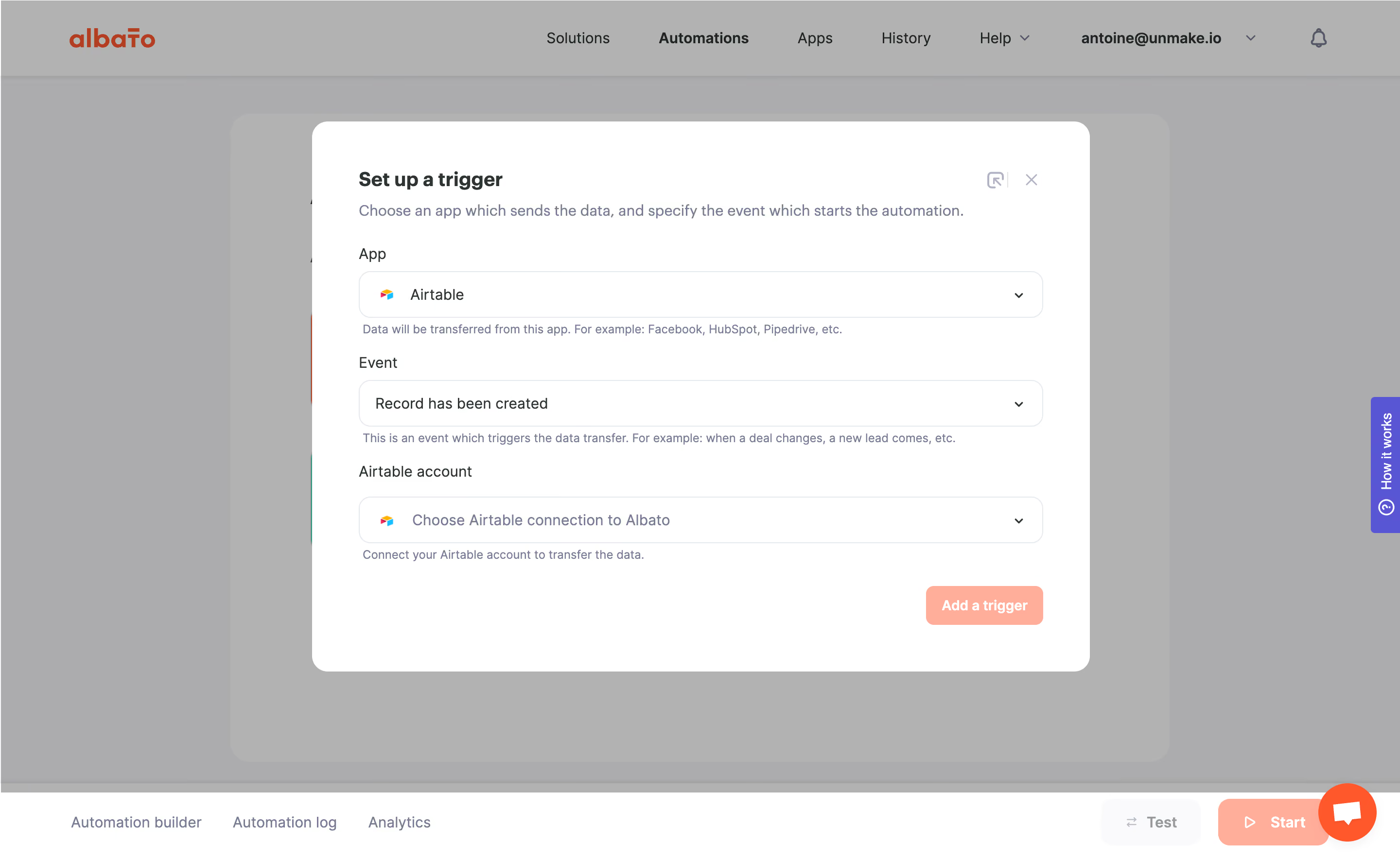
# Design from Reference: Albato Setup Trigger
Create an original, high-fidelity visual design inspired by the reference. Prioritize composition, typography, colors, spacing, and component styling over technical implementation.
## Reference
- **Product:** Albato
- **Category:** Add & Edit
- **Screenshot:** https://cdn.prod.website-files.com/5e9dc792e1210c5325f7ebbc/6acada62a43009b06fe6f283_6acad9f79918fda16bb1f5e0_cms-42c406a91a2d1650a755b635.webp
Analyze the screenshot first. If inaccessible, request it rather than guessing.
## Content
{{content.instructions}}
{{content.data}}
Preserve essential messaging and factual accuracy. Adapt structure and copy length for visual balance; never invent product claims.
## Visual Design
### Overall aesthetic
- **Style:** Quiet automation-builder interface with a white configuration dialog over a gray dimmed workspace; coral actions and muted blue-gray supporting copy.
- **Capture scale:** The source is 2880 × 1772 pixels. Dimensions below estimate a 1440-pixel-wide CSS viewport at 2× capture scale.
### Page composition
- **Application shell:** A roughly 78px top navigation contains the orange Albato wordmark, central navigation, account menu and notification icon; Automations is emphasized.
- **Dialog:** Centered approximately 800 × 565px panel, around 320px from the left and 125px from the top at the estimated CSS scale; about 48px internal horizontal padding.
- **Persistent edges:** The dimmed builder sits behind the dialog. A white bottom toolbar contains builder/log/analytics links and Test/Start actions; a vertical purple help tab and orange chat bubble remain on the right.
### Information hierarchy
- **Primary sequence:** Bold Set up a trigger heading, one explanatory sentence, then App, Event and Airtable account fields in a single column.
- **Supporting text:** Each field has a short muted helper line immediately below it. The bottom-right Add a trigger button completes the sequence.
- **Overlay priority:** A solid white dialog contrasts with the uniform gray scrim; small utility and close icons share the upper-right corner.
### Typography
- **Family:** Rounded, humanist sans-serif appearance; exact font identity is unverified.
- **Roles:** Estimated heading 20px/26px at 700; subtitle and field values 16px/22px; labels 16px regular; helper text about 13px/18px.
- **Actions:** The coral button uses approximately 14px bold white text. Navigation is around 16px, with the current section bold.
### Colors & surfaces
- **Sampled palette:** ICC-aware sRGB image samples include white #FFFFFF, coral #FFA995, muted blue-gray #747E91, near-white #FAFAFB and pale borders #E4E8EC.
- **Overlay:** Large sampled gray regions #ACACAD and #B2B2B2 belong to the dimmed background; they should not be treated as the undimmed application's base colors.
- **Contrast:** Dark charcoal labels anchor the white form; the strongest warm accent is reserved for the primary action.
### Components
- **Select fields:** Three wide, approximately 704 × 48px controls with 12px corners, 1px pale outlines and right-aligned chevrons. App and account controls include small multicolor Airtable icons.
- **Selected and empty values:** App shows Airtable, Event shows Record has been created, and account displays a muted connection prompt; no dropdown menu is open.
- **Primary button:** Approximately 120 × 40px coral rectangle with 8px corners, aligned to the form's right edge and separated from the final helper by about 24px.
- **Dialog treatment:** Approximately 16px outer corners, generous bottom padding and no conspicuous heavy shadow in the visible capture.
### Visual rhythm
- **Form spacing:** Labels sit about 8px above controls; helper lines sit about 6px below. Field groups repeat on an approximately 112px vertical cadence.
- **Alignment:** Heading, introduction, labels and controls share one left edge; the final action terminates the same column on the right.
### Responsive
- **Recommended adaptation:** The screenshot shows desktop only. Reduce the modal to viewport width minus 32px, retain one-column fields, allow the explanation and helper text to wrap, and keep the close control reachable.
- **Viewport management:** Use a scrollable dialog at short heights; avoid allowing fixed builder actions or help tabs to obscure the form.
### Adaptation guidance
- **Preserve:** Keep the three-step selection hierarchy, app icon within relevant controls, immediate helper text and isolated coral completion action.
- **Replace:** Substitute integration names, events and connection guidance with actual product data. Maintain the visible distinction between selected values and the unfinished account prompt.
Use this context to reproduce the reference's visual language: layout, typography, colors, spacing, borders, radii, and distinctive elements. The screenshot takes priority if descriptions conflict.
## Direction
{{preferences.fidelityInstructions}}
## Output
{{output.instructions}}
Deliver a polished, cohesive design with precise alignment, hierarchy, and spacing. Produce the requested visual artifact, not just a description. If unsupported, explain the limitation.