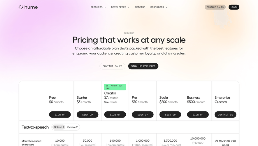
Overall Style and Aesthetic
Better Uptime’s pricing page leans into a modern, minimalist aesthetic, stripping away superfluous elements for sharp clarity. Crisp whitespace envelopes the content, letting pricing boxes and interactive elements stand out. The visual tone strikes a perfect balance between professional and approachable—inviting for first-time visitors while reinforcing trust for B2B audiences. Layout and Structure
The structure is highly intuitive, placing the pricing table front-and-center, eliminating friction in exploring plans. A sticky top navigation ensures users can revisit other resources without losing their spot. Plan cards are horizontally aligned, improving desktop scannability, while a highlighted “Most popular” badge subtly guides decision-making. Subtle but effective toggles for monthly/yearly billing provide seamless comparison. Visual Elements
Delicate, flat icons accompany each feature in the pricing tables, enhancing quick comprehension. Custom illustrations and micro-animations enliven what could otherwise be a utilitarian page. Responsive interactions—like hover states and animated plan highlights—add a sense of delight and polish. No overwhelming stock photos: instead, visuals clarify and support. Color Palette and Typography
A refined color palette of blues, teals, and purples forms the backbone, conveying dependability and energy. Plan highlight backgrounds use subtle gradients for depth. Typography is clean and sans-serif (Inter, in this case); font weights and sizes clearly distinguish between headings, pricing, and body text, aiding fast skimming. User Experience Patterns
Navigation is frictionless: sticky headers, clear “Start free trial” CTAs, smooth scroll transitions, and a persistent chat support widget. Pricing tables collapse beautifully on mobile, and subtle tooltips offer extra context without crowding the page. Sticky action buttons ensure the primary CTA is always accessible. Unique or Notable Design Choices
Standout details include the animated comparison highlights, the transparent “No credit card required” reassurance, and slick accessibility touches (contrast, focus states, readable type). The page’s overall tone feels both innovative and trustworthy—projecting confidence without arrogance. Every design decision drives clarity and conversion, making this a benchmark example for SaaS pricing pages.