Design with AI
Generate a new design based on this screen using your own content.
# Design from Reference: Bento Account Setup
Create an original, high-fidelity visual design inspired by the reference. Prioritize composition, typography, colors, spacing, and component styling over technical implementation.
## Reference
- **Product:** Bento
- **Category:** Account Setup
- **Screenshot:** https://cdn.prod.website-files.com/5e9dc792e1210c5325f7ebbc/6acb7266b10d21a746c47b14_6acb6efd3ceaa499b875ef55_cms-795396f83dc9d90e1aa72d8e.webp
Analyze the screenshot first. If inaccessible, request it rather than guessing.
## Content
{{content.instructions}}
{{content.data}}
Preserve essential messaging and factual accuracy. Adapt structure and copy length for visual balance; never invent product claims.
## Visual Design
### Overall aesthetic
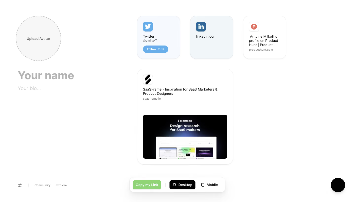
- **Character:** Minimal personal-link canvas with soft rounded tiles, large profile placeholders and a floating editor toolbar.
### Page composition
- **Canvas:** 1440 × 821 screenshot px.
- **Structure:** Profile avatar/name/bio column left; small three-tile social row and larger website card to its right. Bottom editor controls and a black circular add button float above the otherwise empty white canvas.
### Information hierarchy
- **Priority:** Profile identity establishes the page; link tiles use recognizable service icons and small metadata. Copy my Link is emphasized within the bottom toolbar.
### Typography
- **Family:** Modern sans serif, exact font unverified.
- **Scale:** Estimated screenshot name placeholder 44 px bold, bio 20 px, tile text 14–16 px and editor controls 14 px.
### Colors & surfaces
- **Sampled palette:** White #FFFFFF; pale-gray #F7F7F7; cool tile fills #F1F6F9/#F6FAFE; black #000000.
- **Accents:** Blue social branding, green copy action and muted gray placeholders.
### Components
- **Tiles:** Approximately 24–28 screenshot px corner radii, fine gray borders and subtle shadows; social cards approximately 174 px square.
- **Profile:** Large dashed circular avatar-upload placeholder; oversized editable name and smaller bio placeholders.
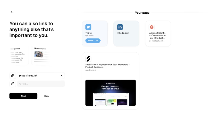
- **Toolbar:** Rounded white floating capsule with green copy button, black selected Desktop toggle and Mobile alternative; larger website tile includes logo, description and preview image.
### Visual rhythm
- **Spacing:** Approximately 40 screenshot px tile gaps; wide blank margins reinforce a canvas-like editing experience.
### Responsive
- **Observed:** Desktop editor with a Mobile toggle visible; actual mobile layout not shown.
- **Adaptation:** Stack identity and tiles, keep editing controls reachable and let link cards reflow without shrinking text.
### Adaptation guidance
- **Preserve:** Rounded modular link tiles, spacious profile identity and lightweight floating controls.
- **Replace:** Use authorized profile details, genuine links and current website previews.
Use this context to reproduce the reference's visual language: layout, typography, colors, spacing, borders, radii, and distinctive elements. The screenshot takes priority if descriptions conflict.
## Direction
{{preferences.fidelityInstructions}}
## Output
{{output.instructions}}
Deliver a polished, cohesive design with precise alignment, hierarchy, and spacing. Produce the requested visual artifact, not just a description. If unsupported, explain the limitation.