Overall Style and Aesthetic
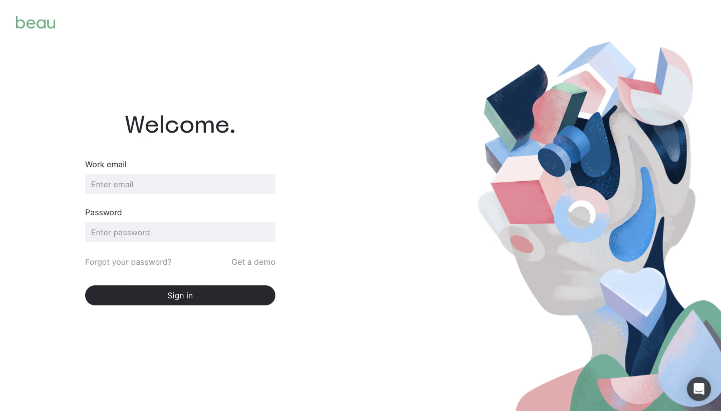
The Beau to login page embodies a polished minimalist aesthetic, blending modern professionalism with inviting visual warmth. The design uses generous white space to create a breathable, distraction-free environment. Subtle gradients and soft shadows add a layer of sophistication without sacrificing clarity or simplicity, encouraging user trust and approachability. Layout and Structure
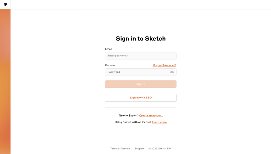
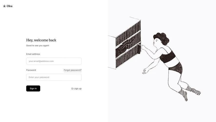
The page features a split-screen layout: the left panel draws attention with an abstract illustration and concise value proposition, while the right presents the login form. Opting for a clear focal hierarchy, all primary actions—entering credentials, accessing forgotten passwords, or creating an account—are immediately visible, streamlining the user journey. The fixed footer carries subtle links and legal info, anchoring the layout without drawing attention away from the main content. Visual Elements
Delicate, on-brand illustrations lend character to the page, steering away from sterile SaaS clichés. The artwork integrates the brand color palette, creating harmony between visuals and interface elements. Rounded button edges and minimal iconography further the approachable, user-centric feel. No unnecessary pop-ups, carousels, or complex animations disturb the user’s focus: every detail feels purposeful. Color Palette and Typography
The palette pairs a crisp white background with calming shades of indigo, deep blue, and vibrant accent hues, guiding attention to calls-to-action and important links. Clean, sans-serif typography ensures maximal legibility; thoughtful use of font weights and sizes leads the user’s eye naturally from headings to inputs, boosting overall readability. User Experience Patterns
Navigation is intuitive and uncluttered, relying on a single, easily accessible login form and concise secondary CTAs. The form is intentionally compact, with large, tappable inputs and clear labels—streamlining completion across devices. The interface’s feedback cues (e.g., active input highlights, gentle error messaging) reinforce clarity and reduce friction. Unique or Notable Design Choices
A standout feature is the illustration-to-form juxtaposition, balancing brand storytelling with functional clarity. The page avoids clichéd hero banners or testimonials, ensuring absolute focus on user action. The overall tone is quietly confident—communicating innovation without hype, and making visitors feel immediately supported and valued.