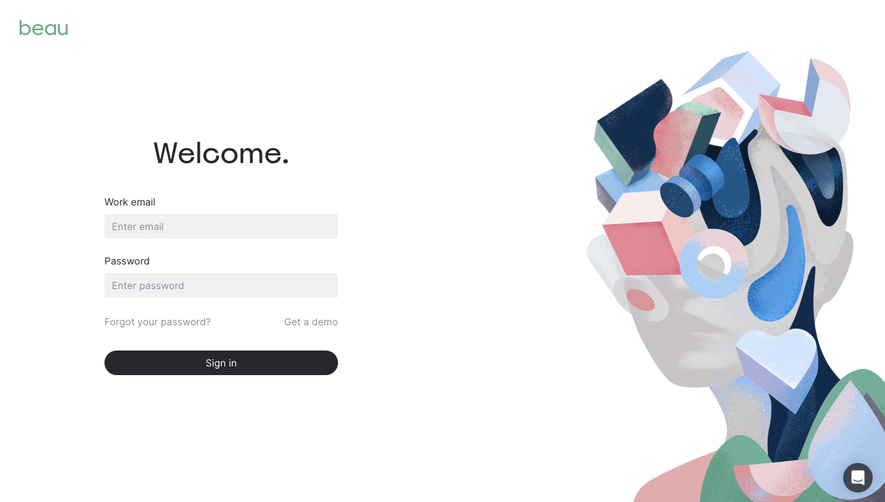
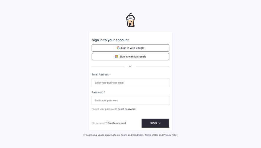
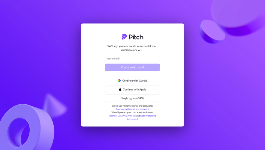
Generate a new design based on this screen using your own content.
Thank you! Your submission has been received!
Oops! Something went wrong while submitting the form.
# Design from Reference: Sketch Login
Create an original, high-fidelity visual design inspired by the reference. Prioritize composition, typography, colors, spacing, and component styling over technical implementation.
## Reference
- **Product:** Sketch
- **Category:** Login
- **Screenshot:** https://cdn.prod.website-files.com/5e9dc792e1210c5325f7ebbc/6acb6df10e8221f130836683_6acb6bdfb5df5d2dd4cf9907_cms-e1a4cf91466c67af5c7e449a.webp
Analyze the screenshot first. If inaccessible, request it rather than guessing.
## Content
{{content.instructions}}
{{content.data}}
Preserve essential messaging and factual accuracy. Adapt structure and copy length for visual balance; never invent product claims.
## Visual Design
Use this context to reproduce the reference's visual language: layout, typography, colors, spacing, borders, radii, and distinctive elements. The screenshot takes priority if descriptions conflict.
## Direction
{{preferences.fidelityInstructions}}
## Output
{{output.instructions}}
Deliver a polished, cohesive design with precise alignment, hierarchy, and spacing. Produce the requested visual artifact, not just a description. If unsupported, explain the limitation.
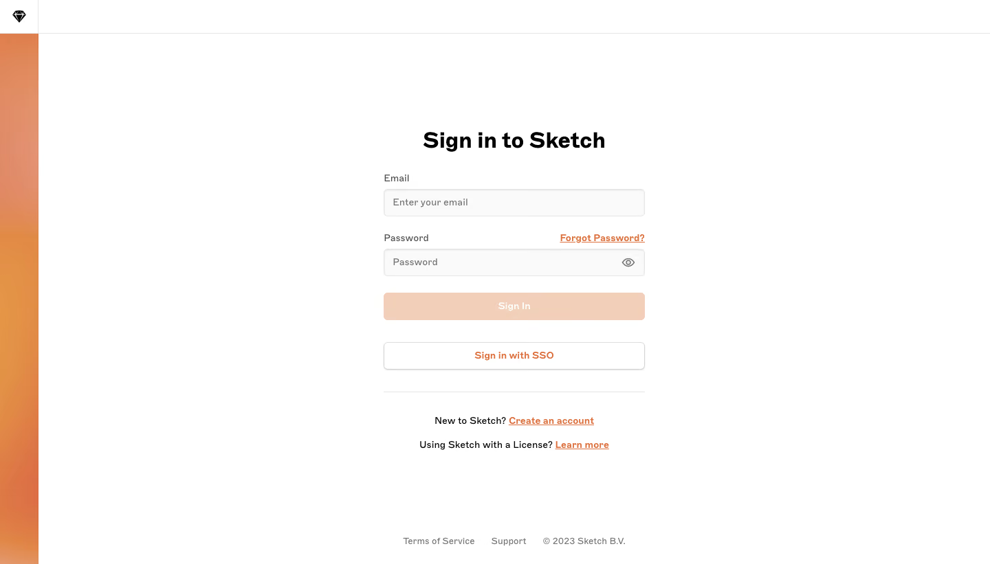
Sketch’s sign-in page embodies minimalist modernism, with an emphasis on clarity and elegance. There’s an evident focus on simplicity—ample negative space, soft edges, and a restrained visual hierarchy work together to evoke professionalism and calm. This page instantly signals trustworthiness and efficiency, catering to a design-savvy SaaS audience.
Layout and Structure
The layout is exceptionally streamlined: a single-column form is vertically and horizontally centered, with all extraneous elements removed. There’s no hero image, no marketing messages, and no unnecessary footers—just the essentials for a frictionless experience. Subtle links for “Create an account” and password reset reside under the form, ensuring users can easily navigate alternative flows.
Visual Elements
Branding remains subtle but unmistakable: the Sketch logo is prominent yet unobtrusive, reinforcing identity without competing for attention. Delicate input borders and gentle hover states offer visual feedback. Icon usage is minimal, keeping the experience laser-focused on the task.
Color Palette and Typography
A clean white background dominates, punctuated by Sketch’s signature gold accent for the primary action button—an immediate visual cue drawing the eye. Neutral grays are used for text and form outlines, promoting readability and a modern interface. Typography is crisp and sans-serif, with bold stylings for headings and primary actions, ensuring a clear visual hierarchy.
User Experience Patterns and Unique Touches
Form accessibility is prioritized: large input fields, clear labels, and error feedback enhance usability. The single, bright call-to-action reduces cognitive load. With its focused approach and polished restraint, the page demonstrates that sophisticated UX often means removing the unnecessary, making every interaction count. This page stands as a masterclass in how minimalist design delivers both elegance and seamless usability for SaaS.