
Thank you! Your submission has been received!
Oops! Something went wrong while submitting the form.
Get SaaSFrame Pro
Monthly
$18
Quarterly
$48
Yearly
$180
Upgrade to access this feature
Browse all screens & flows
Filter and search screens & flows
Access Figma files
Access mobile versions
Bookmark screens & flows
Join now
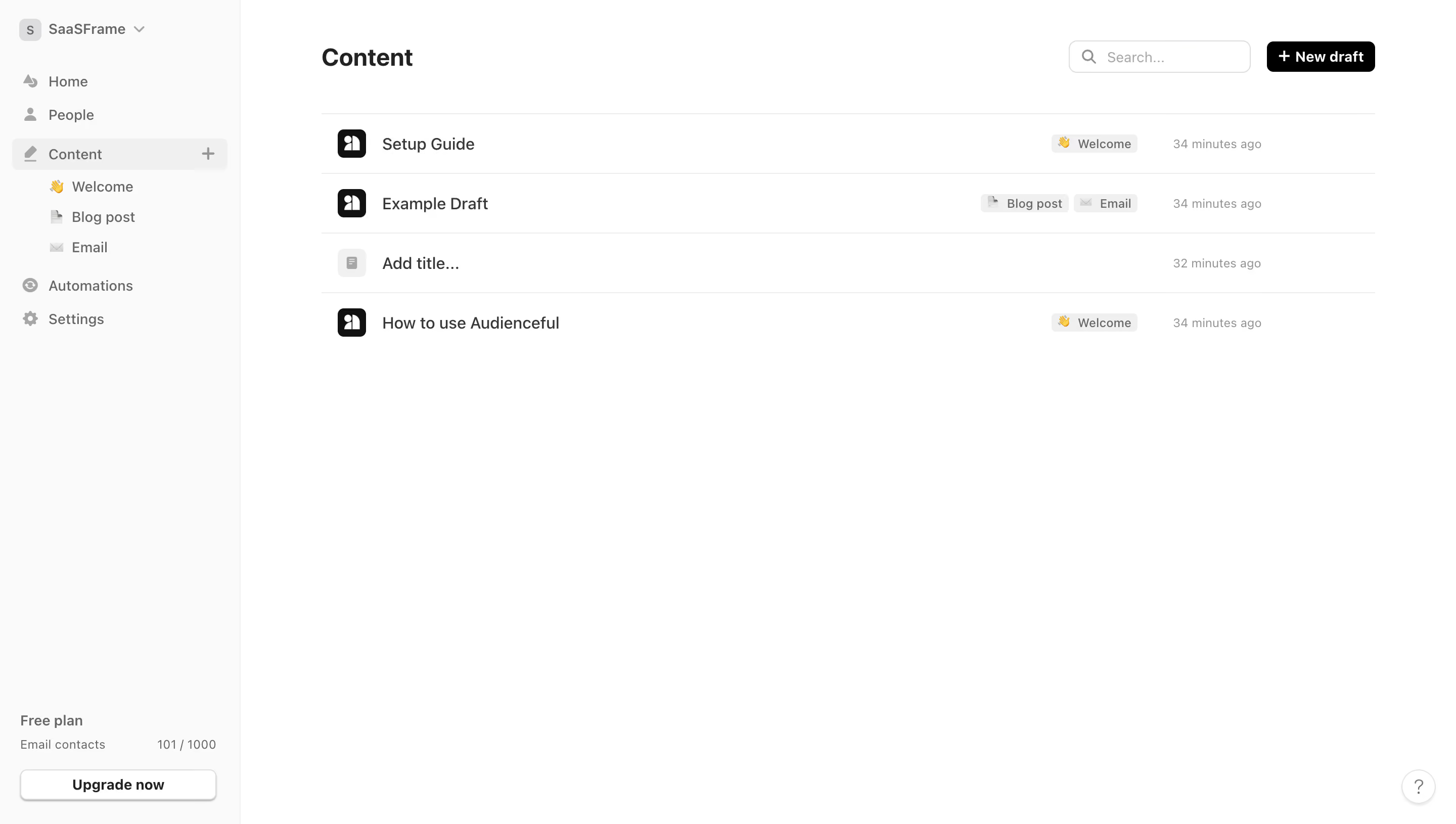
Audienceful Content Table

Audienceful
Email Marketing re-invented
Designed by
No items found.

Bookmark
Bookmark

Design with AI
Thank you! Your submission has been received!
Oops! Something went wrong while submitting the form.
# Design from Reference: Audienceful Content Table
Create an original, high-fidelity visual design inspired by the reference. Prioritize composition, typography, colors, spacing, and component styling over technical implementation.
## Reference
- **Product:** Audienceful
- **Category:** Table
- **Screenshot:** https://cdn.prod.website-files.com/5e9dc792e1210c5325f7ebbc/6acad9bba43009b06fe6be6e_6acad93bbd9ce0e960551006_cms-59a8f1d00437ffabb4f4e8e3.webp
Analyze the screenshot first. If inaccessible, request it rather than guessing.
## Content
{{content.instructions}}
{{content.data}}
Preserve essential messaging and factual accuracy. Adapt structure and copy length for visual balance; never invent product claims.
## Visual Design
### Overall aesthetic
- **Character:** A sparse content-management workspace uses a pale sidebar, white canvas, black primary action, thin row dividers, and restrained gray metadata.
- **Evidence:** The source image is 2880 × 1630 px, inspected at 1400 px width. Dimensions below are approximate CSS-scale estimates assuming a 1440 px layout at 2× capture; the ratio is unverified.
- **Density:** Only four content rows occupy the upper workspace, leaving broad white space below.
### Page composition
- **Sidebar:** An approximately 238 CSS px rail contains a workspace switcher, main navigation, an expanded Content group, and plan/usage information at the bottom.
- **Header:** The main Content heading aligns left; a compact search field and black New draft button sit right.
- **List:** Four full-width rows beneath a fine rule contain a leading document icon, title, category chips where present, and relative timestamp.
- **Utilities:** A small circular help control appears at bottom right. No editor, preview, or secondary detail pane is open.
### Information hierarchy
- **Location:** Content is highlighted in the sidebar with a pale rounded background; three indented child categories sit beneath it.
- **Primary action:** The black New draft control is the strongest action, with a leading plus.
- **Rows:** Titles are dark and larger than timestamps. Small light-gray chips identify welcome, blog-post, or email categories.
- **Plan:** A small free-plan/usage block and outlined upgrade control are anchored low in the sidebar.
### Typography
- **Family:** A neutral interface sans serif appears throughout; exact identity is unverified.
- **Page title:** Approximately 24 px bold with around 30 px line-height.
- **Row titles:** Approximately 16 px regular to medium weight.
- **Navigation:** About 14 px; workspace label is medium weight. Category chips and timestamps are approximately 12 px.
- **Controls:** New draft uses roughly 14 px semibold white text; search placeholder is muted and similarly sized.
### Colors & surfaces
- **Measured palette:** Sampled pixels include white #FFFFFF, pale gray #FAFAFA, row/selection gray #F0F0F0, fine-line gray #ECEBEE, black #000000, and text gray #666666.
- **Semantic use:** Black identifies the primary action and several document icons. Gray distinguishes sidebar, selected navigation, metadata, and badges.
- **Flat design:** There are no large card shadows. A subtle lower shadow appears beneath the sidebar upgrade control.
- **Small accents:** Emoji category icons provide localized color within an otherwise monochrome interface.
### Components
- **Sidebar selection:** A pale rounded row spans most of the rail, with a pencil icon left and a small plus right.
- **Search:** Approximately 180 × 32 CSS px, thin outlined rounded rectangle, with a magnifier and muted placeholder.
- **New draft:** Approximately 108 × 31 px, black, with around 6 px radii and a leading plus.
- **Content rows:** Roughly 59 px high, separated by thin horizontal lines. Leading icons are about 28 px square with rounded corners.
- **Badges:** Compact pale-gray chips use small icons and labels, with minimal padding and slight rounding.
- **Upgrade:** Nearly full-width outlined white button at the rail bottom; usage label and numerical count sit above it.
### Visual rhythm
- **Main gutters:** Content begins about 80 CSS px beyond the sidebar; the same left edge anchors heading and rows.
- **Header spacing:** A roughly 40 px upper margin and a broad gap below the title separate header tools from the list.
- **Row alignment:** Titles share one vertical line; category chips and timestamps align in consistent right-side regions.
- **Whitespace:** The short list and bottom-anchored plan controls create a quiet, uncluttered screen.
### Responsive
- **Observed limit:** Only desktop is shown; mobile navigation and list behavior are unverified.
- **Recommended sidebar:** Collapse into an accessible navigation drawer on small screens while retaining workspace and category access.
- **Recommended rows:** Allow tags and timestamps to wrap below titles instead of compressing the title column.
- **Recommended tools:** Stack search and draft action where necessary and provide comfortable touch areas around compact visible controls.
### Adaptation guidance
- **Preserve:** Keep the simple four-part row anatomy, low-contrast dividers, category chips, and clear black creation action.
- **Build:** Use reusable list rows and consistent navigation states; derive usage display separately from content data.
- **Accessibility:** Provide names for icon-only plus/help controls, label search, and ensure row links and keyboard focus are clear.
- **Validate:** Confirm fonts, true CSS scale, search behavior, empty states, tag overflow, and row selection/hover states. The screenshot shows only the resting content list.
Use this context to reproduce the reference's visual language: layout, typography, colors, spacing, borders, radii, and distinctive elements. The screenshot takes priority if descriptions conflict.
## Direction
{{preferences.fidelityInstructions}}
## Output
{{output.instructions}}
Deliver a polished, cohesive design with precise alignment, hierarchy, and spacing. Produce the requested visual artifact, not just a description. If unsupported, explain the limitation.


Category
Patterns


Added on
October 9, 2023
Similar screens
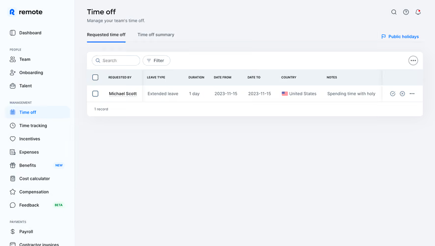


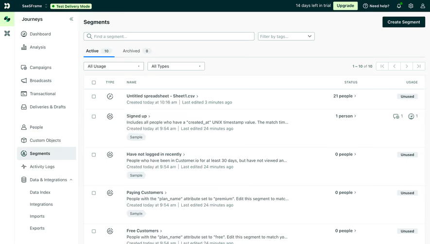

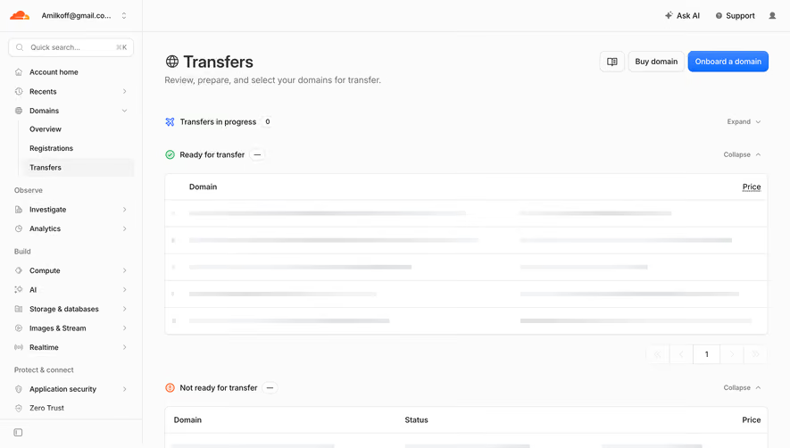

Upgrade to SaaSFrame Pro now to see similar examples.
Monthly
$18 /month
Billed $18 monthly
Browse all screens & flows
Filter and search screens & flows
Search text in screenshots
Access Figma files
Access mobile versions
Join now
Quarterly
$16 /month
Billed $48 quarterly
Browse all screens & flows
Filter and search screens & flows
Search text in screenshots
Access Figma files
Access mobile versions
Join now
Yearly
$15 /month
Billed $180 yearly
Browse all screens & flows
Filter and search screens & flows
Search text in screenshots
Access Figma files
Access mobile versions
Join now