
Thank you! Your submission has been received!
Oops! Something went wrong while submitting the form.
Get SaaSFrame Pro
Monthly
$18
Quarterly
$48
Yearly
$180
Upgrade to access this feature
Browse all screens & flows
Filter and search screens & flows
Access Figma files
Access mobile versions
Bookmark screens & flows
Join now

Artboard Studio Welcome Email

Artboard Studio
Create mockups online
Designed by
No items found.

Bookmark
Bookmark

Design with AI
Thank you! Your submission has been received!
Oops! Something went wrong while submitting the form.
# Design from Reference: Artboard Studio Welcome Email
Create an original, high-fidelity visual design inspired by the reference. Prioritize composition, typography, colors, spacing, and component styling over technical implementation.
## Reference
- **Product:** Artboard Studio
- **Category:** Welcome Email
- **Screenshot:** https://cdn.prod.website-files.com/5e9dc792e1210c5325f7ebbc/62ecad980e99efa296d921cf_1659676372170-5ee4d3e1851b1a5e0c72698c_screencapture-mail-google-mail-u-3-2020-06-13-15_25_05.webp
Analyze the screenshot first. If inaccessible, request it rather than guessing.
## Content
{{content.instructions}}
{{content.data}}
Preserve essential messaging and factual accuracy. Adapt structure and copy length for visual balance; never invent product claims.
## Visual Design
### Overall aesthetic
- **Character:** A centered welcome email uses a white editorial column on a pale gray surround, dark navy typography and one muted coral action.
- **Capture evidence:** The screenshot measures 1305 × 1705 pixels and was inspected in two portions to its bottom. Dimensions below are approximate image pixels; email CSS scale is unverified.
- **Tone:** Large friendly type and two instructional images make the message approachable and tutorial focused.
### Page composition
- **Email container:** A white rectangle approximately 750px wide sits centered with around 275px outer side margins.
- **Brand area:** A centered icon-and-wordmark begins near the top, followed by a large gap before the welcome heading.
- **Tutorial region:** A large video thumbnail around 650 × 365px sits beneath the heading.
- **Text and action:** A centered three-line introduction is followed by a coral help-page button.
- **Support region:** A short live-support sentence introduces a second app screenshot with large white callout arrows and a circular magnification detail.
- **Sign-off:** A centered two-line closing finishes the email, with a bold team name and ample white space below.
### Information hierarchy
- **Primary greeting:** The personalized welcome is the largest text and precedes all instructional content.
- **Learning action:** The prominent thumbnail and help-page button form the first instructional path.
- **Support emphasis:** Bold inline wording highlights tutorials and live support within otherwise regular copy.
- **Image hierarchy:** The upper image promotes learning; the lower image demonstrates where support appears inside the app.
### Typography
- **Family:** A familiar sans-serif email typeface is visible; exact identity is unverified.
- **Greeting:** Approximately 52px image size, bold, with compact line-height around 60px and slightly tight tracking.
- **Body:** Approximately 23px image size with 34–36px line-height and centered alignment.
- **Button:** Approximately 23px bold uppercase, centered on the coral surface.
- **Closing:** Approximately 23px regular, with the team line in bold.
- **Embedded images:** Large white text and play symbol belong to the tutorial thumbnail; tiny interface text in the lower screenshot is illustrative content.
### Colors & surfaces
- **Surround:** Sampled #F5F5F5 forms the outer email background.
- **Container:** Sampled #FFFFFF creates the flat white message column without visible border or shadow.
- **Action:** Sampled #F2ACA6 supplies the muted coral button.
- **Dark image surfaces:** Sampled #000000, #1A1A1A and #2B2B2B appear prominently in the embedded app screenshot.
- **Text:** Main copy and branding are deep navy; photographic colors remain confined to the video thumbnail.
### Components
- **Brand lockup:** A navy rounded-square icon sits beside a bold dark wordmark.
- **Video preview:** A rectangular photograph has a white play-button motif and a stacked instructional title over the right side.
- **Help action:** A roughly 243 × 65px image-size coral rectangle uses about 5px corner rounding and a dark bold label.
- **Support illustration:** A full-column app screenshot includes a circular magnified menu area and arrows pointing toward the support interface.
- **Inline emphasis:** Selected phrases use bold weight without changing the surrounding font size.
### Visual rhythm
- **Inner gutters:** Images and body text use roughly 50px horizontal insets inside the white column.
- **Top spacing:** A notably large gap between logo and greeting gives the opening a spacious appearance.
- **Module spacing:** Around 80–90px separates the first image from its body copy; smaller 20–40px gaps connect related text and controls.
- **Closing spacing:** The sign-off follows the support screenshot with a moderate gap and is followed by about 100px of white space.
### Responsive
- **Evidence limit:** Only one captured email width is observed; client rendering and video behavior are unverified.
- **Container recommendation:** Use a fluid, centered email layout with a practical maximum width and 20–24px mobile padding.
- **Image recommendation:** Scale both images proportionally; keep important tutorial and support guidance available as live text or useful alternative text.
- **Typography recommendation:** Reduce the greeting on small screens while retaining readable body size and a generous action target.
### Adaptation guidance
- **Email structure:** Keep the greeting, instructions, action and sign-off as live text; use linked images for the two visual demonstrations.
- **Priority:** Retain one strongly styled help action and a separate explanatory support module.
- **Personalization:** Supply a fallback greeting and representative demo data rather than reproducing personal identifiers.
- **Accessibility:** Provide descriptive image alternatives, a clear action label and an intelligible reading order when images are blocked.
Use this context to reproduce the reference's visual language: layout, typography, colors, spacing, borders, radii, and distinctive elements. The screenshot takes priority if descriptions conflict.
## Direction
{{preferences.fidelityInstructions}}
## Output
{{output.instructions}}
Deliver a polished, cohesive design with precise alignment, hierarchy, and spacing. Produce the requested visual artifact, not just a description. If unsupported, explain the limitation.


Category
Patterns
No items found.
Tech Stack

Added on
June 13, 2020
Similar screens
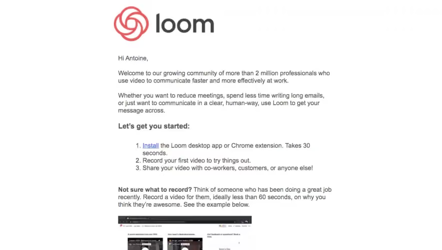


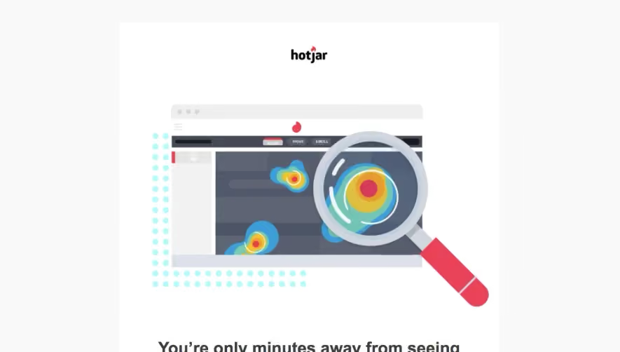

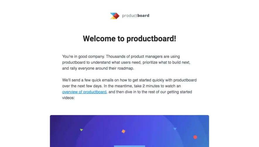

Upgrade to SaaSFrame Pro now to see similar examples.
Monthly
$18 /month
Billed $18 monthly
Browse all screens & flows
Filter and search screens & flows
Search text in screenshots
Access Figma files
Access mobile versions
Join now
Quarterly
$16 /month
Billed $48 quarterly
Browse all screens & flows
Filter and search screens & flows
Search text in screenshots
Access Figma files
Access mobile versions
Join now
Yearly
$15 /month
Billed $180 yearly
Browse all screens & flows
Filter and search screens & flows
Search text in screenshots
Access Figma files
Access mobile versions
Join now