
Thank you! Your submission has been received!
Oops! Something went wrong while submitting the form.
Get SaaSFrame Pro
Monthly
$18
Quarterly
$48
Yearly
$180
Upgrade to access this feature
Browse all screens & flows
Filter and search screens & flows
Access Figma files
Access mobile versions
Bookmark screens & flows
Join now


Designed by
No items found.

Bookmark
Bookmark

Design with AI
Thank you! Your submission has been received!
Oops! Something went wrong while submitting the form.
# Design from Reference: Arc Blog Feed
Create an original, high-fidelity visual design inspired by the reference. Prioritize composition, typography, colors, spacing, and component styling over technical implementation.
## Reference
- **Product:** Arc
- **Category:** Blog Feed
- **Screenshot:** https://cdn.prod.website-files.com/5e9dc792e1210c5325f7ebbc/6acb6470b206c0d3f8f06779_6acb63e40e8221f1308111b6_cms-cd569df4096e03a060a198ac.webp
Analyze the screenshot first. If inaccessible, request it rather than guessing.
## Content
{{content.instructions}}
{{content.data}}
Preserve essential messaging and factual accuracy. Adapt structure and copy length for visual balance; never invent product claims.
## Visual Design
### Overall aesthetic
- **Character:** A restrained financial-services editorial layout uses white space, fine architectural grid lines, dark teal imagery, and a long chronological article archive.
- **Evidence and scale:** The original screenshot is 2880 × 21200 image pixels, inspected in eight readable crops at 1400 px width. Dimensions below are approximate CSS-scale estimates assuming a 1440 px layout at 2× capture; that device pixel ratio is unverified.
- **Surface language:** Articles sit directly on the white page, separated by shared rules rather than floating rounded cards. Teal and pale mint unify otherwise varied article artwork.
### Page composition
- **Navigation:** A centered desktop header places the black arc wordmark left, four text navigation groups across the middle, and Log in plus an outlined Get started button at right.
- **Introduction:** The blog title and one-line description occupy the left two thirds. A compact pale-mint newsletter form sits in the upper-right third.
- **Featured row:** A large lead story spans two grid columns with a wide image, headline, excerpt, and author. A narrower story occupies the right column with the same anatomy.
- **Archive:** Subsequent rows use three equal columns with edge-to-edge shared vertical and horizontal separators. Each article contains a landscape thumbnail, date, title, substantial excerpt, and author identity.
- **End regions:** The last article occupies the left column, with a pale mint blank region spanning the other two. A small editorial disclaimer precedes a full-width teal CTA, extensive fine-print disclosures, multi-column footer navigation, and a final legal/social row.
### Information hierarchy
- **Entry point:** A large teal page title identifies the archive; the wide lead thumbnail and larger headline distinguish the featured article from the smaller companion.
- **Article metadata:** Muted dates precede bold titles. Gray excerpts carry more visual density than typical short card summaries, while circular portraits and two-line bylines anchor the bottom of each card.
- **Row alignment:** Author groups align across each row despite unequal excerpt lengths, creating a stable baseline and intentional white gaps.
- **Closing conversion:** A large white message in the teal band highlights a phrase in bold mint. A dark Get started button sits beneath it; legal copy is much smaller and lower contrast.
### Typography
- **Family:** Text uses a straightforward sans serif with humanist-looking details. Exact font identity is unverified; the arc mark is a separate graphic asset.
- **Page title:** Approximately 48 CSS px, regular weight, roughly 58 px line-height, with neutral tracking.
- **Article headings:** Lead title is approximately 28 px, semibold; standard card titles are approximately 21–22 px with tight 24–26 px line-height and semibold weight.
- **Body and metadata:** Excerpts are approximately 14 px with 21 px line-height; dates are about 14 px. Author names are around 12 px bold, with roles around 12 px regular.
- **CTA and footer:** CTA text is about 62–64 px with 70–74 px line-height. Footer links are approximately 14 px, while disclosures and legal text are around 12 px with 18 px line-height.
### Colors & surfaces
- **Measured palette:** Sampled source pixels include white #FFFFFF, teal #216C69, pale mint #F0FBF5, deep green-black #052A2B, warm text gray #5E5B54, and near-black #20211F.
- **Semantic use:** White forms the article and footer canvas; teal marks the title, signup buttons, and closing CTA. Pale mint fills newsletter surfaces and the unused final grid area.
- **Rules:** Thin light warm-gray lines separate grid cells and extend slightly past their intersections, producing an architectural frame.
- **Artwork:** Thumbnails combine deep teal gradients, mint diagrams, portraits, product interfaces, event graphics, and occasional yellow/navy accents. These belong to editorial images rather than universal UI tokens.
### Components
- **Article cells:** Standard cells are roughly 400 px wide with about 38–40 px internal side padding. Shared lines form square corners; there are no card shadows.
- **Thumbnails:** Standard images are approximately 322 × 176 px, a wide landscape ratio near 1.8:1, without visible rounded corners. The lead image is roughly 720 × 395 px.
- **Authors:** Circular portraits or brand avatars measure approximately 48 px; names and roles sit to the right with around 12 px separation.
- **Newsletter:** A mint panel approximately 324 × 200 px uses about 20 px padding, a small uppercase teal label, short helper copy, a white email input about 38 px high, and a full-width teal signup button.
- **Buttons:** Header Get started has a thin gray outline, almost-square corners, and around 42 px height. The closing dark button is approximately 138 × 56 px with subtly rounded corners.
- **Footer:** Logo, grouped navigation links, and a second newsletter form form columns. A horizontal rule separates these from copyright, legal links, and three small social icons.
### Visual rhythm
- **Container:** Main content occupies roughly 1200 CSS px with approximately 120 px outer margins; article content is inset further within each grid cell.
- **Repeated spacing:** Around 40 px separates borders from thumbnails; dates follow images after roughly 28–32 px. Titles sit close to dates, excerpts begin after about 20 px, and bylines retain breathing room below.
- **Variable row height:** Rows expand to accommodate the longest excerpt while shorter columns preserve empty space above their aligned authors.
- **Macro spacing:** The introduction and closing regions use larger vertical pauses. The CTA is a deep horizontal band with approximately 120 px vertical padding; disclosures occupy a separate spacious white block.
### Responsive
- **Observed limit:** Only the desktop archive is visible. Mobile layout, sticky navigation, pagination, and hover behavior are unverified.
- **Recommended columns:** Change the archive to two columns and then one. Collapse the featured two-column span to the available width; preserve article reading order.
- **Recommended header:** Stack the blog introduction and newsletter panel at narrow widths, reduce outer gutters to 20–24 CSS px, and provide a compact navigation pattern.
- **Recommended text and footer:** Let excerpts and bylines flow naturally rather than preserving excessive desktop blank space. Reduce CTA type fluidly, wrap legal links, and stack footer groups without shrinking disclosure text.
### Adaptation guidance
- **Preserve:** Retain the fine shared grid, generous cell padding, landscape image ratios, substantial excerpts, and repeated author treatment.
- **Build:** Use a responsive grid with article components and flexible vertical layout to align bylines. Keep the lead story as an explicit span variant.
- **Content:** Treat article imagery, dates, author portraits, and descriptions as distinct content slots. Do not rebuild embedded charts or event graphics as interactive page controls.
- **Accessibility:** Provide meaningful image alternatives, visible keyboard focus, persistent email labels, adequate muted-text contrast, and accessible form feedback.
- **Validate:** Confirm font files, actual CSS scale, long-title wrapping, newsletter states, and footer behavior in implementation; these cannot be established from static pixels.
Use this context to reproduce the reference's visual language: layout, typography, colors, spacing, borders, radii, and distinctive elements. The screenshot takes priority if descriptions conflict.
## Direction
{{preferences.fidelityInstructions}}
## Output
{{output.instructions}}
Deliver a polished, cohesive design with precise alignment, hierarchy, and spacing. Produce the requested visual artifact, not just a description. If unsupported, explain the limitation.


Category
Patterns
No items found.
Tech Stack



Added on
July 4, 2023
Similar screens



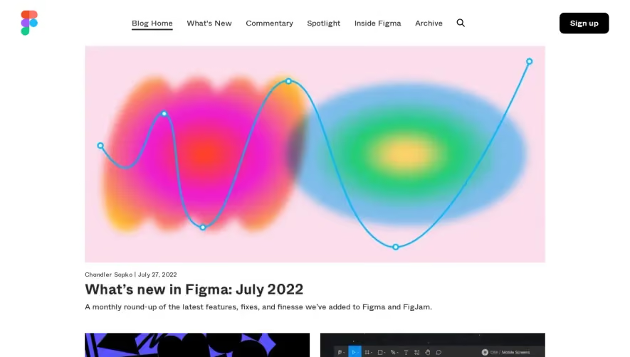

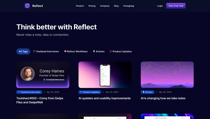

Upgrade to SaaSFrame Pro now to see similar examples.
Monthly
$18 /month
Billed $18 monthly
Browse all screens & flows
Filter and search screens & flows
Search text in screenshots
Access Figma files
Access mobile versions
Join now
Quarterly
$16 /month
Billed $48 quarterly
Browse all screens & flows
Filter and search screens & flows
Search text in screenshots
Access Figma files
Access mobile versions
Join now
Yearly
$15 /month
Billed $180 yearly
Browse all screens & flows
Filter and search screens & flows
Search text in screenshots
Access Figma files
Access mobile versions
Join now