Overall Style and Aesthetic
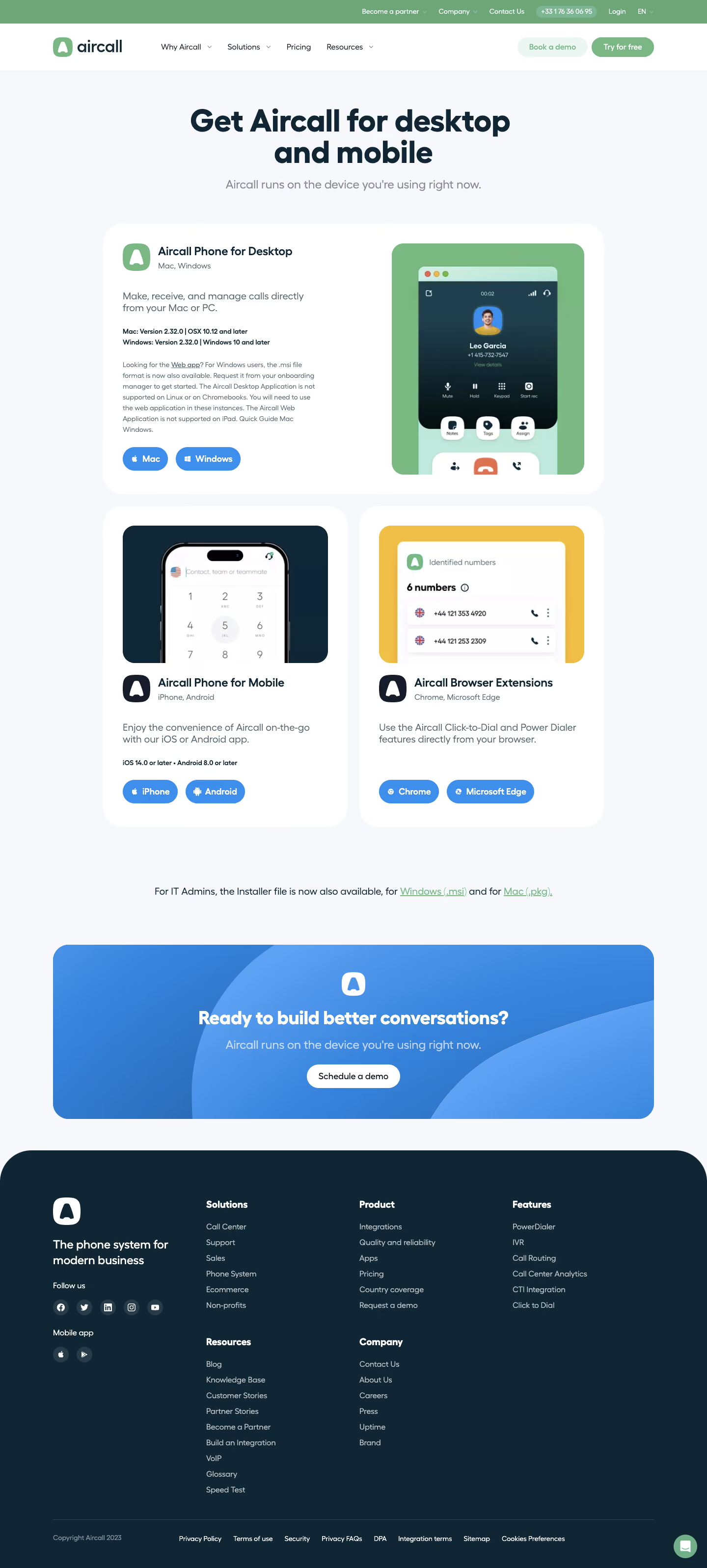
Aircall’s download page exemplifies a sleek, modern SaaS aesthetic, blending a minimalist layout with confident, professional energy. Ample white space ensures the content breathes, while rounded edges, soft drop shadows, and subtle gradients convey friendliness without forgoing clarity or sophistication. Layout and Structure
The page opens with a concise hero section: a bold headline, succinct value proposition, and prominent download CTAs for multiple platforms. Scrolling reveals clear, card-based sections for features and device compatibility. The overall layout follows a single-column flow, reducing distractions and accelerating user decision-making, while the persistent sticky header ensures navigation is always accessible. Visual Elements
Cohesive custom illustrations depict devices and app interfaces, adding visual interest and reinforcing trust. Recognizable icons denote each platform, and a minimalistic animation gently draws attention to the primary download CTA. Occasional use of soft gradients and drop shadows make interactive elements pop against the neutral backdrop. Color Palette and Typography
A cool palette—anchored by Aircall’s signature greens, with compliant highlights in teal and blue—evokes both innovation and dependability. Sharp, legible typography (GT Walsheim) pairs geometric sans-serif headers with approachable body text, maintaining visual hierarchy and scannability. User Experience Patterns
Persistent CTAs, platform-specific buttons, and an intelligent download detection prompt streamline the journey for all users. Microinteractions, from button states to smooth section transitions, reinforce intuitiveness. The footer distills navigation to essentials without visual clutter. Unique or Notable Design Choices
Standout choices include the use of tailored device illustrations to demystify the download process and the bold yet unintrusive “Get the App” CTAs that adapt contextually. Tone throughout feels welcoming, trustworthy, and quietly innovative—perfectly embodying the SaaS ethos.