Overall Style and Aesthetic
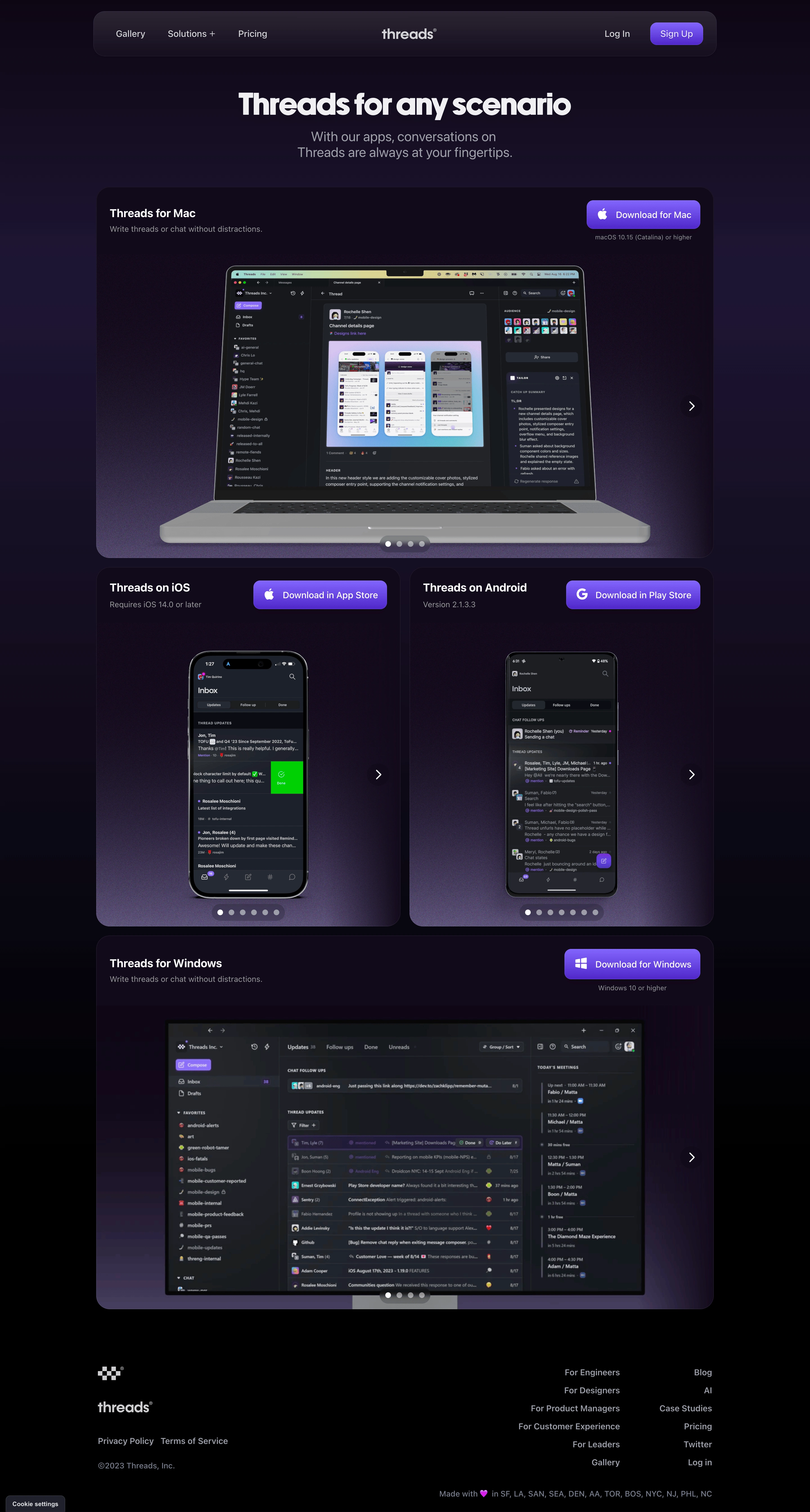
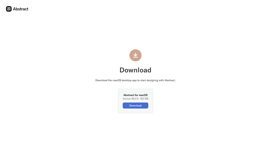
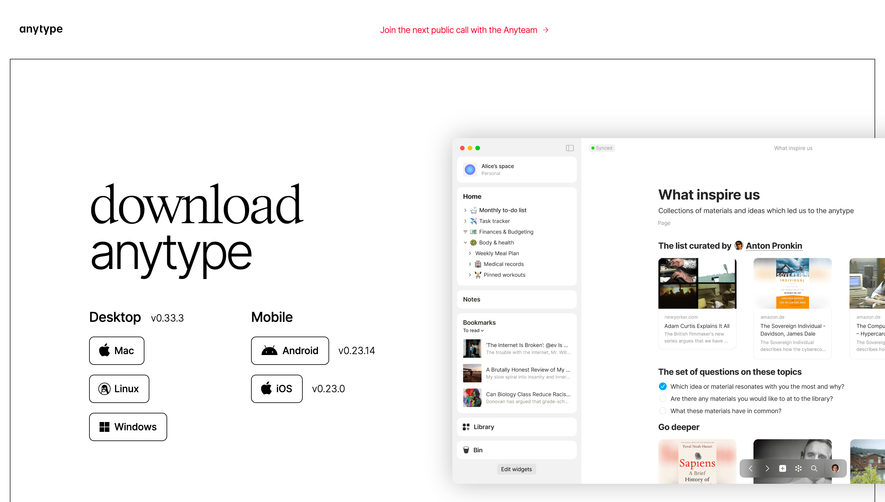
Threads’ download page embodies a crisp, minimalist ethos, projecting professionalism with contemporary flair. Every pixel feels intentional, balancing functional clarity with sleek, inviting surfaces. Smooth gradients and generous whitespace produce an airy, approachable vibe while subtly signaling the brand’s modernity and trustworthiness. Layout and Structure
The page opens with a focused hero section featuring a concise headline, a subheadline, and dual download CTAs—each supported by platform-specific icons. Content is vertically stacked, placing immediate emphasis on action. No superfluous sections clutter the journey; every element has a singular, conversion-driven purpose. The streamlined footer gently transitions users out with brand links and understated social/navigation cues. Visual Elements
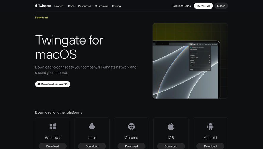
Polished device mockups—some with subtle, animated glows—showcase Threads running on multiple platforms, instantly clarifying the product’s cross-device versatility. Scattered micro-animations lend kinetic energy without distracting from primary actions. Minimalist icons reinforce platform choices, enhancing scannability and aesthetic harmony. Color Palette and Typography
A refined palette leverages deep blues and clean whites, accented with electric purple gradients for strategic highlights. These colors not only reinforce brand identity but guide focus to CTAs and key sections. Typography is bold, modern, and sans-serif, establishing a clear hierarchy with oversized headings and supportive body copy, ensuring both accessibility and impact. User Experience Patterns
Primary CTAs are instantly visible and unmistakable, shaped for easy tap/click interactions. Navigation is sticky yet discreet, supporting the central action. Download links are unambiguous, each paired with familiar icons. Scroll interaction is minimal, purposefully eliminating friction for users seeking fast conversion. Unique or Notable Design Choices
Minimal content paired with high-fidelity, platform-specific mockups signals focus and technical polish. The absence of feature overload places user intent first, while animated glows lend Threads a feeling of continuous innovation. The outcome is a landing page that feels both dynamic and frictionless—an ideal SaaS download experience.