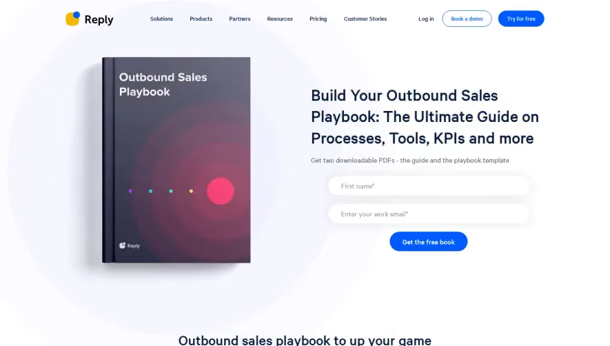
Overall Style and Aesthetic
Acquire’s landing page exudes a polished, modern professionalism with a minimalist sensibility. The design feels airy and approachable, using generous white space and subtle shadows to create depth. This balanced aesthetic feels trustworthy and contemporary, perfectly suited for SaaS audiences seeking clarity and confidence. Layout and Structure
The page structure is linear and highly scannable. The hero section immediately captivates with a bold headline, concise subtext, and a prominent, animated CTA button. Supporting sections flow seamlessly with alternating backgrounds, including benefits, chapter overviews, and social proof. The footer remains clean and functional, integrating essential links and branding without visual clutter. Visual Elements
Custom illustrations—a blend of line art and soft gradients—add energy and personality to the narrative. Micro-animations, such as button hover effects or subtle section transitions, introduce interactivity without detracting from usability. Icons are harmonious and consistent, used sparingly to highlight key points, while the minimal use of photography maintains focus on the product story. Color Palette and Typography
A restrained palette of deep blues, fresh teals, and crisp whites ensures both vibrancy and accessibility. Accent colors highlight interactive elements, drawing attention to calls-to-action. Typography is clean and modern: bold sans-serif headlines provide hierarchy and impact, while body text is easy on the eyes, enhancing readability throughout the scroll. User Experience Patterns & Unique Choices
Navigation is frictionless, with a sticky top bar keeping progress and key actions always in reach. CTAs are clear and recurrent, while section transitions guide users smoothly from discovery to conversion. Notably, the animated hero CTA and interactive chapter list give visitors a sense of progress, boosting engagement. The tone throughout is expert yet approachable, making the experience both authoritative and welcoming.