Overall Style and Aesthetic
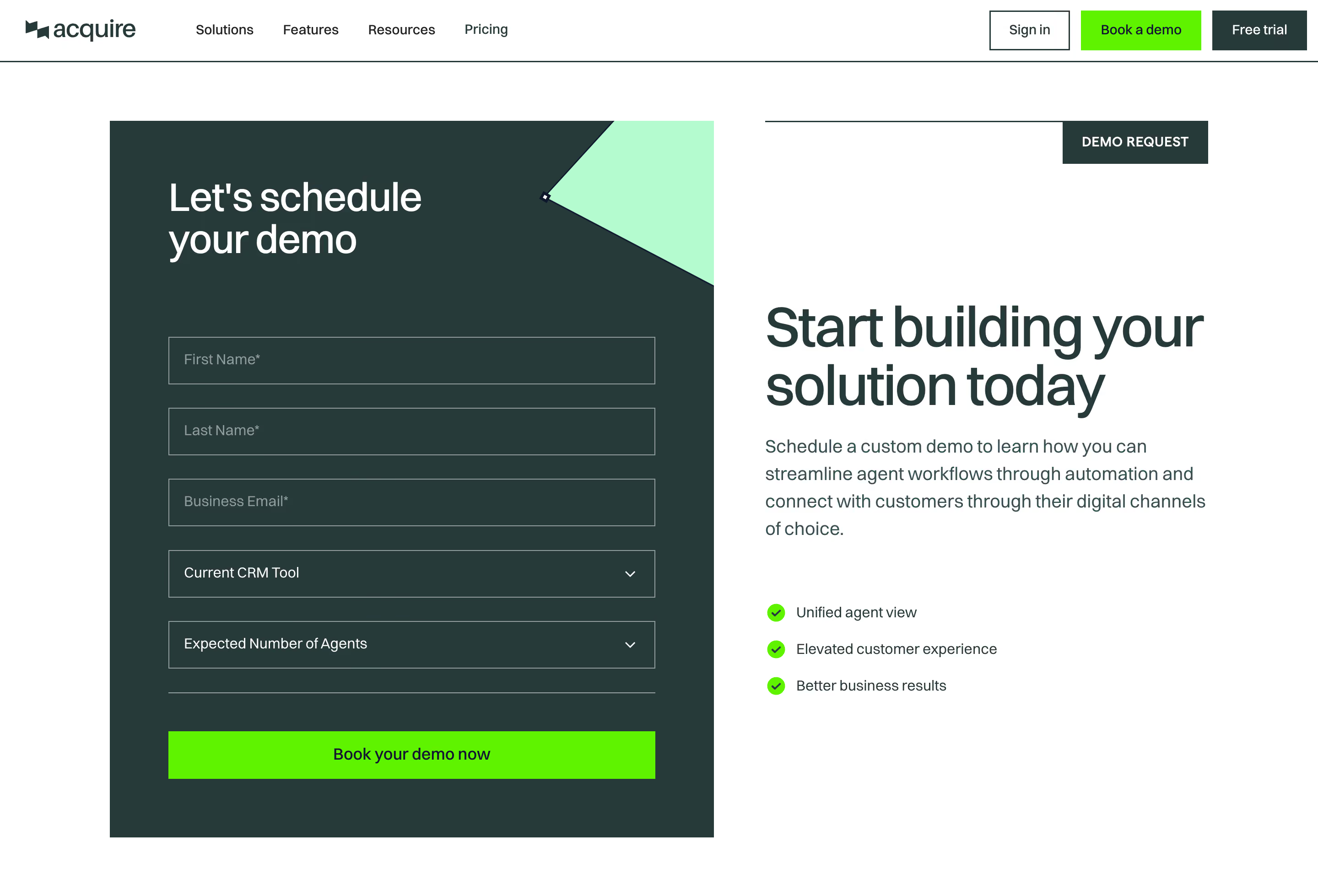
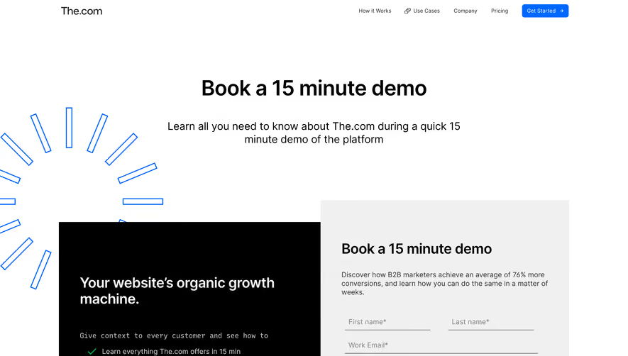
Acquire.io’s demo request page embodies a clean, modern professionalism rooted in minimalism. The design leans toward spacious layouts, subtle gradients, and a restrained aesthetic that feels both approachable and enterprise-ready. The tone is confident yet inviting, aligning perfectly with B2B SaaS expectations. Layout and Structure
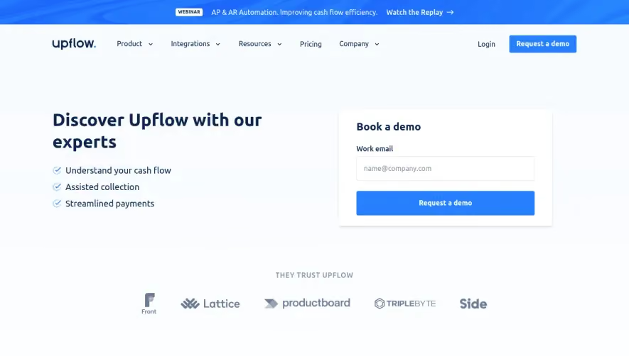
The page opens with a dominant hero section featuring a clear, purpose-driven headline and a concise supporting statement. A right-aligned demo request form immediately grabs attention, while trust signals like customer logos reinforce credibility. Below, succinct features highlight benefits, followed by testimonials and social proof. A well-organized footer anchors the page with navigation links and subtle branding cues. Visual Elements
Custom illustrations and gentle motion effects add a dynamic edge without overwhelming the user. Sleek icons efficiently communicate key features, while subtle hover effects add interactivity. There’s a judicious use of white space, allowing visual elements to breathe and engage users organically. Color Palette and Typography
The palette is rooted in tech-forward blues and whites, punched up with accent gradients and vivid call-to-action buttons. Typography is sharply modern—a blend of bold headers and high-legibility sans-serif text. The clear hierarchy ensures that headlines, body copy, and CTAs remain instantly distinguishable. User Experience Patterns
Navigation is intentionally minimal, driving focus toward the primary conversion—requesting a demo. The form is short, frictionless, and prominent, reducing barriers. CTAs are visually distinct, offering an obvious action path. Micro-interactions and concise copy guide the user effortlessly down the page. Unique or Notable Design Choices
Particularly noteworthy is Acquire.io’s combination of enterprise trust markers (customer logos, testimonials) with warm, illustration-driven visuals, balancing authority and accessibility. The laser-focused layout—centered on conversion—is a masterclass in SaaS landing page efficiency. The overall tone exudes reliability, innovation, and user-first thinking, setting a high bar for SaaS website inspiration.