Generate a new design based on this screen using your own content.
Thank you! Your submission has been received!
Oops! Something went wrong while submitting the form.
# Design from Reference: Abstract eBook Page
Create an original, high-fidelity visual design inspired by the reference. Prioritize composition, typography, colors, spacing, and component styling over technical implementation.
## Reference
- **Product:** Abstract
- **Category:** Ebook Page
- **Screenshot:** https://cdn.prod.website-files.com/5e9dc792e1210c5325f7ebbc/6acbd2756bfbf3cb03d70ff2_6acbd01d22110b38791e44ae_cms-4ceede8a234362fa2fd6c67f.webp
Analyze the screenshot first. If inaccessible, request it rather than guessing.
## Content
{{content.instructions}}
{{content.data}}
Preserve essential messaging and factual accuracy. Adapt structure and copy length for visual balance; never invent product claims.
## Visual Design
Use this context to reproduce the reference's visual language: layout, typography, colors, spacing, borders, radii, and distinctive elements. The screenshot takes priority if descriptions conflict.
## Direction
{{preferences.fidelityInstructions}}
## Output
{{output.instructions}}
Deliver a polished, cohesive design with precise alignment, hierarchy, and spacing. Produce the requested visual artifact, not just a description. If unsupported, explain the limitation.
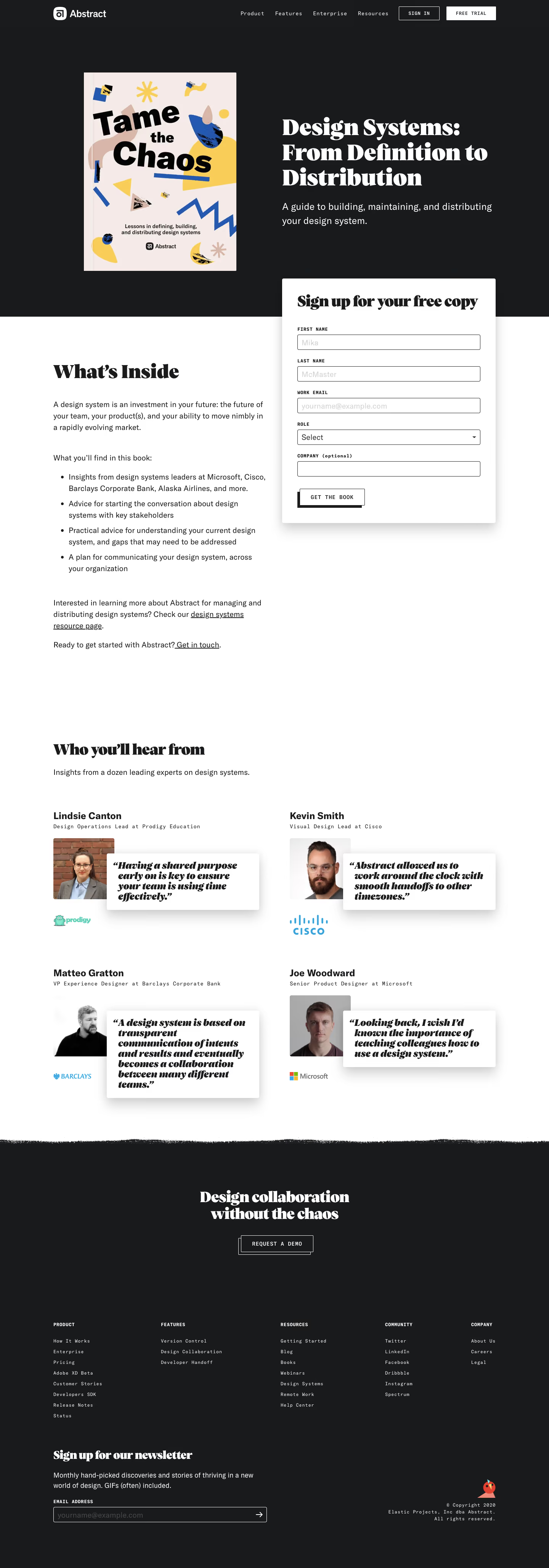
The illustrated cover art for "Tame the Chaos" hits you first. It's colorful, a little playful, and feels editorial in a way most SaaS landing pages don't attempt. The rest of the page is black and white with tons of breathing room, so that cover pops hard. Smart contrast.
Form Placement That Actually Works
The sign-up form floats right where you'd expect a CTA, overlapping the hero and the content section below. It's bold, thick-bordered, and impossible to ignore without feeling aggressive. The "Get the Book" button is clean and minimal. No gradients, no fuss. Just a solid black-on-white box that says exactly what it does.
Social Proof With Real Faces and Real Quotes
The testimonials section pairs headshots with hand-drawn italic quotes from people at Cisco, Microsoft, Barclays. Company logos sit right underneath. It feels credible without trying too hard. The typography throughout mixes a punchy serif for headlines with a neutral sans-serif body. That combo gives it a magazine-quality feel that most gated content pages completely miss.