Error State
17
Handle the unexpected with helpful SaaS Error State patterns. Learn how to design '404' messages, 'Connection Lost' banners, and inline form errors that guide users toward a solution.

An error state explains why a task could not proceed and helps the user recover. It needs more than a red icon: people need to know what failed, whether their work is preserved, and which next action has a realistic chance of helping. The design should reduce uncertainty without claiming a cause the system has not established.
SaaS errors vary in scope. A missing field can be fixed inside a form. A failed connection may block an entire workflow. A partially completed operation may require investigation before retrying. Choosing the right presentation begins with understanding what the failure means for the task.
Users usually recognize the action they attempted more readily than an internal error code. “Couldn’t upload this file” establishes the affected task. A diagnostic code can remain available for support without carrying the entire explanation.
State a known cause when it is useful and verified. If the system cannot determine the cause, say what was observed and offer appropriate checks. Avoid turning every connection failure into an assertion that the user’s network is broken.
Explain the scope. Did one file fail or the whole batch? Was the draft saved? Did a payment request reach the service? Those distinctions determine whether the next step should be a correction, a retry, or a check for an existing result.
Use calm, direct language. Friendly tone can help, but jokes or dramatic illustrations should not obscure a consequential failure. The immediate need is a understandable route forward.
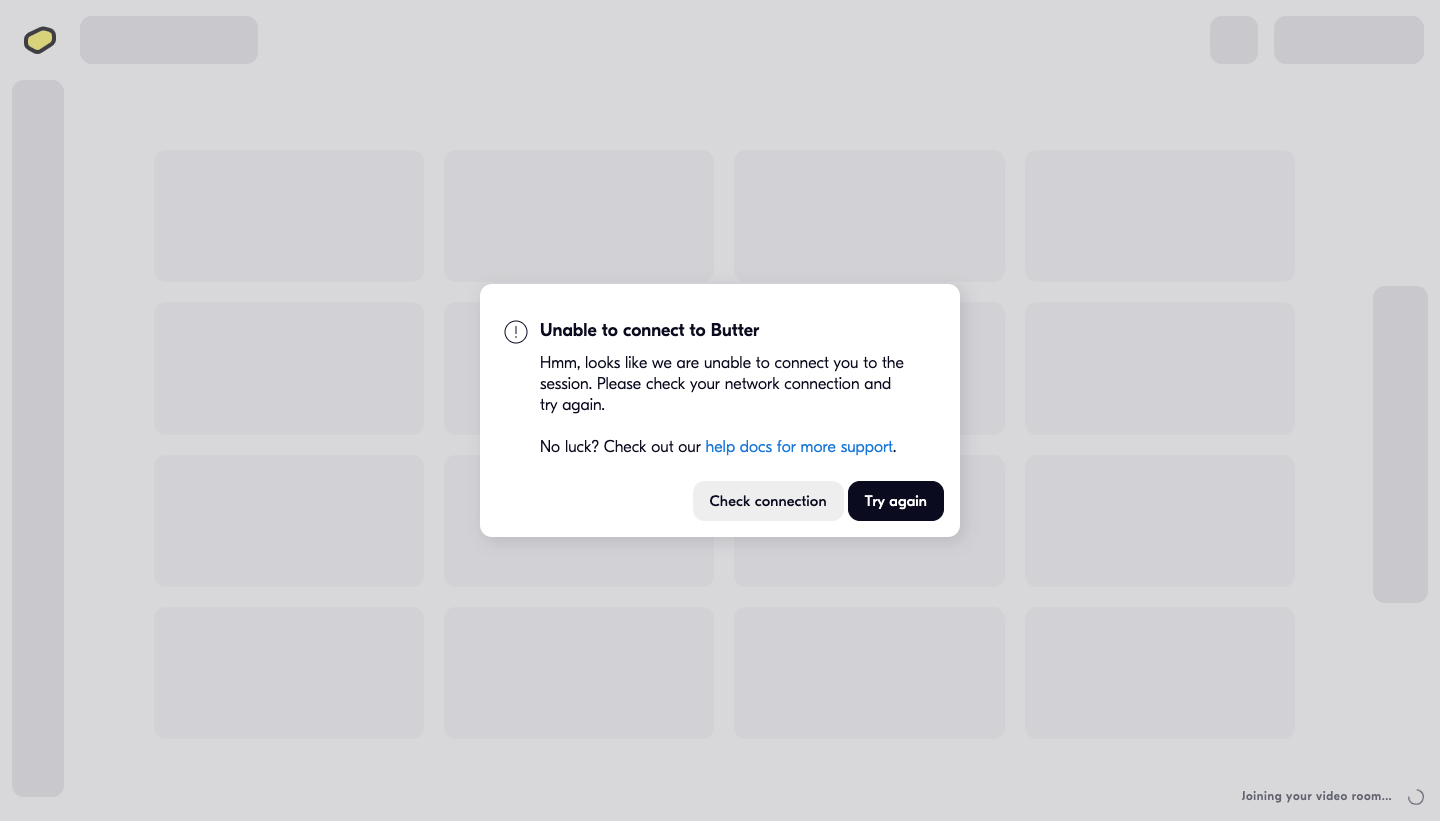
The Butter capture shows a dialog titled “Unable to connect to Butter.” The body explains that the session connection could not be established, suggests checking the network, and links to help documentation. The actions are “Check connection” and “Try again.”
The title names the failure, while the buttons distinguish investigation from repeating the attempt. This is more useful than two differently styled buttons that both perform the same unclear operation. The help link provides a continuation if the immediate actions do not resolve the issue.
The background remains a loading-shaped interface, and a joining status is still visible near the bottom. That creates a design question worth testing: does the user understand whether a connection attempt is still running, or whether the process has stopped and needs explicit retry? Loading and error states must agree.
The screenshot cannot establish whether the network check identifies a cause or how retry behaves. Borrow the recovery structure only after defining the actual capabilities of those actions.
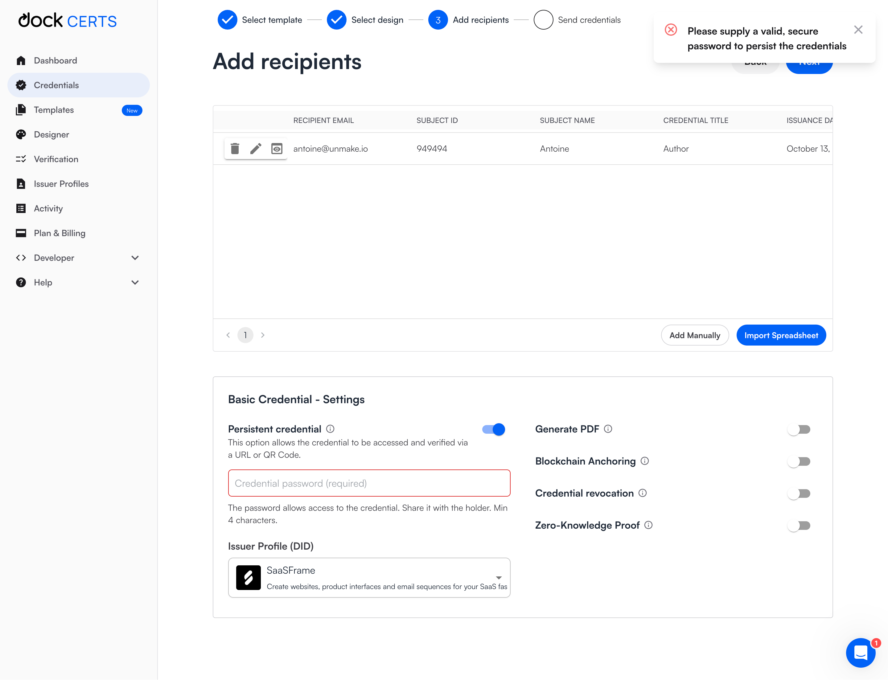
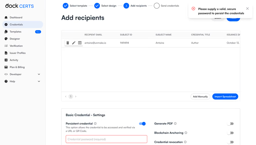
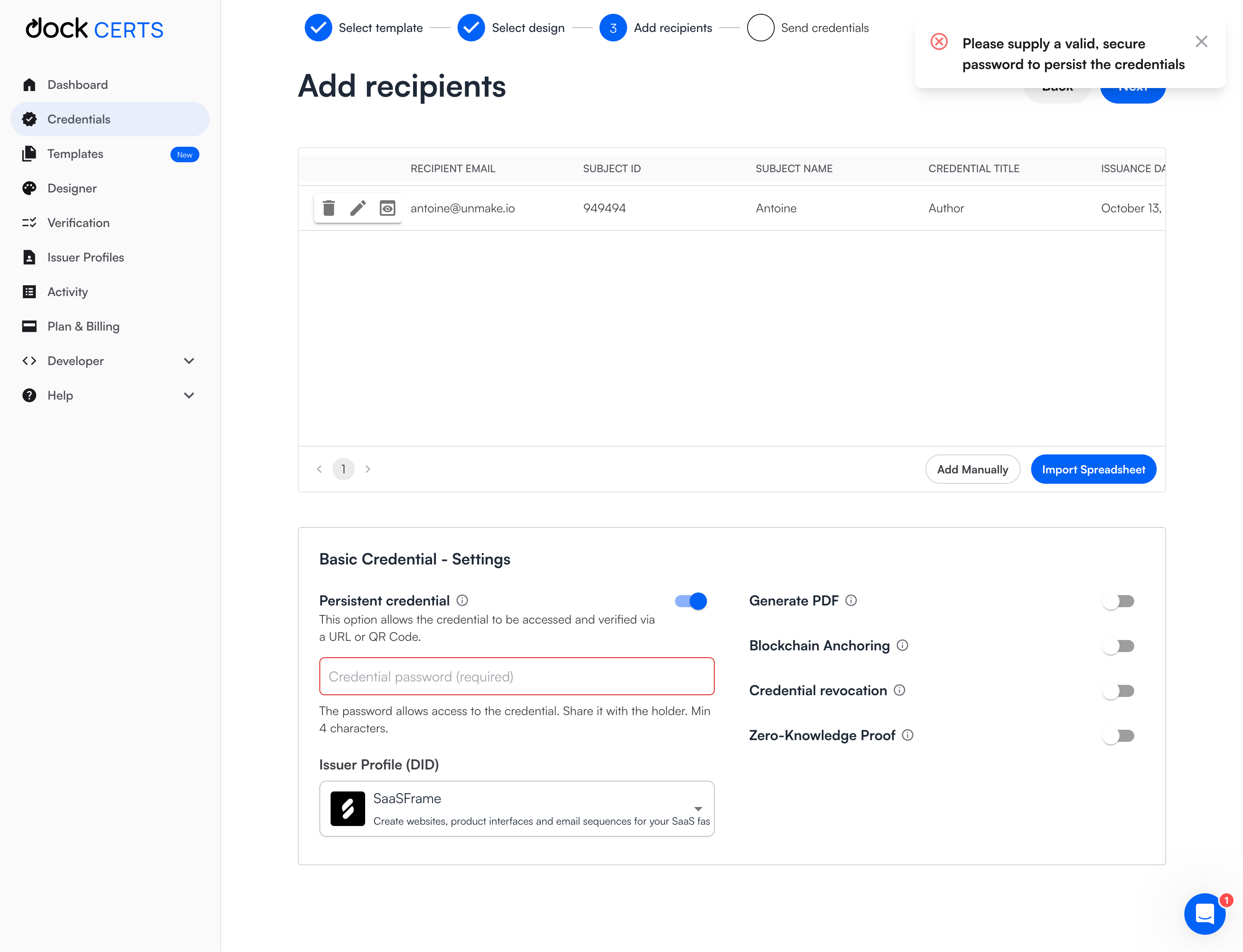
The Dock capture shows an “Add recipients” step with a credential settings section. Persistent credential is enabled, the required password field is outlined in red, and a top-right notification asks for a valid password. Helper text below the field explains its purpose and a minimum length.
The field cue identifies where the user can correct the problem. The general notification makes the failed action noticeable. These layers can work together, provided the field also has a persistent, specific error message that does not disappear with the toast.
The phrase “valid, secure password” leaves a question: which rule has failed? A missing value, length condition, or another constraint needs its own actionable explanation. A precise error should tell the user what to change without requiring guesses.
The screen also shows why conditional requirements matter. Enabling a feature can make a field required. The interface should reveal that dependency as soon as the option is chosen, rather than surprising the user only at submission.
A field error belongs beside the field. A failed section can use a local message while the rest of the page remains usable. A blocking workflow failure may need a dialog or full-page state. Scope the interruption to the impact.
A toast is useful for a brief operation failure when the user can understand the task from context. It is a poor sole location for a persistent validation problem. The message may disappear before the user reaches the field or may be missed while they are scanning elsewhere.
For long forms, an error summary can help users find all affected fields. Each summary entry should lead to the relevant location where possible. Keep field-level explanations as well so the correction is understandable once the user arrives.
Do not replace an entire populated page with an error if only one panel failed to load. Preserve the available information and provide a local retry. This helps users continue useful work while the failed portion recovers.
Keep entered data after a failed submission unless there is a concrete reason it cannot be retained. A user should not need to recreate a long message, reselect files, or reconstruct a configuration simply because the request failed.
When an operation is partially successful, show which items completed and which did not. “Upload failed” is misleading if four files arrived and one did not. Offer retry for the failed portion when the system supports that safely.
If the result is uncertain, do not label it as definitely failed. A timeout may leave the client unsure whether a server completed the operation. Explain that uncertainty and provide a way to check the current state before repeating a consequential action.
The same principle applies to saves. A visible edited field does not prove persistence. Show whether the last save was confirmed, and distinguish unsaved changes from a successfully stored value.
Retry is appropriate for some temporary failures. It does not solve invalid input, unavailable permissions, or a deleted resource. Choose the next action based on the known condition instead of adding “Try again” to every error component.
For operations that can create duplicates or incur cost, explain what repeating the action does and check for an existing result. A user should not have to understand backend behavior to avoid making the same purchase or job twice.
After retry begins, show a pending state and prevent conflicting repeated submissions where appropriate. If it fails again, retain context and offer another route rather than cycling through the same message indefinitely.
Use an action label that describes the task: “Retry upload,” “Reconnect,” or “Request access” can be clearer than “Continue.” Butter’s distinct Check connection and Try again actions illustrate the value of naming the route.
A user without access needs a different response from someone opening an item that no longer exists. The interface may need to limit detail for privacy, but it should still provide an appropriate continuation where available.
If access can be requested, offer that route explicitly and identify the relevant owner or process when permitted. If the user is signed into the wrong account or workspace, a switcher may be more useful than a generic support link.
Do not present disabled controls as though they failed unexpectedly when the limitation is known in advance. Explain the requirement before the user spends effort attempting the action. Conversely, do not disable everything without explaining how to proceed.
A subscription limitation is also different from a system failure. If an upgrade or usage limit blocks the action, name that condition and show the relevant terms. Reusing a generic red error can make a deliberate product rule look like a defect.
A support reference, request identifier, or exact timestamp can help investigation. Keep these secondary to the human-readable explanation and make copying convenient when users need to contact support.
Diagnostic detail should avoid exposing secrets or unrelated personal data. Raw server responses may be useful in a developer view but unsuitable for general users. Show information according to the audience and actual support need.
A help link should lead to the relevant issue where possible. Sending every error to a documentation homepage forces users to search again. If the product can include context in a support request, let the user understand what will be sent.
Where a known service incident explains the error, connect the message to current status information. Do not claim an outage from a single failed request, and remove incident-specific guidance when it is no longer applicable.
Use text to explain an error and connect it to the relevant control. A red border alone does not tell users what failed. Icons and color can supplement the message but should not carry its entire meaning.
Keep keyboard focus behavior predictable. If submission reveals several problems, guide users to a useful summary or affected field without repeatedly disrupting their edits. Do not move focus to every new error while the user is typing.
Dynamic errors need to be perceivable to assistive technology. Provide concise feedback and avoid announcing the same message on every keystroke. Test the working interface with the intended keyboard and screen-reader workflows.
On mobile, the message and correction route should remain visible when the keyboard is open. A notification at the far top of the page may be separated from the field where the user is currently working.
Test missing input, invalid input, temporary network failure, denied access, partial completion, and uncertain completion. For each, ask whether the user understands the affected task and the next safe action.
Check that loading ends or changes appropriately, drafts survive, error messages persist where needed, and retries cannot create misleading duplicate results. An error component is successful when users recover with confidence, not when it simply looks consistent.
No. Retry helps temporary failures. Invalid input, permissions, and unavailable resources require different actions. Name the route that can actually resolve the condition.
A toast can attract attention, but the field needs persistent, specific guidance. Users should still know what to correct after the toast disappears.
Explain that the result is not confirmed and provide a way to check state before repeating a consequential operation. Do not assume that lack of a response proves nothing happened.
Compare SaaSFrame’s error examples with help and support, loading indicators, and success notifications to design coherent transitions between action, waiting, failure, and recovery.