Color Picker
35
Enhance customization with SaaS Color Picker patterns. From simple preset swatches to advanced HEX/RGBA inputs, see how to build intuitive color selection tools for your app.

A color picker translates a visual choice into a value a product can store and apply. In SaaS interfaces, it often controls something practical: a brand accent, a chart series, a workspace theme, or the appearance of an embedded widget. The component succeeds when users can choose a color, understand where it will appear, and confirm that the saved result matches their intention.
A palette alone cannot answer those questions. The surrounding labels, preview, input format, and save behavior determine whether the picker is a useful configuration tool or an isolated visual gadget. Design the whole path from selection to the surface that other people will eventually see.
Identify the object being changed before choosing the control. A hotspot background, chatbot header, and chart category have different requirements. Some users need an exact brand value; others need a small set of distinguishable colors. The picker should serve that requirement instead of exposing every possible format and option.
Name the target explicitly. Labels such as “Background” and “Text” make more sense inside a clearly named component group. A generic “Color” label leaves users to discover its scope through trial and error. If the value affects several surfaces, show those surfaces or explain the shared role.
Decide whether arbitrary colors are appropriate. A limited palette can protect consistency and simplify selection. An unrestricted picker gives more flexibility but requires stronger preview, validation, and recovery. Neither is universally preferable; the choice depends on how much freedom users need and what the product can safely render.
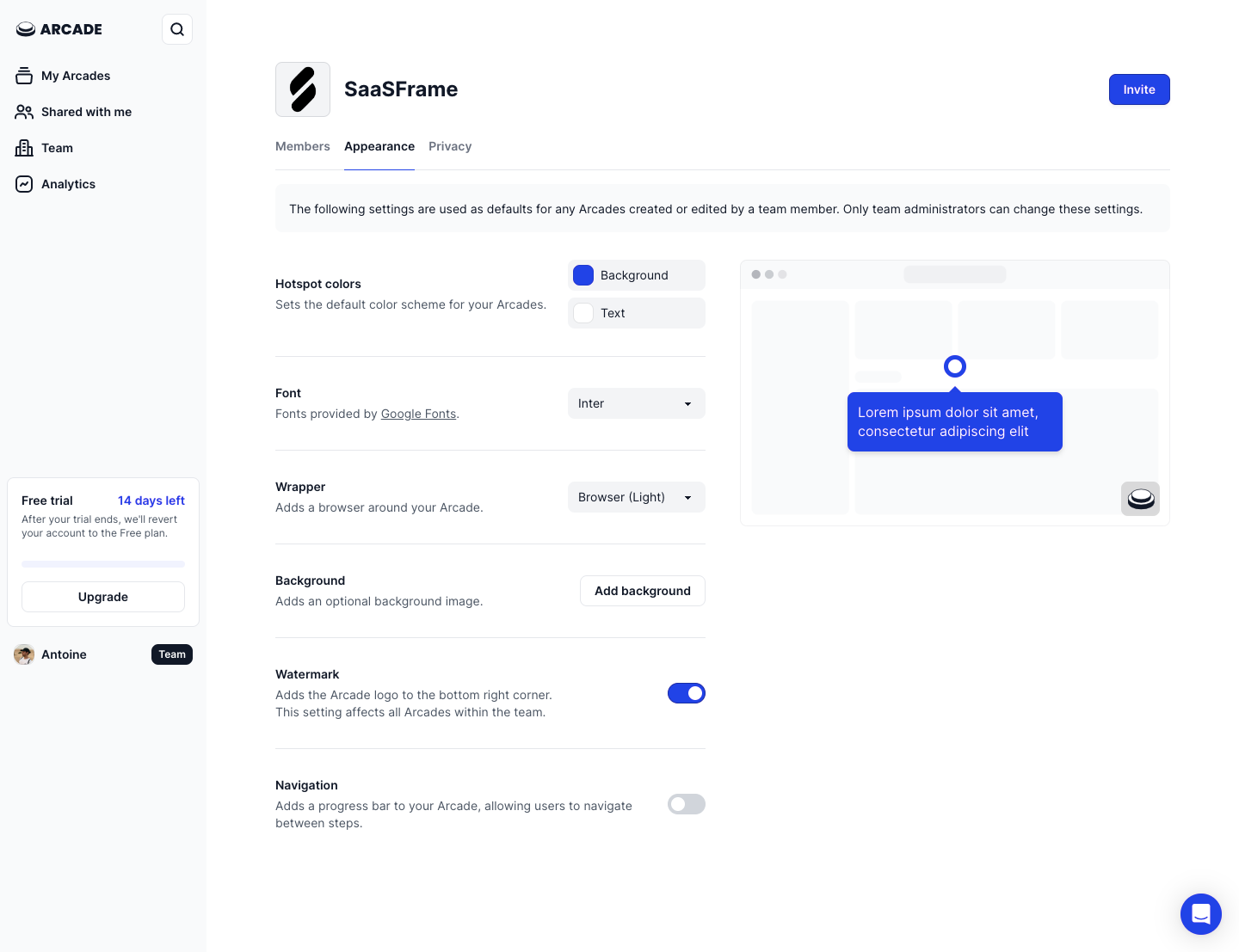
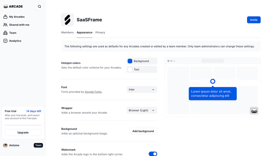
The Arcade screenshot shows an Appearance settings page for the SaaSFrame team. A “Hotspot colors” group contains separate background and text rows, each with a color swatch. On the right, a preview displays a blue hotspot with white text. Other settings, including font and wrapper style, share the same page.
The surrounding copy states that the settings act as defaults for team-created or edited Arcades and that only team admins can change them. This is valuable context for a color choice: the person is configuring a shared appearance, not merely changing a private preference. The scope and editing authority are visible before the user touches a swatch.
The preview also gives the two colors a concrete relationship. A background color cannot be evaluated in isolation from the text placed over it. Showing the actual component helps users judge hierarchy, readability, and brand fit in a way that two disconnected swatches cannot.
The screenshot shows the swatch controls closed. It does not reveal the expanded picker, accepted value formats, validation, or save behavior. Those details still need to be specified in your implementation. The transferable lesson is the connection between a named color role, a paired setting, and a relevant preview.
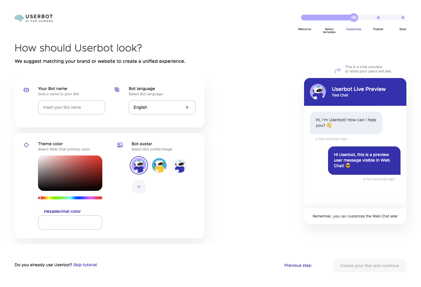
The Userbot screenshot places color configuration inside an onboarding step titled “How should Userbot look?” The page suggests matching the bot to the user’s brand or website. A theme-color panel contains a square color area, a hue track, and a field labeled “Hexadecimal color.” A chatbot preview appears on the right.
These two input routes support different tasks. Someone exploring an appearance can use visual controls. Someone carrying a brand specification needs a way to enter a precise value. If both routes exist, they should represent the same underlying selection and remain understandable as the user moves between them.
The static image also sets an important limit on interpretation. The picker visibly contains red tones while the chatbot preview shows purple elements, and the hexadecimal field appears empty. This capture does not demonstrate a synchronized live preview. Do not infer how the interface responds from the presence of the preview alone.
For your own flow, turn that uncertainty into a test case: choose a new hue, enter a known value, move focus away, and inspect the rendered component. Confirm which action commits the change and whether the preview corresponds to that committed value. A preview earns trust through consistency, not simply by occupying space beside a picker.
Exact entry is useful when users bring existing brand colors from a design system or a customer specification. Label the supported format and make its expected structure clear. Accepting an input should produce a recognizable result, while invalid values should receive an explanation close to the field.
Do not silently replace an invalid value with a different color. That can leave users believing they configured their brand correctly when the product applied a fallback. Preserve enough of the entered value for correction and make the effective color visible after validation.
If the product supports several formats, decide which one is displayed by default and how conversions are presented. More formats can help specialist users, but they also increase the interface’s complexity. Avoid adding format selectors merely because the underlying color library offers them.
Include a clear way to copy or reuse an existing value when that task matters. Teams often need the same accent in several settings. A readable text value can be more practical than asking users to visually recreate a color in a gradient repeatedly.
A useful preview contains the surfaces that will receive the color. For a chatbot, that may include a header, a message bubble, and text. For a tooltip or hotspot, show the background and foreground together. For a chart, show adjacent series rather than one isolated swatch.
Preview relevant states when the color participates in interaction. Hover, selection, disabled controls, and error messages may use related colors that are not visible in a default preview. Decide whether those values are independently editable or derived from the chosen accent, and explain consequential limitations.
Make the timing clear. An immediate preview can support exploration, while a save action may still be required to affect the live product. Label that distinction through the page’s controls and status messages. Users should not mistake an unsaved preview for a change already visible to customers.
Test the preview in representative backgrounds and themes. A color that looks effective on a white configuration page may become difficult to distinguish in a dark widget or alongside existing branding. The preview should represent the destination rather than flatter the selected value in an unrelated setting.
Where users choose both text and background colors, readability depends on the pair. Arcade’s two hotspot rows make that relationship visible. Your product should evaluate the actual combinations it renders, including links, icons, borders, and any state text placed on the chosen background.
A warning can explain a problematic pairing, but it needs a useful next step. Offer a suggested alternative, allow the user to adjust the relevant foreground, or constrain the range when the product cannot support arbitrary combinations responsibly. The right response depends on the purpose and requirements of the surface.
Do not use a color swatch as the only way to identify a value. Text labels, visible values, and selection markers help people compare and recover choices without relying entirely on color perception. Apply the same principle to a palette: a selected option needs a recognizable state beyond a subtle change in hue.
Color settings can belong to an individual object, a workspace default, or a broader brand configuration. Explain which level is being edited. If a widget inherits a team color, make the inherited value understandable before offering a local override.
Reset behavior deserves a precise definition. “Reset” might restore a product default, remove a local override, or return to the last saved value. Those actions can produce different results. Choose a label and confirmation behavior that match the actual consequence.
Shared settings also need appropriate authority. Arcade’s screenshot explicitly mentions team-admin access. In your own product, ensure that a person who cannot edit can still understand the applied appearance where necessary. A read-only swatch should not look like a broken interactive control.
For changes that affect published customer-facing assets, explain when the update reaches those assets. If existing objects keep their previous values while new objects inherit the default, say so. Users cannot infer inheritance rules from a color square.
A gradient surface is an efficient visual tool, but it should not be the only way to choose a value. Support a practical alternative through text entry or discrete palette choices where appropriate. Test that users can reach, identify, and adjust the relevant controls with a keyboard.
Give the trigger an understandable name. A tiny unlabeled swatch may be visually familiar to designers but ambiguous to other users. When the picker opens, keep its relationship to the original field clear and ensure that closing it returns people to a sensible point in the interface.
Test touch input, increased text size, long value strings, and constrained viewports. A popover that clips its controls or hides the confirmation button can make an otherwise simple setting unusable. Include the picker inside the real settings layout rather than testing it only in a component sandbox.
Test visual selection and exact entry separately, then test moving between them. Confirm that the stored value, displayed value, swatch, preview, and final rendered surface agree. Include invalid input, cancellation, reset, and returning to the page after a save.
For shared appearance settings, check both an authorized editor and a user without editing access. For onboarding, check whether users can proceed with defaults and whether an incomplete color field blocks the journey for a clear reason. These tests connect the component to the actual task it serves.
No. It is useful when users need to reproduce exact brand values. A constrained palette may be enough for lightweight organization or predefined themes. Choose the input route according to the task.
Immediate feedback can help users explore, provided the preview stays synchronized with the selected value. Make any separate save requirement clear so that experimentation is not confused with a published change.
Only if the product can support that flexibility in its rendered surfaces. A limited palette, paired foreground controls, or useful validation may better serve contexts where readability and consistency are essential.
Explore color picker examples on SaaSFrame to compare visual selection, exact entry, shared appearance settings, and previews in real SaaS interfaces.