Overall Style and Aesthetic
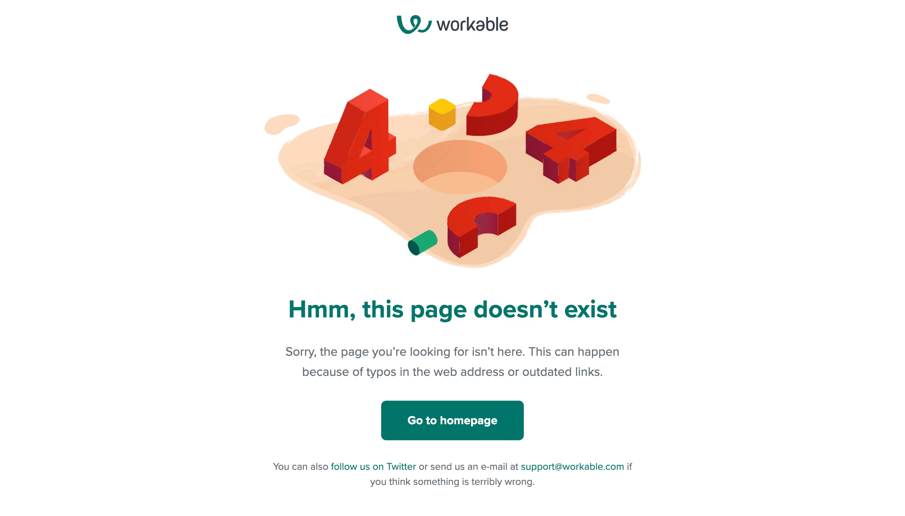
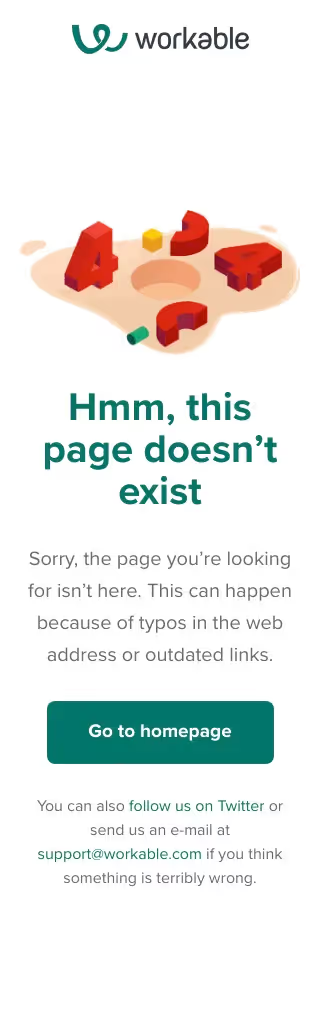
Workable’s 404 page epitomizes minimalist, modern design with a playful edge. The clean layout, judicious use of white space, and a singular focus create immediate clarity. The tone is approachable and subtly witty, transforming a potential frustration (a broken link) into a small delight for visitors. Layout and Structure
The structure is simple and intentional: a large hero section dominates, centered both vertically and horizontally in the viewport. There’s no clutter—no features, pricing, or testimonials—just pure focus on the message. At the bottom, a concise navigation footer offers paths back to key destinations like the homepage, Careers, and Support, maintaining usability. Visual Elements
A central illustration draws the eye—an isometric-style box with dashed lines, radiating a sense of curiosity and approachability. The absence of stock photos or distracting animations keeps users engaged without overwhelming them. This quirky graphic sets the tone, effortlessly turning a 404 error into a moment of brand personality. Color Palette and Typography
The palette is dominated by crisp whites and gentle greys, with accents of Workable’s signature rich teal-green. Typography is modern and highly readable: the main headline is bold and friendly, while supporting text offers gentle guidance. Visual hierarchy is clear—headline first, then explanation, then navigation. User Experience Patterns
Navigation is explicit and user-friendly, offering direct links to vital pages. Calls to action are subtle, supporting user recovery without hard-selling. There are no forms or unnecessary elements to clutter the experience. Unique or Notable Design Choices
What stands out is the creative use of negative space and a single uplifting illustration to transform a utilitarian error page into a memorable, brand-affirming touchpoint. The overall feel remains trustworthy, innovative, and gently playful—hallmarks of smart SaaS UI design.