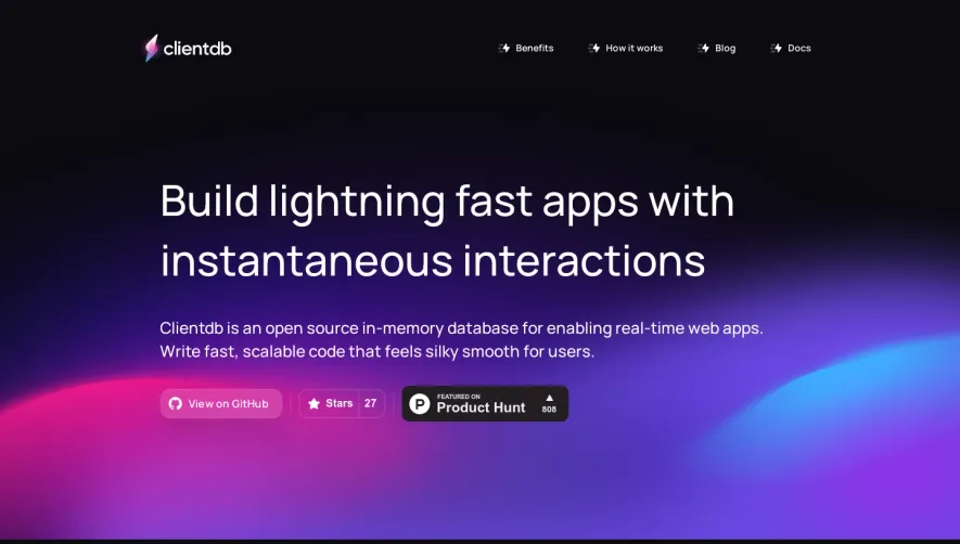
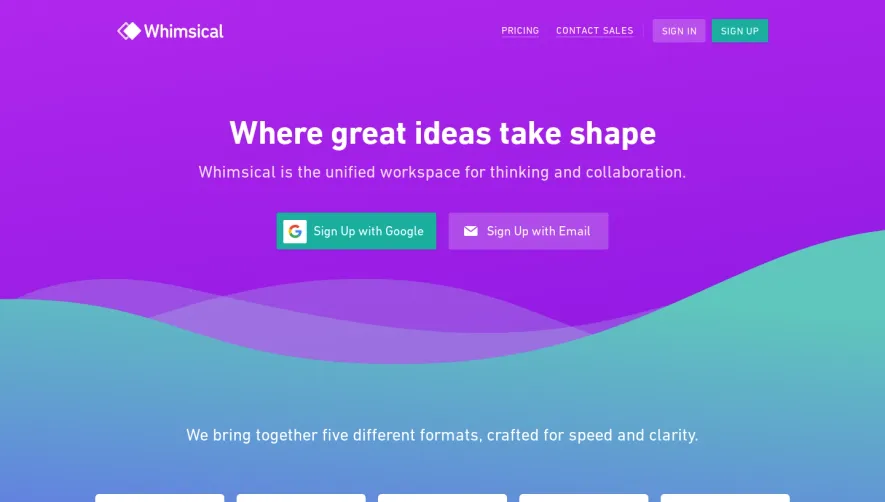
Generate a new design based on this screen using your own content.
Thank you! Your submission has been received!
Oops! Something went wrong while submitting the form.
# Design from Reference: Wope Landing Page
Create an original, high-fidelity visual design inspired by the reference. Prioritize composition, typography, colors, spacing, and component styling over technical implementation.
## Reference
- **Product:** Wope
- **Category:** Landing Page
- **Screenshot:** https://cdn.prod.website-files.com/5e9dc792e1210c5325f7ebbc/63eb6f7b9776e8910b97e506_oIB73I65gVMQCRi_EbHzRMTv3L2Z1QyHlLoHSAyNBxU.webp
Analyze the screenshot first. If inaccessible, request it rather than guessing.
## Content
{{content.instructions}}
{{content.data}}
Preserve essential messaging and factual accuracy. Adapt structure and copy length for visual balance; never invent product claims.
## Visual Design
Use this context to reproduce the reference's visual language: layout, typography, colors, spacing, borders, radii, and distinctive elements. The screenshot takes priority if descriptions conflict.
## Direction
{{preferences.fidelityInstructions}}
## Output
{{output.instructions}}
Deliver a polished, cohesive design with precise alignment, hierarchy, and spacing. Produce the requested visual artifact, not just a description. If unsupported, explain the limitation.
WOPE’s homepage embraces a sleek, modern minimalism that exudes confidence and clarity. The interface feels crisp and thoughtfully restrained, using generous white space to emphasize content while projecting a tech-forward, trustworthy presence. Every visual element feels purposeful, contributing to an aesthetic that’s both professional and subtly playful.
Layout and Structure
The site features a high-impact hero section with a concise headline, animated product preview, and a prominent call to action. Scrolling reveals neatly segmented sections: feature highlights, visualized workflows, direct testimonials, a tastefully presented pricing table, and a footer laden with useful links. Each content block is well contained and employs gentle animation for smooth storytelling and flow.
Visual Elements
Custom illustrations and micro-animations infuse the product story with movement and energy. Interactive feature sliders and compelling demo videos further explain value without overwhelming the user. Delicate iconography supports key points, while visual hierarchy maintains focus on conversion elements.
Color Palette and Typography
WOPE’s color scheme leans on bright whites, deep slate, and saturated accent colors—like vivid purples and blues—for both emphasis and accessibility. Typography is clean and legible, using a geometric sans-serif for headers and body copy, establishing a sense of modernity and clarity. Font sizing and weight guide the eye seamlessly from headline to supporting detail.
User Experience Patterns
Navigational elements are sticky for easy access, and calls to action are strategically repeated. Dynamic content reveals, interactive demos, and light-touch forms ensure interaction feels effortless. Smooth scroll effects enhance engagement without distracting from content.
Unique or Notable Design Choices
WOPE stands out for its playful use of animation to demonstrate software features directly in the hero and product sections. The blend of bold color with ample negative space creates a memorable brand impression, while subtle hover effects and contextual tooltips keep the UX both informative and delightful. The overall tone combines innovation with dependability—inviting yet credible, and perfect for SaaS inspiration.