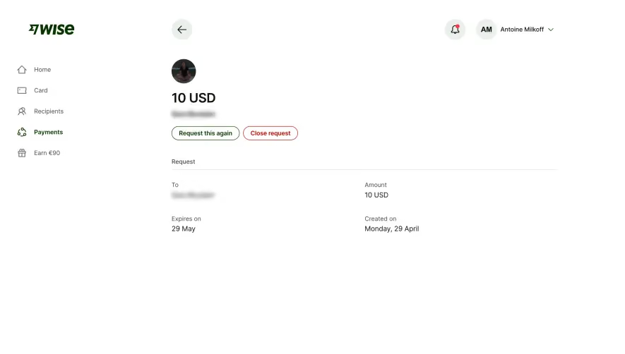
Generate a new design based on this screen using your own content.
Thank you! Your submission has been received!
Oops! Something went wrong while submitting the form.
# Design from Reference: Wise Send Payment Request
Create an original, high-fidelity visual design inspired by the reference. Prioritize composition, typography, colors, spacing, and component styling over technical implementation.
## Reference
- **Product:** Wise
- **Category:** Add & Edit
- **Screenshot:** https://cdn.prod.website-files.com/5e9dc792e1210c5325f7ebbc/6aca27e5aca7079066e8e76e_6aca2701aca7079066e89ee7_cms-0537a9512f5d1859746ab092.webp
Analyze the screenshot first. If inaccessible, request it rather than guessing.
## Content
{{content.instructions}}
{{content.data}}
Preserve essential messaging and factual accuracy. Adapt structure and copy length for visual balance; never invent product claims.
## Visual Design
Use this context to reproduce the reference's visual language: layout, typography, colors, spacing, borders, radii, and distinctive elements. The screenshot takes priority if descriptions conflict.
## Direction
{{preferences.fidelityInstructions}}
## Output
{{output.instructions}}
Deliver a polished, cohesive design with precise alignment, hierarchy, and spacing. Produce the requested visual artifact, not just a description. If unsupported, explain the limitation.
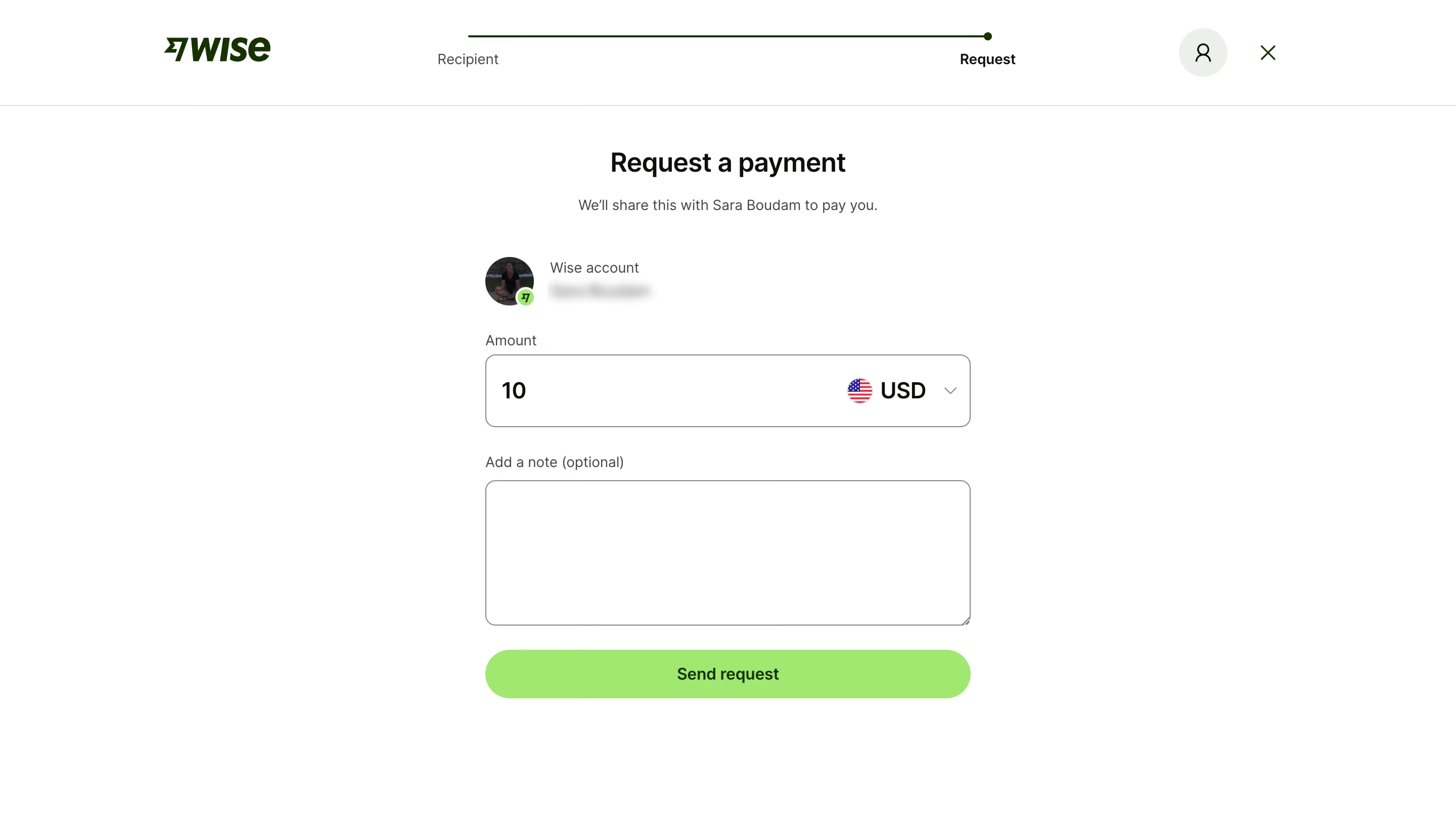
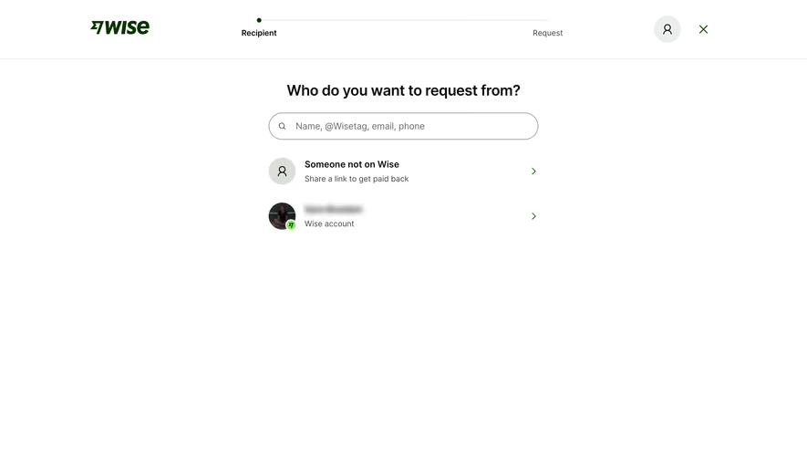
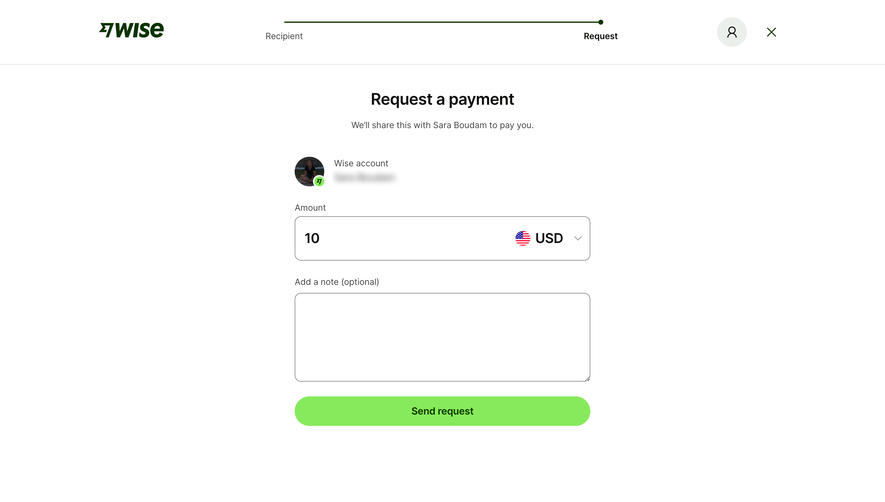
Wise keeps things dead simple here. The "Request a payment" flow is stripped down to exactly what you need and nothing else. A two-step progress bar at the top gives you instant orientation. Recipient done, now you're on Request. That's it.
Trust in the Details
The recipient card with the profile photo and Wise badge feels personal without being cluttered. You immediately know who you're requesting money from. The amount field is bold and large, making the "10 USD" entry feel intentional and confident. That currency dropdown with the flag icon is a small touch that does a lot of heavy lifting for international context.
That Green Button Though
The lime green "Send request" CTA practically vibrates against the white background. It's impossible to miss and feels satisfying to click. The whole page uses generous whitespace to let each element breathe. Typography is clean, hierarchical, no decorative nonsense. The optional note field is there but doesn't demand attention. This is form design that respects people's time. Wise understands that fewer decisions equals faster conversions.