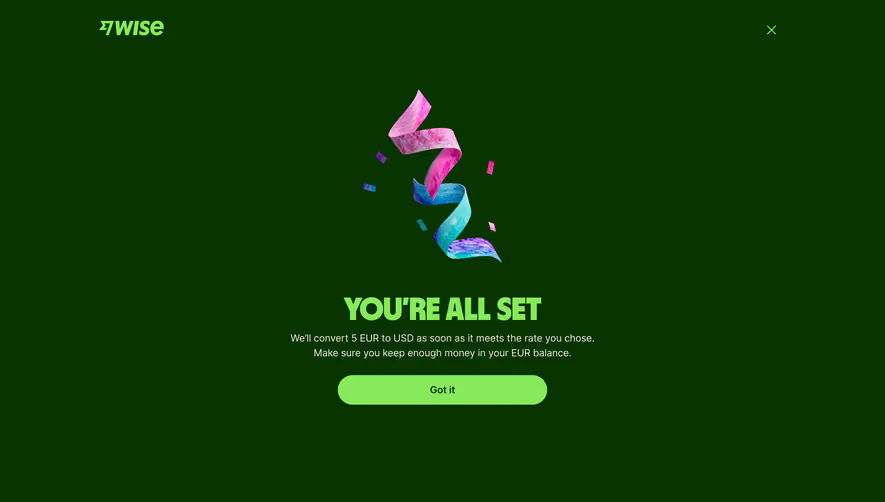
Generate a new design based on this screen using your own content.
Thank you! Your submission has been received!
Oops! Something went wrong while submitting the form.
# Design from Reference: Wise Review & Confirm Conversion
Create an original, high-fidelity visual design inspired by the reference. Prioritize composition, typography, colors, spacing, and component styling over technical implementation.
## Reference
- **Product:** Wise
- **Category:** Confirmation
- **Screenshot:** https://cdn.prod.website-files.com/5e9dc792e1210c5325f7ebbc/662fbf1a84d68c1f04fc7da1_hMNfaVsBF1fJNXel4T75bAWaV-Ew3EIT-e_0uZ9WbOs.webp
Analyze the screenshot first. If inaccessible, request it rather than guessing.
## Content
{{content.instructions}}
{{content.data}}
Preserve essential messaging and factual accuracy. Adapt structure and copy length for visual balance; never invent product claims.
## Visual Design
Use this context to reproduce the reference's visual language: layout, typography, colors, spacing, borders, radii, and distinctive elements. The screenshot takes priority if descriptions conflict.
## Direction
{{preferences.fidelityInstructions}}
## Output
{{output.instructions}}
Deliver a polished, cohesive design with precise alignment, hierarchy, and spacing. Produce the requested visual artifact, not just a description. If unsupported, explain the limitation.
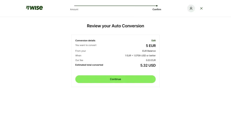
Wise keeps things dead simple here. The "Review your Auto Conversion" page strips away every distraction and puts one card front and center. White space does all the heavy lifting. Your eye lands on the bold 5 EUR at the top right of the card, then naturally scans down through the conversion details to the estimated total of 5.32 USD. That hierarchy is tight.
The Green Button Pulls You In
That lime green "Continue" button is doing serious work. It's the only color on the entire page besides the dark Wise logo, so it absolutely dominates attention. The rounded shape and generous padding make it feel tappable even on desktop. Smart move.
Typography That Stays Out of the Way
The type system is minimal. Left-aligned labels in regular weight, right-aligned values in bold. The progress bar up top with "Amount" and "Confirm" steps is subtle but orients you instantly. Fee transparency at 0.03 EUR feels intentionally visible without being noisy. Everything here serves one goal: get the user to confirm with zero friction. No decoration, no fluff. Just clarity.