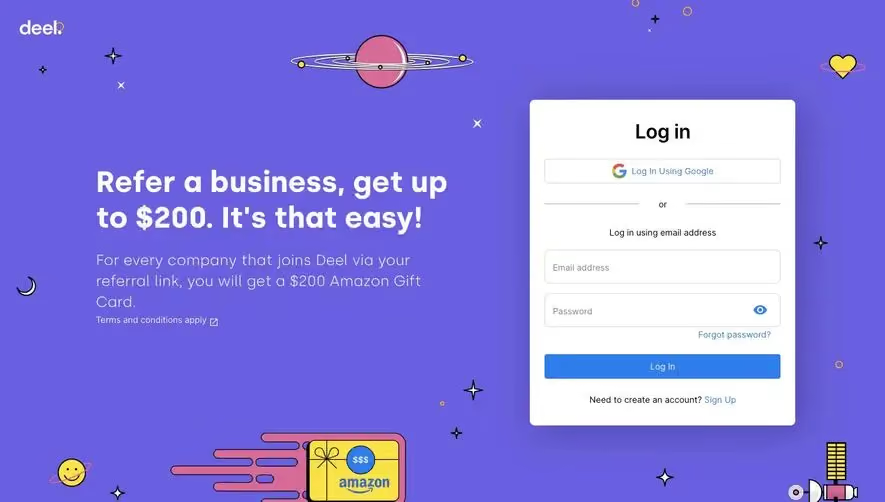
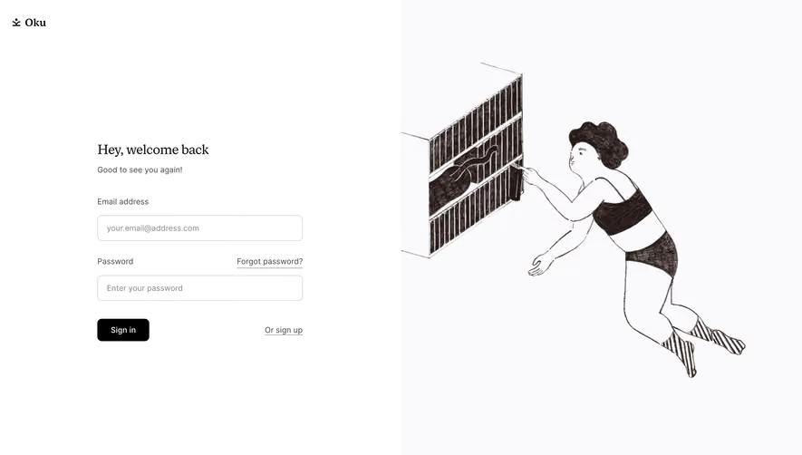
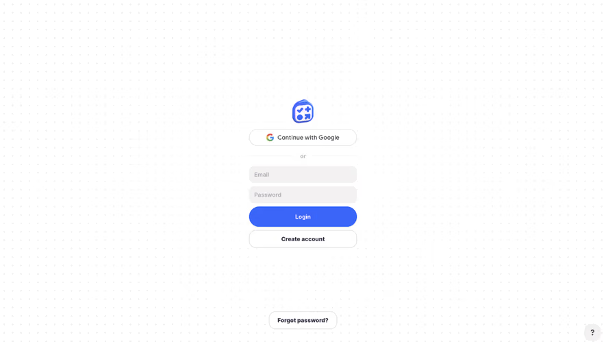
Generate a new design based on this screen using your own content.
Thank you! Your submission has been received!
Oops! Something went wrong while submitting the form.
# Design from Reference: Wise Login
Create an original, high-fidelity visual design inspired by the reference. Prioritize composition, typography, colors, spacing, and component styling over technical implementation.
## Reference
- **Product:** Wise
- **Category:** Login
- **Screenshot:** https://cdn.prod.website-files.com/5e9dc792e1210c5325f7ebbc/6acad793fbf1299940aab4e3_6acad311c2028efdec71919d_cms-26f7499d22c4f4391fde8216.webp
Analyze the screenshot first. If inaccessible, request it rather than guessing.
## Content
{{content.instructions}}
{{content.data}}
Preserve essential messaging and factual accuracy. Adapt structure and copy length for visual balance; never invent product claims.
## Visual Design
Use this context to reproduce the reference's visual language: layout, typography, colors, spacing, borders, radii, and distinctive elements. The screenshot takes priority if descriptions conflict.
## Direction
{{preferences.fidelityInstructions}}
## Output
{{output.instructions}}
Deliver a polished, cohesive design with precise alignment, hierarchy, and spacing. Produce the requested visual artifact, not just a description. If unsupported, explain the limitation.
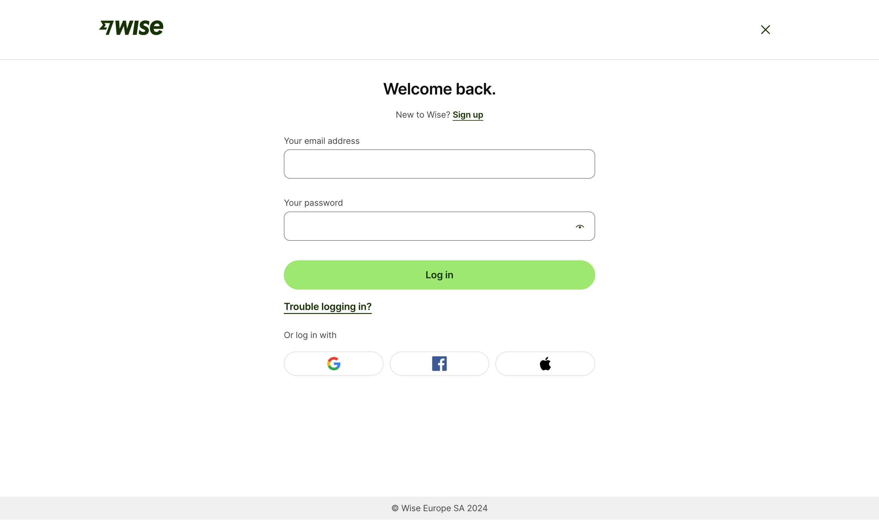
This is Wise's login page and it's a masterclass in restraint. The first thing that grabs you is that bright green "Log in" button. It pops hard against the white background and naturally pulls your eye down the page exactly where it needs to go.
Typography That Breathes
"Welcome back." as a headline is warm and human. The period at the end feels intentional, almost conversational. They're using a bold serif-style font for the heading paired with clean sans-serif body text. The hierarchy is dead simple: headline, subtitle with a "Sign up" link, two input fields, button. Done. No clutter, no distractions.
Smart Little Details
The password field has that eye icon for visibility toggle, which is expected but well-placed. Social login options at the bottom use recognizable brand icons for Google, Facebook, and Apple without labels. They trust the icons to do the work. The "Trouble logging in?" link sits right below the CTA without competing for attention. The Wise logo anchored top-left with a close X on the right gives it an overlay modal feel. Everything serves the single goal: get you logged in fast.