




```html

Thank you! Your submission has been received!
Oops! Something went wrong while submitting the form.
Get SaaSFrame Pro
Monthly
$18
Quarterly
$48
Yearly
$180
Upgrade to access this feature
Browse all screens & flows
Filter and search screens & flows
Access Figma files
Access mobile versions
Bookmark screens & flows
Join now
Weglot Customers Page

Weglot
Translate your website
Designed by
No items found.

Bookmark
Bookmark
Design with AI
Thank you! Your submission has been received!
Oops! Something went wrong while submitting the form.
# Design from Reference: Weglot Customers Page
Create an original, high-fidelity visual design inspired by the reference. Prioritize composition, typography, colors, spacing, and component styling over technical implementation.
## Reference
- **Product:** Weglot
- **Category:** Customers Page
- **Screenshot:** https://cdn.prod.website-files.com/5e9dc792e1210c5325f7ebbc/62ec9c88bf75bbc057ce6ea9_1659625236858-screenshot-device-ef6bd02e5a7863d186313fb8065a01a1-1659605284521.webp
Analyze the screenshot first. If inaccessible, request it rather than guessing.
## Content
{{content.instructions}}
{{content.data}}
Preserve essential messaging and factual accuracy. Adapt structure and copy length for visual balance; never invent product claims.
## Visual Design
### Overall aesthetic
- **Style:** A social-proof-heavy customers page combines white and pale lavender surfaces, dark indigo text and electric blue-violet actions.
- **Character:** Customer logos, website screenshots and portrait testimonials provide visual variety within a consistent, spacious card system.
### Page composition
- **Capture:** The source measures 1440 × 7509 pixels. Dimensions below approximate image pixels; CSS scale is unverified.
- **Header:** A centered navigation row includes brand, language selector, product links, active Customers item, login and a filled trial capsule.
- **Hero:** A large centered two-line claim has a blue-emphasized opening phrase, muted subtitle and ten monochrome customer logos arranged in two rows.
- **Featured story:** A centered section heading precedes a roughly 1060-pixel-wide bordered panel with a large website image left and customer logo, category chips, summary, quotation and attribution right.
- **Story grid:** Nineteen smaller customer cards form three columns, with one card in the final row. Each combines logo, two tags, website screenshot and centered outcome copy.
- **Testimonials:** A pale lavender full-width band contains four testimonials in a two-by-two layout, using portraits or a brand tile above italic quotations and attribution.
- **Closing:** A wide dark indigo gradient CTA panel precedes the footer. The footer contains brand, four link groups, newsletter row, social icons and legal line, with floating corner controls.
### Information hierarchy
- **Hero:** Large bold text and selective blue emphasis establish the main message; the logo grid supports it beneath.
- **Featured example:** Its much larger image and more detailed quotation distinguish it from the repeated card grid.
- **Card structure:** Brand identity leads, category/platform tags classify, and bold phrases emphasize outcomes within regular description text.
- **Testimonials:** Bold italic quotations form a strong lower-page proof layer.
- **Final action:** White centered copy and a bright capsule stand out against the dark CTA surface.
### Typography
- **Family:** Neutral sans serif throughout; exact identity is unverified.
- **Hero:** Approximately 48 pixels, bold, with tight 50-pixel leading; subtitle around 22 pixels.
- **Section heading:** Approximately 36 pixels, bold, usually spanning two lines.
- **Card copy:** Around 16 pixels with 24-pixel leading; selected outcome phrases are bold.
- **Featured summary:** Approximately 20 pixels, with smaller italic quotation and 14-pixel attribution.
- **Testimonials:** Around 20 pixels, bold italic, with generous leading. Footer links and tags are about 14 pixels.
### Colors & surfaces
- **Measured base:** White #FFFFFF and pale lavender #EDEEFF dominate the page.
- **Soft variants:** Samples include #EDEFFE, #EEF0FF and #F8F9FF in gently varying light regions.
- **Ink and action:** Dark indigo text contrasts with vivid blue-violet links and buttons; exact accent hex values were not isolated in the dominant-color samples.
- **CTA:** A dark navy-to-purple gradient carries faint circular forms and blue dot motifs.
- **Borders and depth:** Very light lavender outlines define customer cards. Portrait tiles and the floating chat control have soft shadows.
### Components
- **Navigation CTA:** A blue-violet capsule about 135 × 40 pixels; the selected Customers text uses the accent color.
- **Featured panel:** Thin pale outline, small rounded corners and internal two-column layout. Small carousel dots appear over the large image.
- **Story cards:** Approximately 305 pixels wide and 470–490 pixels high, with around 24-pixel inner padding, small corner radius and no strong shadow.
- **Tags:** Two light-lavender capsules display sector and platform in blue-violet text.
- **Website imagery:** Landscape screenshots sit between tags and copy, with consistent widths but some variation in visible image proportions.
- **See more:** A small centered outlined capsule follows the last card row.
- **Testimonial artwork:** Rounded portrait or logo tiles sit over small peach, blue and dotted decorative shapes.
- **Closing CTA:** Roughly 1140 × 345 pixels with 16-pixel corners, centered eyebrow, two-line supporting pitch and filled trial capsule.
- **Newsletter:** A horizontal email field with arrow action sits opposite its heading and short description.
- **Floating controls:** A circular video-style welcome bubble sits bottom right; a smaller dark circular utility control sits bottom left.
### Visual rhythm
- **Grid cadence:** Broad column gaps and generous row gaps prevent the long card collection from feeling dense.
- **Internal card rhythm:** Logos, tags, screenshots and descriptions repeat in the same vertical order, with centered alignment.
- **Section transitions:** Large whitespace gaps lead into the testimonial band and final dark CTA.
- **Footer rhythm:** Fine horizontal rules divide link navigation, newsletter and legal rows.
### Responsive
- **Evidence:** Only a wide desktop page is shown; mobile layout and carousel behavior are unverified.
- **Recommended grid:** Reduce three customer columns to two and then one, preserving card reading order.
- **Recommended featured story:** Stack the image and narrative; avoid shrinking the embedded screenshot beyond readability.
- **Recommended testimonials:** Use one column on narrow screens and keep quotation line lengths comfortable.
- **Footer and overlays:** Stack newsletter controls and link groups; keep floating bubbles clear of essential actions.
### Adaptation guidance
- **Preserve:** Retain pale lavender proof regions, indigo text, blue-violet actions and the consistent customer-card anatomy.
- **Build:** Use separate featured-story, standard-story and testimonial components, with flexible heights for varied copy.
- **Content fidelity:** Treat metrics, logos and quotations as visible page content rather than independently verified product claims.
- **Images:** Use supplied customer assets and maintain their proportions; do not invent unseen website details.
- **Interaction:** Define card links, carousel, See more, newsletter and floating controls explicitly; only visual states are established.
Use this context to reproduce the reference's visual language: layout, typography, colors, spacing, borders, radii, and distinctive elements. The screenshot takes priority if descriptions conflict.
## Direction
{{preferences.fidelityInstructions}}
## Output
{{output.instructions}}
Deliver a polished, cohesive design with precise alignment, hierarchy, and spacing. Produce the requested visual artifact, not just a description. If unsupported, explain the limitation.
Category
Patterns
No items found.
Tech Stack
Added on
May 30, 2020
Similar screens
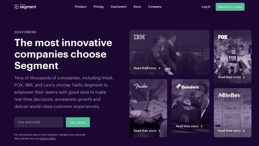




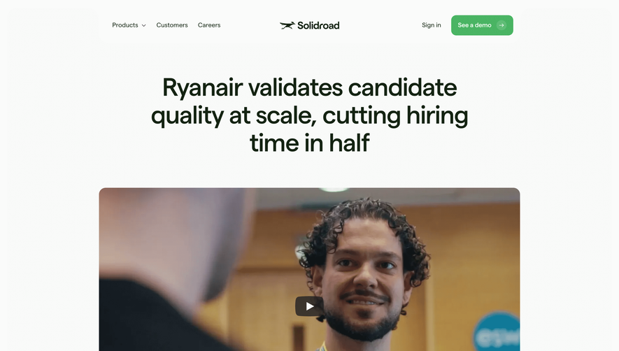

Upgrade to SaaSFrame Pro now to see similar examples.
Monthly
$18 /month
Billed $18 monthly
Browse all screens & flows
Filter and search screens & flows
Search text in screenshots
Access Figma files
Access mobile versions
Join now
Quarterly
$16 /month
Billed $48 quarterly
Browse all screens & flows
Filter and search screens & flows
Search text in screenshots
Access Figma files
Access mobile versions
Join now
Yearly
$15 /month
Billed $180 yearly
Browse all screens & flows
Filter and search screens & flows
Search text in screenshots
Access Figma files
Access mobile versions
Join now