Design with AI
Generate a new design based on this screen using your own content.
# Design from Reference: Webflow New Features Emails
Create an original, high-fidelity visual design inspired by the reference. Prioritize composition, typography, colors, spacing, and component styling over technical implementation.
## Reference
- **Product:** Webflow
- **Category:** Product Update Emails
- **Screenshot:** https://cdn.prod.website-files.com/5e9dc792e1210c5325f7ebbc/6acbbf744d71070f5fd4146c_6acbbe9b7ce271b1287034d6_cms-890d7b0fef26fcc9e7918436.webp
Analyze the screenshot first. If inaccessible, request it rather than guessing.
## Content
{{content.instructions}}
{{content.data}}
Preserve essential messaging and factual accuracy. Adapt structure and copy length for visual balance; never invent product claims.
## Visual Design
### Overall aesthetic
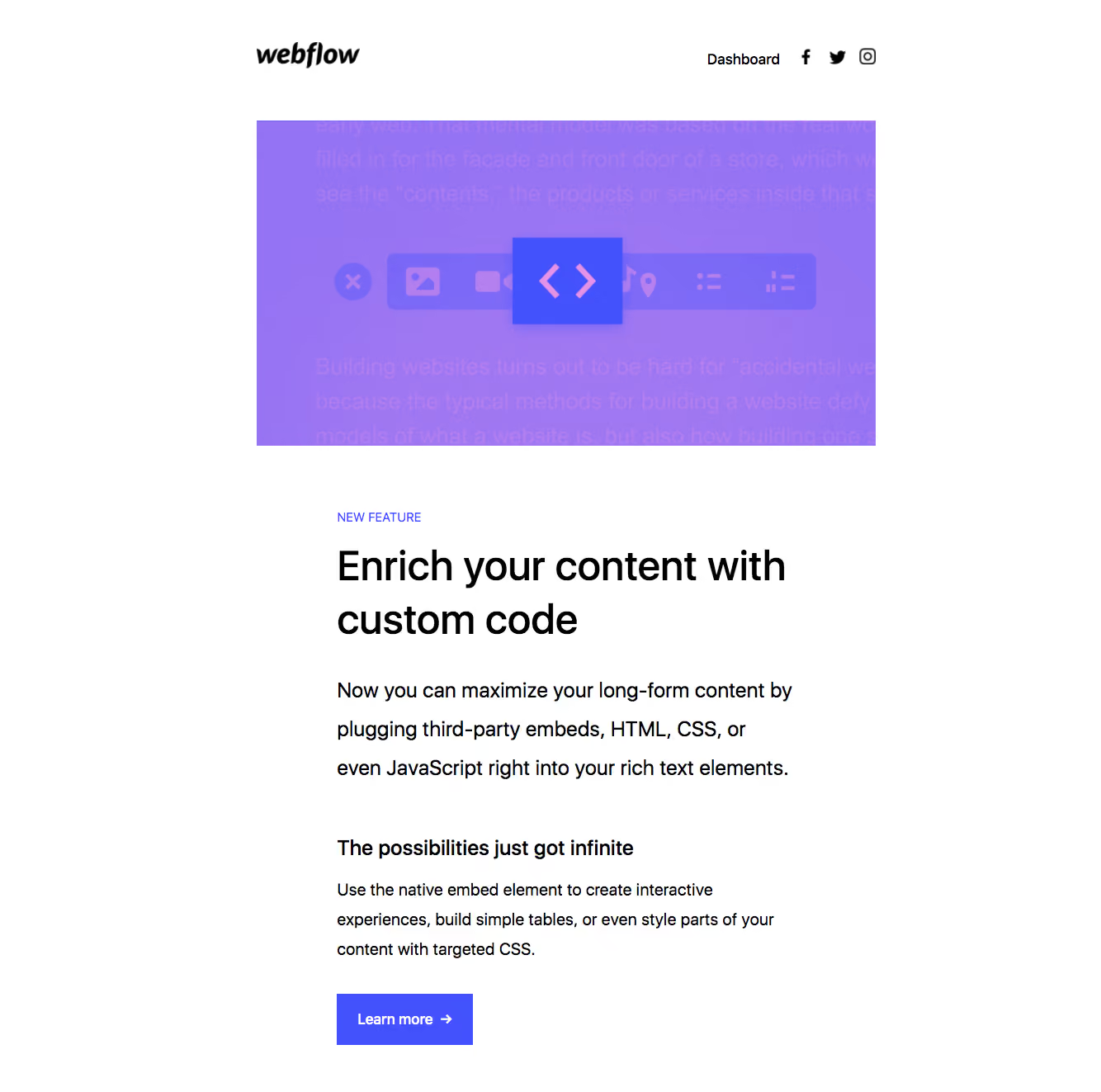
- **Style:** Clean product-update email with a white background, purple feature artwork and a strong black typographic hierarchy.
- **Character:** Spacious editorial message introduces one feature and closes with a single purple action.
### Page composition
- **Canvas:** Source 1334 × 1323 pixels, inspected at native size. Email-client zoom and CSS scale are unverified.
- **Header:** Roughly 750px-wide row at x311, with black wordmark left and dashboard/social links right.
- **Hero artwork:** Approximately 750 × 394px image begins around y146.
- **Message:** Narrower roughly 556px reading column begins at x408, y621, with category label, two-line heading, lead paragraph, subheading, supporting paragraph and action.
- **Extent:** The supplied image ends below the CTA; no additional footer is visible.
### Information hierarchy
- **Feature category:** Small purple uppercase label introduces the message.
- **Primary title:** Large two-line custom-code heading is the dominant text element.
- **Lead:** Larger explanatory paragraph follows, describing the feature in several lines.
- **Detail:** A bold short subheading and smaller supporting paragraph explain potential usage.
- **Action:** Learn more is the only visible button.
### Typography
- **Heading:** Approximately 50px medium sans serif, around 64px line height and tight tracking.
- **Lead:** Approximately 25px regular with about 47px line spacing.
- **Subheading:** Around 25px semibold.
- **Supporting text:** Approximately 21px regular, around 36px line height.
- **Utility roles:** Category around 14px uppercase; header/button around 18px. Exact font family is unverified.
### Colors & surfaces
- **Measured base:** #FFFFFF white with #000000 and #000001 black text/artwork.
- **Measured accent:** #4352FC vivid blue-violet action/artwork tone.
- **Measured artwork shades:** #9774F4, #9673F3, #9473F5 and #9F77F2 supply the purple hero gradient range.
- **Surface treatment:** No enclosing card, visible shadow or tinted message panel; artwork and whitespace provide structure.
### Components
- **Header wordmark:** Black italic brand artwork, separate from the message font.
- **Social controls:** Three small black social icons aligned after the dashboard link.
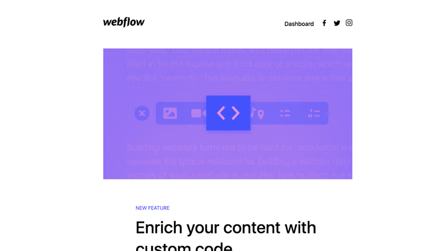
- **Feature image:** Purple gradient field with faint content lines, a horizontal editing-tool strip and raised-looking central code symbol.
- **CTA:** Approximately 165 × 63px, solid violet, square corners, bold white label and right arrow.
- **States:** Static email only; link destinations, hover and feature interaction are not demonstrated.
### Visual rhythm
- **Header/image:** Approximately 60px separates header baseline and artwork top.
- **Image/message:** Around 80px separates artwork bottom and category label.
- **Text rhythm:** Compact label-to-heading spacing, then broad gaps before lead and detail blocks.
- **CTA spacing:** Around 35–40px follows the supporting paragraph before the action.
- **Alignment:** Main message uses a narrower left edge than the image/header wrapper, forming an inset editorial column.
### Responsive
- **Observed scope:** One email rendering only; mobile behavior is unverified.
- **Recommended width:** Use fluid image width and a max-width email container.
- **Recommended text:** Reduce the apparent desktop heading/lead scale on mobile, keeping comfortable line height.
- **Recommended controls:** Allow header links to wrap and maintain a comfortably tappable CTA.
### Adaptation guidance
- **Preserve:** One-feature focus, large purple artwork, clear title/lead/detail hierarchy and one primary action.
- **Assets:** Replace artwork and feature copy with supplied content; do not infer implementation from the illustrated editor.
- **Implementation:** Use email-compatible layout and inline styling, with descriptive image alternatives.
- **Restraint:** Keep the message uncluttered and avoid adding unsupported footer or secondary content.
Use this context to reproduce the reference's visual language: layout, typography, colors, spacing, borders, radii, and distinctive elements. The screenshot takes priority if descriptions conflict.
## Direction
{{preferences.fidelityInstructions}}
## Output
{{output.instructions}}
Deliver a polished, cohesive design with precise alignment, hierarchy, and spacing. Produce the requested visual artifact, not just a description. If unsupported, explain the limitation.