Generate a new design based on this screen using your own content.
Thank you! Your submission has been received!
Oops! Something went wrong while submitting the form.
# Design from Reference: Visitors Delete
Create an original, high-fidelity visual design inspired by the reference. Prioritize composition, typography, colors, spacing, and component styling over technical implementation.
## Reference
- **Product:** Visitors
- **Category:** Delete
- **Screenshot:** https://cdn.prod.website-files.com/5e9dc792e1210c5325f7ebbc/697b75becd83044f1a88d8f6_6710yiCm7mi1smkO52-y-gXR9Sl1HrXdfC2oLtp4IG0.avif
Analyze the screenshot first. If inaccessible, request it rather than guessing.
## Content
{{content.instructions}}
{{content.data}}
Preserve essential messaging and factual accuracy. Adapt structure and copy length for visual balance; never invent product claims.
## Visual Design
Use this context to reproduce the reference's visual language: layout, typography, colors, spacing, borders, radii, and distinctive elements. The screenshot takes priority if descriptions conflict.
## Direction
{{preferences.fidelityInstructions}}
## Output
{{output.instructions}}
Deliver a polished, cohesive design with precise alignment, hierarchy, and spacing. Produce the requested visual artifact, not just a description. If unsupported, explain the limitation.
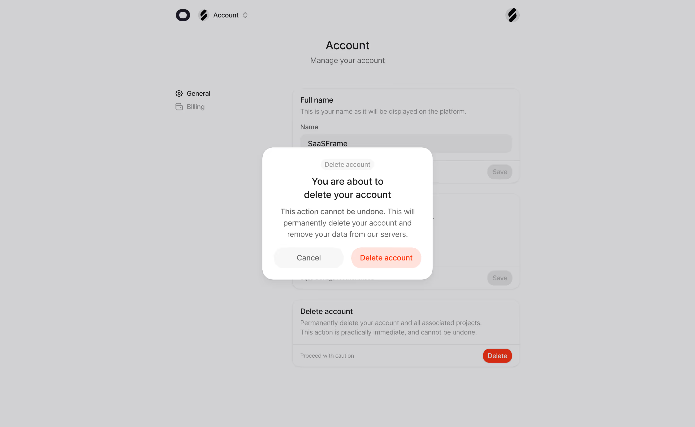
The dimmed background with that floating confirmation dialog is doing exactly what it should. It stops you cold. The red "Delete account" button contrasts hard against the soft white card, and the "Cancel" button is deliberately understated in gray. Smart hierarchy. You know which one they want you to pick.
Clean Account Settings With Zero Clutter
Behind the modal, the account page is dead simple. Left sidebar with just two options: General and Billing. No bloated mega-menu, no unnecessary icons everywhere. The content cards have generous padding and clear section labels like "Full name" and "Delete account" with helpful subtext underneath. Typography is straightforward, likely Inter or something similarly neutral. Everything breathes.
What Makes It Stand Out
That bottom "Delete account" card is worth noting. The red "Delete" button sits isolated on the right with "Proceed with caution" as a label. It feels intentionally ominous without being dramatic. The whole page uses a warm gray overlay that keeps focus tight on the modal. Restraint is the design choice here, and it works.