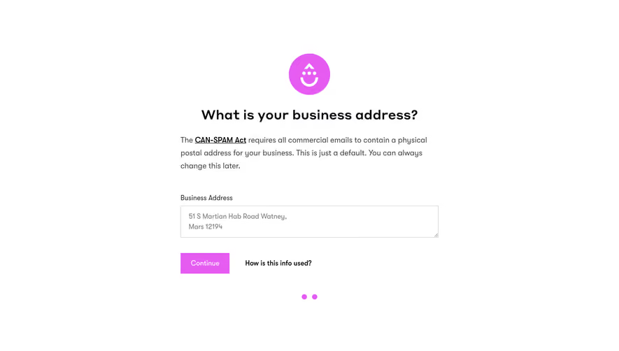
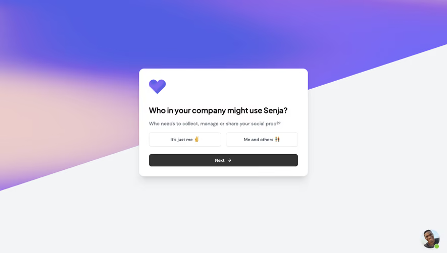
Generate a new design based on this screen using your own content.
Thank you! Your submission has been received!
Oops! Something went wrong while submitting the form.
# Design from Reference: Visitors Account Name
Create an original, high-fidelity visual design inspired by the reference. Prioritize composition, typography, colors, spacing, and component styling over technical implementation.
## Reference
- **Product:** Visitors
- **Category:** Account Setup
- **Screenshot:** https://cdn.prod.website-files.com/5e9dc792e1210c5325f7ebbc/697b75afcf9cb012bdc57e2f_QpjXFz_RrZKtu4BcfRH0XrGMjd2G0pLabVFA3mL7oNI.avif
Analyze the screenshot first. If inaccessible, request it rather than guessing.
## Content
{{content.instructions}}
{{content.data}}
Preserve essential messaging and factual accuracy. Adapt structure and copy length for visual balance; never invent product claims.
## Visual Design
Use this context to reproduce the reference's visual language: layout, typography, colors, spacing, borders, radii, and distinctive elements. The screenshot takes priority if descriptions conflict.
## Direction
{{preferences.fidelityInstructions}}
## Output
{{output.instructions}}
Deliver a polished, cohesive design with precise alignment, hierarchy, and spacing. Produce the requested visual artifact, not just a description. If unsupported, explain the limitation.
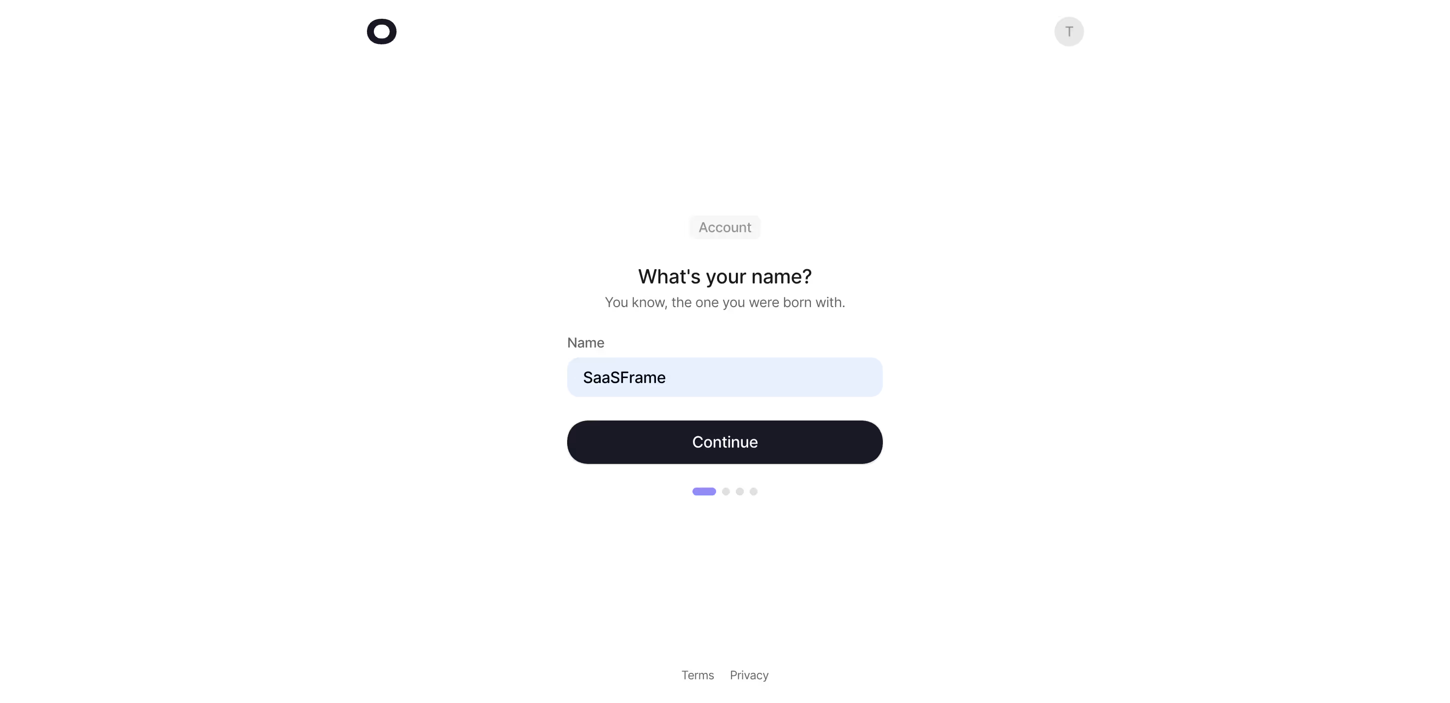
This onboarding flow from what appears to be a project management or SaaS tool nails the art of reducing friction. The page asks exactly one thing: your name. That's it. No overwhelming forms, no twelve fields staring you down. The subtitle "You know, the one you were born with" adds a bit of personality without trying too hard.
Clean to the Point of Calm
The layout is dead center, tons of whitespace breathing around a single input field and a chunky black "Continue" button. The input has a soft blue highlight that feels intentional and warm. Typography is sharp, likely a geometric sans-serif, with clear hierarchy between the heading, subtext, and label. The "Account" pill tag up top gives context without cluttering anything.
Progress Without Pressure
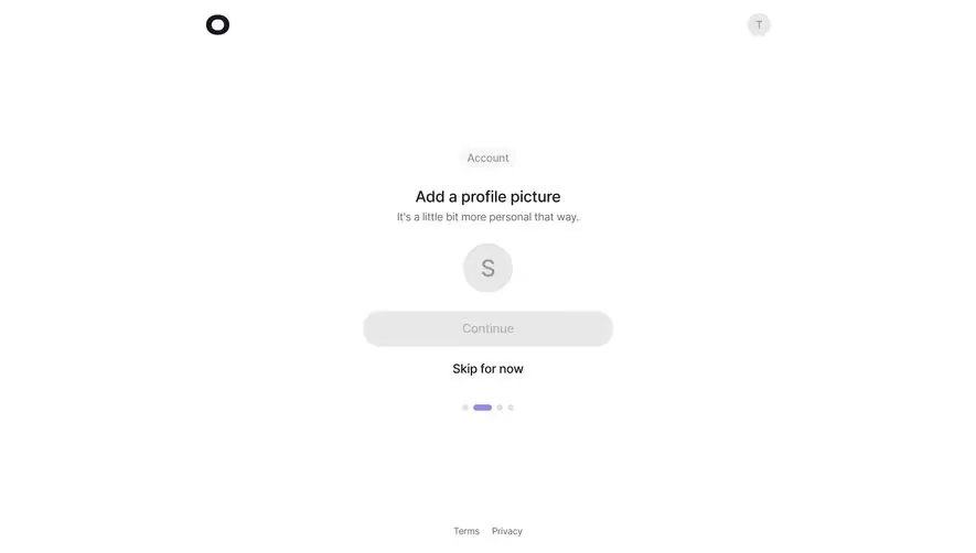
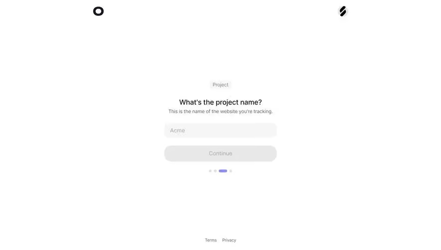
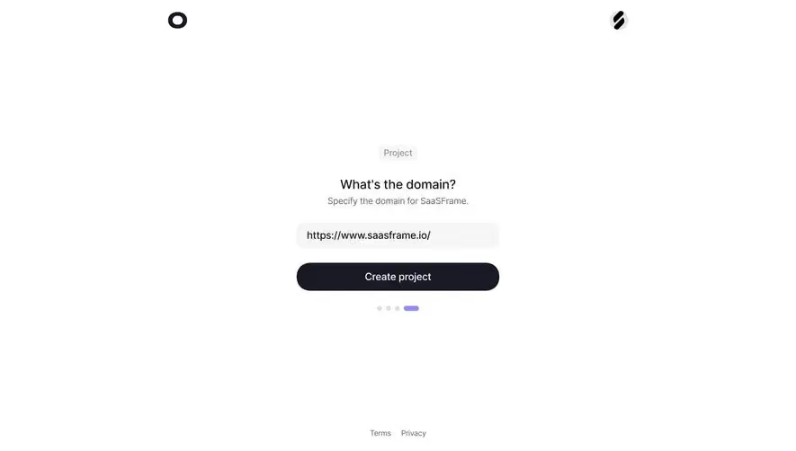
That dot-based stepper at the bottom is doing quiet but important work. You're on step one of four, and the purple active indicator tells you exactly where you stand. Small detail, big impact. The whole thing feels like a conversation, not a form.