Design with AI
Generate a new design based on this screen using your own content.
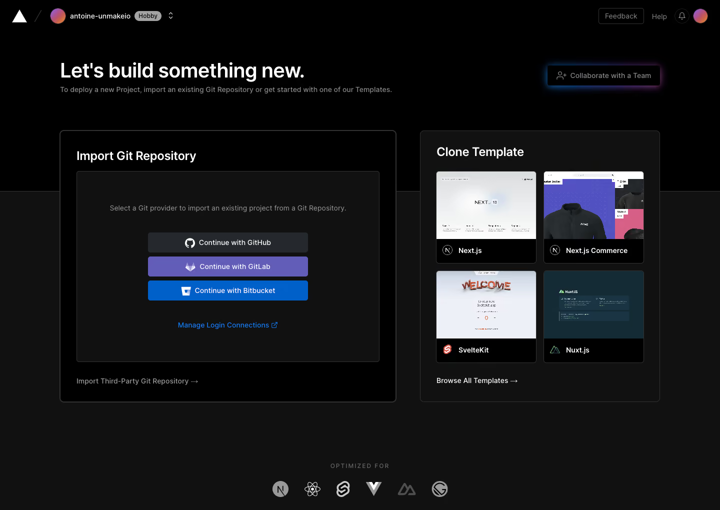
# Design from Reference: Vercel Welcome screen
Create an original, high-fidelity visual design inspired by the reference. Prioritize composition, typography, colors, spacing, and component styling over technical implementation.
## Reference
- **Product:** Vercel
- **Category:** Welcome Screen
- **Screenshot:** https://cdn.prod.website-files.com/5e9dc792e1210c5325f7ebbc/6acbbeba39e7f22db40287a8_6acbbdf6d6be908889c50d4d_cms-a54a019e5960df2dd6426235.webp
Analyze the screenshot first. If inaccessible, request it rather than guessing.
## Content
{{content.instructions}}
{{content.data}}
Preserve essential messaging and factual accuracy. Adapt structure and copy length for visual balance; never invent product claims.
## Visual Design
### Overall aesthetic
- **Character:** Dark developer welcome screen with two clear project-start paths, subtle borders and provider-specific color accents.
- **Evidence and scale:** Screenshot measures 1440 × 1020 image pixels. Sizes estimate 1× CSS capture; DPR and exact font identity are unverified.
### Page composition
- **Header:** Brand/workspace/tier context left and feedback/help/notification/account utilities right.
- **Introduction:** Large left-aligned heading and short explanation pair with a glowing team-collaboration control at right.
- **Main choices:** Wide Import Git Repository panel at left and narrower Clone Template panel at right.
- **Import content:** Provider explanation, three stacked authentication buttons, management link and lower third-party repository route.
- **Templates:** Four preview cards form a two-by-two grid, followed by browse-all link.
- **Bottom:** Small uppercase label and framework logos sit centered below the panels.
### Information hierarchy
- **Primary decision:** Import an existing repository or start from a template are visually equal top-level paths.
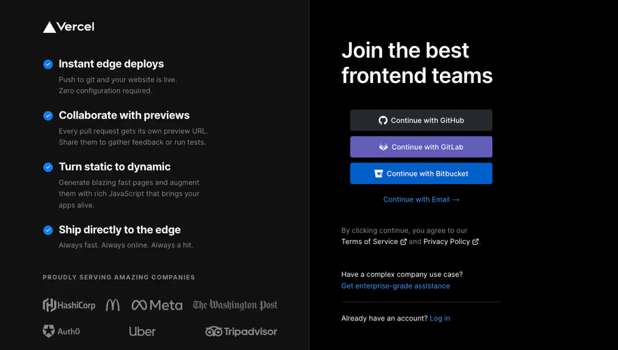
- **Provider actions:** Three full-width stacked buttons distinguish GitHub, GitLab and Bitbucket.
- **Template scan:** Large thumbnails and dark title strips make examples recognizable.
- **Secondary routes:** Manage connections, third-party import, browse-all and collaboration remain smaller controls.
### Typography
- **Intro:** Approximately 40px CSS bold sans-serif.
- **Panel headings:** Around 24px semibold.
- **Body/actions:** Around 14px; template labels medium at similar scale.
- **Bottom label:** Small uppercase around 12px with expanded tracking. Exact family and computed weights remain unverified.
### Colors & surfaces
- **Measured grounds:** Black #000000 and charcoal #111111 form the shell/panels.
- **Measured borders:** Dark gray #333333 supports outlines.
- **Measured provider accents:** Violet #625DB9/#5251C1 and blue #005FC9 appear in buttons; dark #25292E supports neutral provider action.
- **Artwork:** Template images include pale #EDF0F7 and dark teal #142A35; colorful avatars/glow remain localized.
### Components
- **Import shell:** Approximately 674 × 545px, fine gray border, 8px radius and about 32px padding.
- **Provider inset:** Darker bordered rectangle around 605 × 380px, with centered helper text and three buttons around 320 × 40px.
- **Template shell:** Approximately 480px wide, dark raised surface, border/radius matching import.
- **Template cards:** Two columns around 200px, thumbnail over black title strip, thin border and 6px radius.
- **Collaboration action:** Dark outlined control with blue/purple glow and small user-plus icon.
- **Framework row:** Grayscale logos arranged horizontally beneath a spaced uppercase label.
### Visual rhythm
- **Container:** Main content spans approximately 1200px centered with 120px side gutters.
- **Panel gap:** Roughly 48px separates unequal-width choices.
- **Provider cadence:** Buttons use short 8px gaps; larger breaks separate helper, providers and management link.
- **Whitespace:** Generous gaps above panels and before framework row keep the initial setup approachable.
### Responsive
- **Observed limit:** Desktop welcome only; provider authentication, template cloning, deployment and mobile behavior are unobserved.
- **Recommended layout:** Stack import and template panels, preserving path headings.
- **Recommended cards:** Reduce template columns when necessary and keep provider controls full-width.
- **Recommended header:** Simplify workspace utilities while retaining account/help routes.
### Adaptation guidance
- **Preserve the decision:** Offer distinct existing-project and starter-template paths with concise explanations.
- **Keep technical choices legible:** Use recognizable provider branding and template previews without extra steps in the initial view.
- **Implementation:** Provide accessible button/link names, keyboard focus and explicit authentication/deployment states. The screenshot does not authorize repository access or deployment.
Use this context to reproduce the reference's visual language: layout, typography, colors, spacing, borders, radii, and distinctive elements. The screenshot takes priority if descriptions conflict.
## Direction
{{preferences.fidelityInstructions}}
## Output
{{output.instructions}}
Deliver a polished, cohesive design with precise alignment, hierarchy, and spacing. Produce the requested visual artifact, not just a description. If unsupported, explain the limitation.