Overall Style and Aesthetic
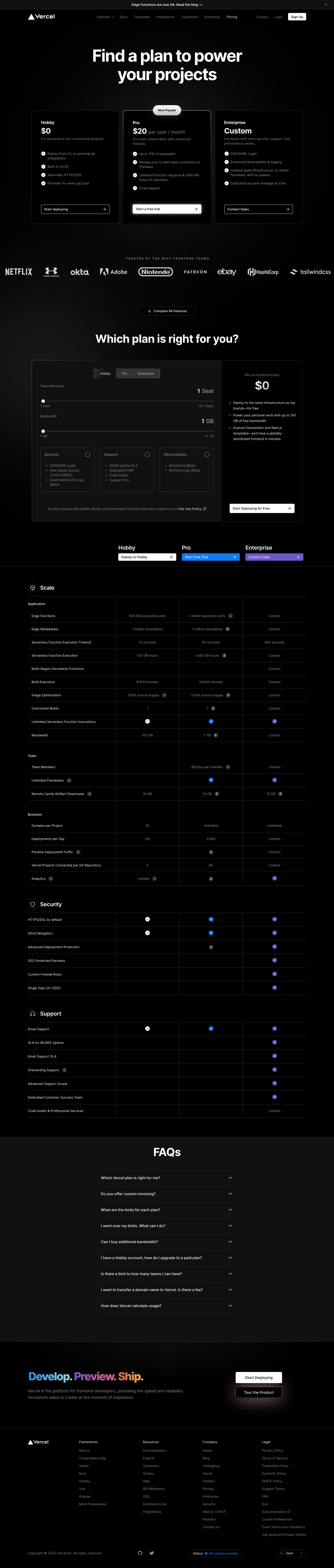
Vercel’s pricing page exemplifies clean, modern minimalism with a professional edge. The atmosphere is crisp and uncluttered, leveraging generous white space and subtle details to project confidence and clarity. Every element feels thoughtfully placed, achieving a visually harmonious balance between elegance and technical prowess. Layout and Structure
The page opens with a focused hero section: a simple, high-contrast header that immediately establishes the page’s purpose. Below, an at-a-glance pricing table anchors the structure, showcasing plans side by side with toggles (e.g., monthly/yearly). Concise feature breakdowns appear just beneath, organized for scannability. Deeper down, customers find FAQs, trust signals, and resource links, capped off by a structured, monochrome footer for navigation and legal info. Visual Elements
Distinctive custom icons punctuate each pricing tier, offering visual differentiation without pulling attention from the content. Delicate animations cue plan highlights, and subtle hover effects on CTAs and features animate the interface with understated, dynamic energy. The absence of stock photography keeps the focus on clarity and the product offering. Color Palette and Typography
The dominant color palette pivots around black, white, and slate grays, punctuated by strategic use of Vercel’s signature accent (a lively blue or green for action states and highlights). The type is modern and approachable—typically a geometric sans-serif—establishing a clear hierarchy with bold headers, high legibility, and consistent rhythm. User Experience Patterns
Navigation is frictionless, with sticky menus and well-labeled anchor links. CTAs stand out through color contrast and microinteractions. Pricing tiers are easily comparable, aided by tooltips and detailed feature tables. Forms and inquiries are minimal, reinforcing ease of conversion. Scroll behaviors are smooth, with content loading predictably and responsively across devices. Unique and Notable Design Choices
Noteworthy is Vercel’s use of whitespace, which avoids overwhelming visitors while inviting them to focus on decision-critical content. Plan highlights animate subtly into view, and toggling between plans is instantaneous and visually smooth. Overall, the tone is quietly innovative—instilling trust through restraint, polish, and a genuinely user-focused approach.