Overall Style and Aesthetic
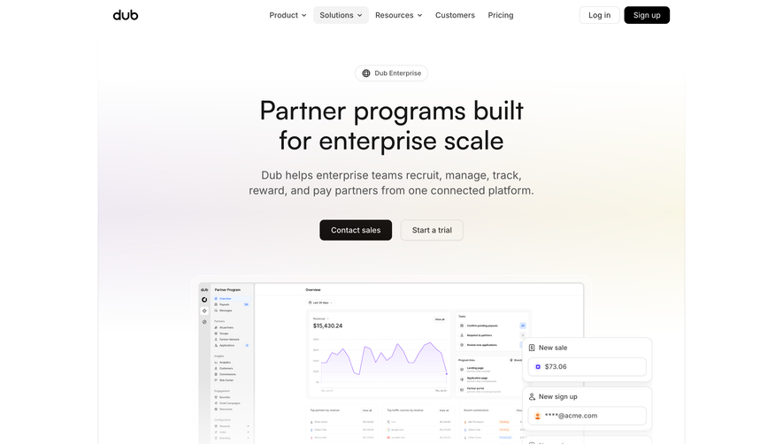
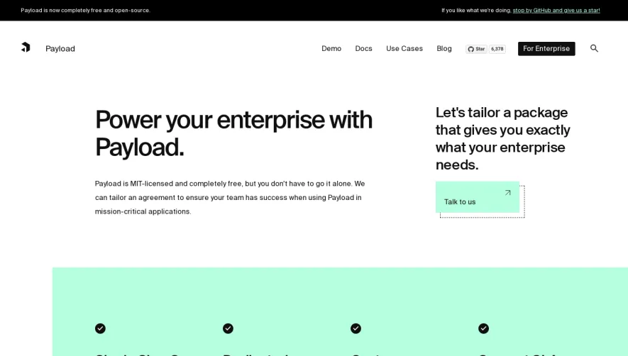
The Vercel Enterprise page exudes a crisp, ultra-modern minimalism with a strong sense of professionalism. It embodies the “less is more” philosophy, leveraging generous white space, clear visual hierarchy, and subtle motion to create an atmosphere of quiet confidence and technological sophistication. Layout and Structure
The page structure is intuitive and familiar to SaaS audiences: a commanding hero section leads with a bold, concise headline and a direct call-to-action. Scrolling reveals concise feature highlights with supporting visuals, interspersed with customer logos for social proof. There’s a logical flow to the content, culminating in a focused, action-oriented footer. Visual Elements
Sleek illustrations, tasteful iconography, and occasional micro-animations inject life without stealing focus. UI screenshots and diagrams are employed thoughtfully, providing context for complex features without overwhelming the user. No stock photography; visuals are data-driven and product-centric. Color Palette and Typography
A restrained palette of black, white, grays, and subtle accent blues promotes clarity and trust. The typography is sleek and geometric, with the primary font (likely Inter or a similar sans-serif) delivering optimal legibility. Headings are bold and spacious, while supporting text is light and unobtrusive, ensuring a clear information hierarchy. User Experience Patterns
Navigation is sticky and straightforward, with scroll-triggered reveals and persistent CTAs that maintain engagement without distraction. Interactive elements (like buttons and menus) feature smooth transitions, subtly guiding user attention. Forms are strategically minimal—frictionless, signaling enterprise competence. Unique or Notable Design Choices
The standout design move is the interplay of dynamic headlines with ambient motion, paired with a disciplined, no-clutter ethos. The page feels high-end yet approachable, perfectly reflecting an innovative, trustworthy SaaS brand built for discerning enterprise users.