Design with AI
Generate a new design based on this screen using your own content.
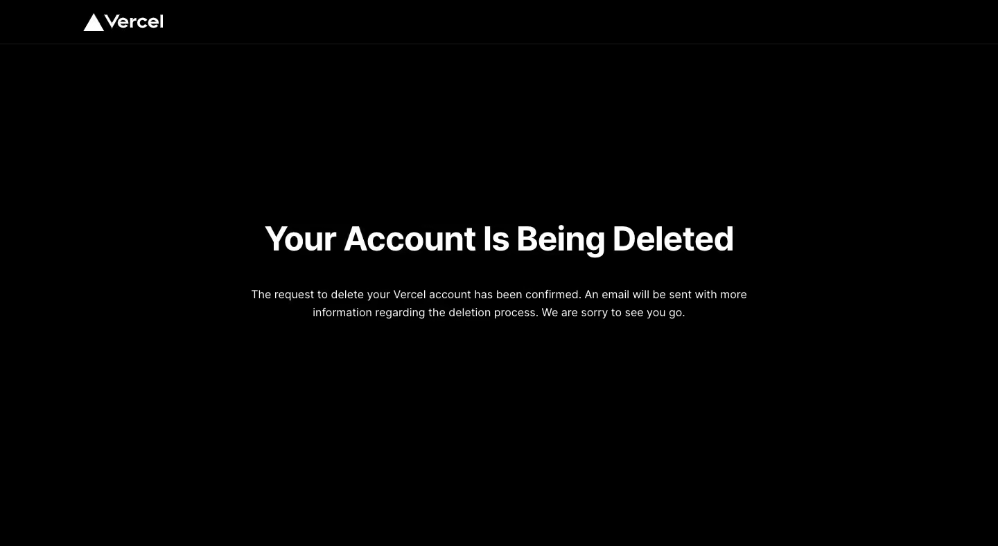
# Design from Reference: Vercel Delete Account
Create an original, high-fidelity visual design inspired by the reference. Prioritize composition, typography, colors, spacing, and component styling over technical implementation.
## Reference
- **Product:** Vercel
- **Category:** Delete
- **Screenshot:** https://cdn.prod.website-files.com/5e9dc792e1210c5325f7ebbc/6acc0d39ea6cae5cb6f1c259_6acc0848bffbeae372688ebc_cms-0792d3a1907c95750a2b547b-v3.webp
Analyze the screenshot first. If inaccessible, request it rather than guessing.
## Content
{{content.instructions}}
{{content.data}}
Preserve essential messaging and factual accuracy. Adapt structure and copy length for visual balance; never invent product claims.
## Visual Design
### Overall aesthetic
- **Character:** Stark monochrome account-deletion status page.
### Page composition
- **Canvas:** 1440 × 789 screenshot px. Small logo/header rule at top; large centered status heading and two-line explanatory paragraph occupy the upper-middle area.
### Information hierarchy
- **Priority:** Your Account Is Being Deleted dominates, followed by request confirmation and email-next-step guidance. No action is visible.
### Typography
- **Scale:** Approximate screenshot heading 48 px bold and body 16 px with 26 px leading. Sans serif family/CSS scale unverified.
### Colors & surfaces
- **Palette:** Sampled sRGB #000000, #FFFFFF, and subtle dark #1A1A1A/#111111. Secondary copy is light gray.
### Components
- **Details:** Flat black canvas and thin dark header divider; no cards, illustrations, or conversion controls.
### Visual rhythm
- **Spacing:** Roughly 720 screenshot px text width and very large outer margins create a definitive status presentation.
### Responsive
- **Adaptation:** Mobile is not shown. Reduce heading to 32 px and retain a narrow readable paragraph.
### Adaptation guidance
- **Transfer:** Preserve clear status and next-step explanation. Match wording to the actual deletion lifecycle.
Use this context to reproduce the reference's visual language: layout, typography, colors, spacing, borders, radii, and distinctive elements. The screenshot takes priority if descriptions conflict.
## Direction
{{preferences.fidelityInstructions}}
## Output
{{output.instructions}}
Deliver a polished, cohesive design with precise alignment, hierarchy, and spacing. Produce the requested visual artifact, not just a description. If unsupported, explain the limitation.