Design with AI
Generate a new design based on this screen using your own content.
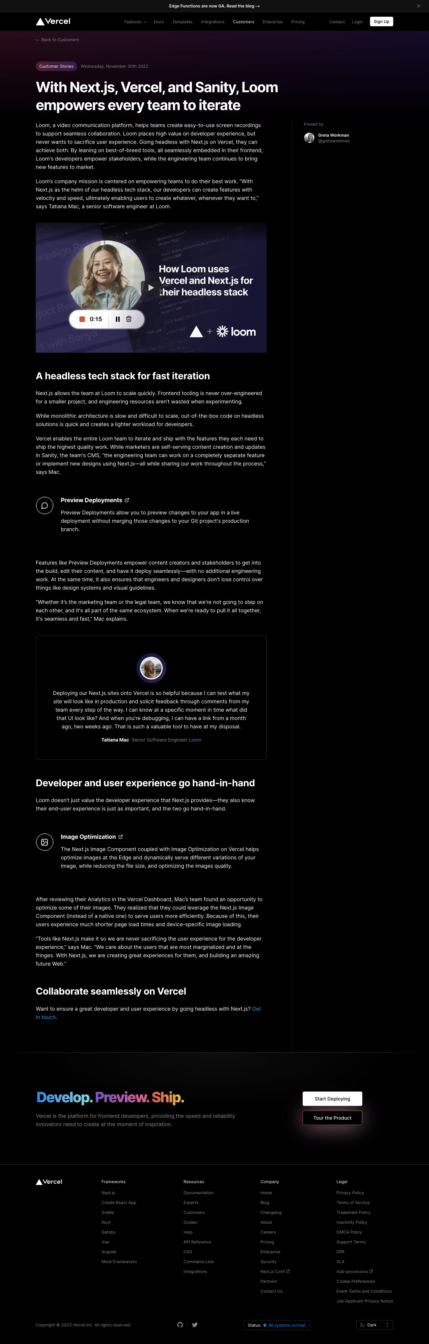
# Design from Reference: Vercel Customer Stories
Create an original, high-fidelity visual design inspired by the reference. Prioritize composition, typography, colors, spacing, and component styling over technical implementation.
## Reference
- **Product:** Vercel
- **Category:** Customer Stories
- **Screenshot:** https://cdn.prod.website-files.com/5e9dc792e1210c5325f7ebbc/6acbbebb39e7f22db40287b5_6acbbdf8a4008ddb74770506_cms-4ebe66b3685df92bd77d44d3.webp
Analyze the screenshot first. If inaccessible, request it rather than guessing.
## Content
{{content.instructions}}
{{content.data}}
Preserve essential messaging and factual accuracy. Adapt structure and copy length for visual balance; never invent product claims.
## Visual Design
### Overall aesthetic
- **Character:** Dark customer-story article with white editorial text, a subtle purple hero wash and restrained product callouts.
### Page composition
- **Canvas:** 1440 × 4504 screenshot px.
- **Structure:** Announcement/navigation; back link and article metadata; wide title; left reading column with video, subheads, feature callouts and quotation card; author rail right behind a vertical divider; full-width CTA and footer.
### Information hierarchy
- **Priority:** Large headline leads into narrative paragraphs. Video breaks the introduction; callout icons and bordered quote distinguish product evidence.
### Typography
- **Family:** Modern sans serif, exact font unverified.
- **Scale:** Estimated screenshot headline 48 px, section headings 30–32 px, body 18 px with approximately 28 px leading and metadata 14 px.
### Colors & surfaces
- **Sampled palette:** Black #000000, white #FFFFFF, announcement/dark surfaces #111111 and video purple #2F2B52.
- **Accents:** Blue links; bottom CTA headline uses blue-to-violet-to-coral/yellow coloring; fine dark-gray borders.
### Components
- **Article:** Widescreen video thumbnail with circular portrait and play control; small outlined circular feature icons beside label/description.
- **Quote:** Large thin-bordered rounded card, centered avatar, quote and attribution.
- **Footer CTA:** Gradient-colored headline left, white primary and dark gradient-outlined secondary buttons right; link columns below.
### Visual rhythm
- **Spacing:** Approximately 40–64 screenshot px between article blocks; larger gaps around feature callouts. Narrow prose line length contrasts with broad title/CTA.
### Responsive
- **Observed:** Desktop only.
- **Adaptation:** Move author metadata above article, remove the empty right rail, stack CTA actions and maintain readable text contrast.
### Adaptation guidance
- **Preserve:** Black editorial canvas, disciplined reading column and subtle feature/quote differentiation.
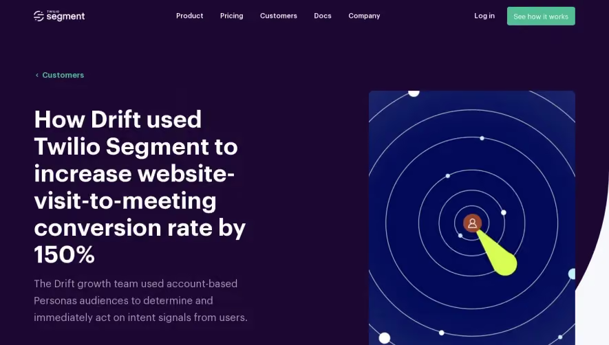
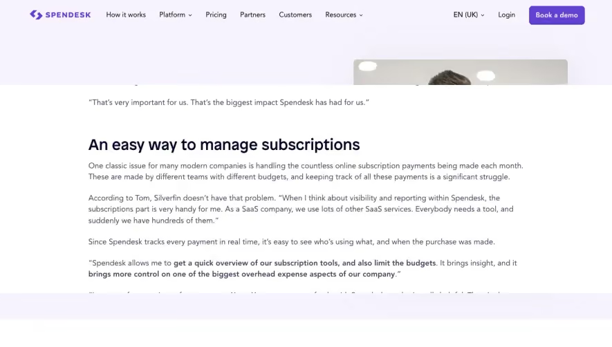
- **Replace:** Use approved customer story, authentic quotations and real product outcomes; do not reuse reference claims.
Use this context to reproduce the reference's visual language: layout, typography, colors, spacing, borders, radii, and distinctive elements. The screenshot takes priority if descriptions conflict.
## Direction
{{preferences.fidelityInstructions}}
## Output
{{output.instructions}}
Deliver a polished, cohesive design with precise alignment, hierarchy, and spacing. Produce the requested visual artifact, not just a description. If unsupported, explain the limitation.