






Certainly! Here is a concise and visually descriptive review of the Vercel Changelog page, structured for design inspiration:

Thank you! Your submission has been received!
Oops! Something went wrong while submitting the form.
Get SaaSFrame Pro
Monthly
$18
Quarterly
$48
Yearly
$180
Upgrade to access this feature
Browse all screens & flows
Filter and search screens & flows
Access Figma files
Access mobile versions
Bookmark screens & flows
Join now
Vercel Changelog

Vercel
Build Fast and Reliable Sites
Designed by
No items found.

Bookmark
Bookmark
Design with AI
Thank you! Your submission has been received!
Oops! Something went wrong while submitting the form.
# Design from Reference: Vercel Changelog
Create an original, high-fidelity visual design inspired by the reference. Prioritize composition, typography, colors, spacing, and component styling over technical implementation.
## Reference
- **Product:** Vercel
- **Category:** Changelog
- **Screenshot:** https://cdn.prod.website-files.com/5e9dc792e1210c5325f7ebbc/6acbbebd39e7f22db402881c_6acbbdfd4d71070f5fd38516_cms-ecb63a4f17f9018c83346551.webp
Analyze the screenshot first. If inaccessible, request it rather than guessing.
## Content
{{content.instructions}}
{{content.data}}
Preserve essential messaging and factual accuracy. Adapt structure and copy length for visual balance; never invent product claims.
## Visual Design
### Overall aesthetic
- **Direction:** A monochrome developer changelog combines a black canvas, thin gray dividers, white release headings and vivid blue inline links.
- **Character:** Restrained page chrome frames a long illustrated editorial timeline. Color mainly comes from embedded product screenshots, avatars and occasional purple graphics.
### Page composition
- **Observed canvas:** The full source is 1440 × 9847 pixels and was inspected throughout in seven readable crops. Geometry below uses the 1400px-wide inspection rendering; exact CSS scale is unverified.
- **Top chrome:** A roughly 39px announcement strip sits above a 62px navigation row. The main wrapper spans approximately x116–1284.
- **Sidebar:** A roughly 310px left region ends at a vertical rule near x427. A bordered search field and six icon-led category rows appear at the top; Changelog is selected.
- **Main column:** The content begins around x482, with an approximately 800px heading/notice width. A timeline rail near x494 accompanies about 747px-wide release imagery beginning at x537.
- **Ending:** A centered outlined Load more control ends the feed. A full-width divider introduces a footer with logo plus four link columns, then copyright, social icons, status and theme controls.
### Information hierarchy
- **Page introduction:** Changelog appears as a large heading beside a small RSS icon, followed by a dark social-follow notice.
- **Release pattern:** Each item presents a bordered illustration, overlapping author avatars and date, bold title, explanatory paragraphs and documentation links.
- **Full feed:** Visible entries cover deployment promotion, active branches, deployment links, support cases, environment filtering, domain renewal, analytics filtering, improvements/fixes, usage paths and Gatsby support.
- **Reading density:** Most entries use short prose; the improvements and final framework entry introduce indented bullet lists with bold lead-ins and small inline code tokens.
### Typography
- **Headings:** Page and release headings are approximately 32px bold with 39–40px line height and slightly tight tracking. Long release titles wrap naturally to two lines.
- **Body:** Approximately 16px regular sans serif with 25–26px line height; bold list labels increase emphasis without changing size.
- **Metadata and chrome:** Dates, navigation and footer links are around 14px. Inline code uses a monospace face inside gray rectangular chips. Exact font identities are unverified.
### Colors & surfaces
- **Measured neutrals:** Source samples include #000000, #111111, #010101, #FFFFFF, #020002 and #333333. Black forms the page, #111111 supports notices and some imagery, while #333333 matches the stronger selected-navigation treatment.
- **Semantic contrast:** White headings and pale gray body copy contrast with darker metadata; blue links provide the recurring interactive accent.
- **Image accents:** Product illustrations add mint status dots, amber indicators, a purple gradient, blue usage bars and a purple framework symbol. These remain inside the release media rather than coloring the overall page.
### Components
- **Search and categories:** Search is approximately 280 × 39px, with a subtle border and small radius. Category rows are about 40px tall; the selected row has a charcoal fill, white icon and white label.
- **Timeline markers:** White circles about 24px across contain black plus signs and intersect a thin gray vertical line. They visually mark release entries; interactive expansion is not verified.
- **Release media:** Repeated roughly 747 × 420px panels use thin charcoal borders and approximately 12px radii. Content includes deployment tables, branch lists, tooltip examples, support rows, filters and abstract logo graphics.
- **Metadata:** Approximately 30px round avatars overlap horizontally, sometimes ending in a count circle; gray dates align beside them.
- **Footer controls:** The outlined load-more button is around 365 × 39px. Smaller bordered status and theme selectors sit along the bottom row. No hover, focus or loading state is captured.
### Visual rhythm
- **Main spacing:** The title begins roughly 50px below navigation; the social notice follows its divider by about 24px, and the first media panel begins around 54px later.
- **Entry spacing:** Approximately 24px separates media from metadata, around 20px separates metadata from title, and 32–36px separates title from body.
- **Long-page structure:** Large gaps between release groups and consistent image ratios create predictable scanning. The sidebar remains largely empty below its category list, balancing the dense right column.
- **Footer rhythm:** Link columns use roughly 32px row spacing with generous separation from the final utility row.
### Responsive
- **Observed scope:** Only a desktop-width long page is shown; sticky behavior and mobile layouts are unverified.
- **Recommended navigation:** Collapse the global menu and convert the sidebar into a compact search/category control on narrow screens.
- **Recommended feed:** Keep one release column, reduce outer gutters to 20–24px and move or simplify the timeline rail so it does not compress copy.
- **Recommended media/footer:** Preserve media aspect ratios, provide access to dense screenshot details and stack footer columns and utility controls without clipping.
### Adaptation guidance
- **Preserve:** Reuse the black editorial canvas, consistent timeline markers, image-first release rhythm and restrained blue links.
- **Build:** Model releases as semantic articles with a media slot, author/date row, heading, prose and optional lists. Use a shared spacing scale rather than fixed positions from the long screenshot.
- **Separate UI layers:** Treat filters, tooltips and tables inside release images as illustrations, not active page controls.
- **Complete interaction:** Supply accessible search labeling, selected-category semantics, descriptive image alternatives and a clear pagination/loading state. These are recommendations beyond the captured state.
Use this context to reproduce the reference's visual language: layout, typography, colors, spacing, borders, radii, and distinctive elements. The screenshot takes priority if descriptions conflict.
## Direction
{{preferences.fidelityInstructions}}
## Output
{{output.instructions}}
Deliver a polished, cohesive design with precise alignment, hierarchy, and spacing. Produce the requested visual artifact, not just a description. If unsupported, explain the limitation.
Category
Patterns
No items found.
Tech Stack
Added on
February 5, 2023
Similar screens



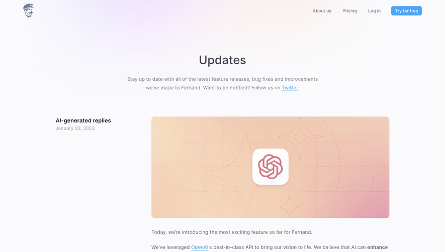

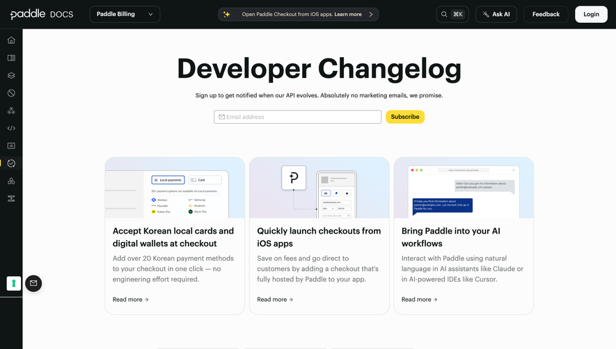

Upgrade to SaaSFrame Pro now to see similar examples.
Monthly
$18 /month
Billed $18 monthly
Browse all screens & flows
Filter and search screens & flows
Search text in screenshots
Access Figma files
Access mobile versions
Join now
Quarterly
$16 /month
Billed $48 quarterly
Browse all screens & flows
Filter and search screens & flows
Search text in screenshots
Access Figma files
Access mobile versions
Join now
Yearly
$15 /month
Billed $180 yearly
Browse all screens & flows
Filter and search screens & flows
Search text in screenshots
Access Figma files
Access mobile versions
Join now