Overall Style & Aesthetic
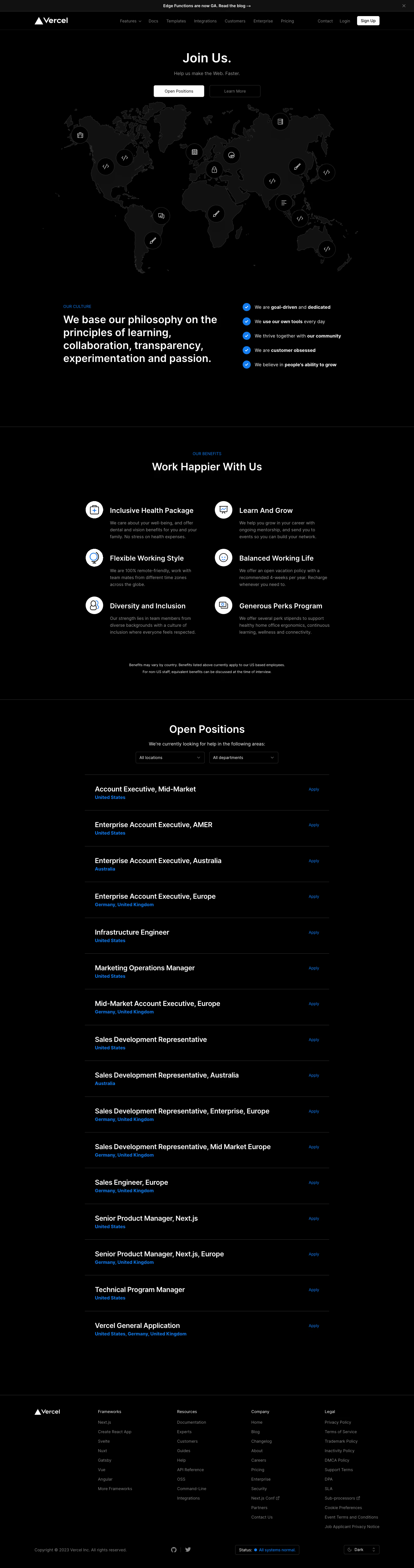
Vercel’s careers page exemplifies modern minimalism fused with a distinct, tech-forward vibe. Generous white space, sleek lines, and subtle gradients create an airy, professional look. The page feels understated yet polished, projecting confidence and clarity. Subtle micro-interactions and motion effects inject a layer of sophistication without overwhelming the visitor. Layout & Structure
The structure is elegantly simple: a clean hero section sets the stage with a concise mission and call-to-action, followed by a curated list of open roles. Supporting content like company values and benefits appears in crisp, modular sections. The sticky navigation ensures easy movement through key sections without interrupting flow. There’s no clutter—each segment is purposeful, easily scannable, and optimized for conversion. Visual Elements
Vercel eschews cliché stock imagery, opting for abstract SVGs, crisp vector icons, and dynamic visual accents that reinforce an innovative, engineering-driven culture. Occasional, subtle transitions and hover effects give tactile feedback, while concise iconography highlights key information. Color Palette & Typography
Deep blacks and pristine whites dominate, punctuated by vibrant accent gradients (e.g., purples and blues) to guide attention. Typography is highly readable and modern, with decisive heading hierarchies and plenty of breathing room—likely leveraging an elegant sans-serif font that’s consistent with the brand’s developer-centric ethos. User Experience Patterns & Notable Design Choices
Clear, sticky navigation, prominent CTAs, and smart use of progressive disclosure (expandable job details) minimize friction. The absence of traditional testimonials or lengthy distractions keeps focus on action: discovering and applying to roles. The tone is aspirational yet approachable, subtly encouraging candidates to envision themselves as part of a driven, world-class team.