Design with AI
Generate a new design based on this screen using your own content.
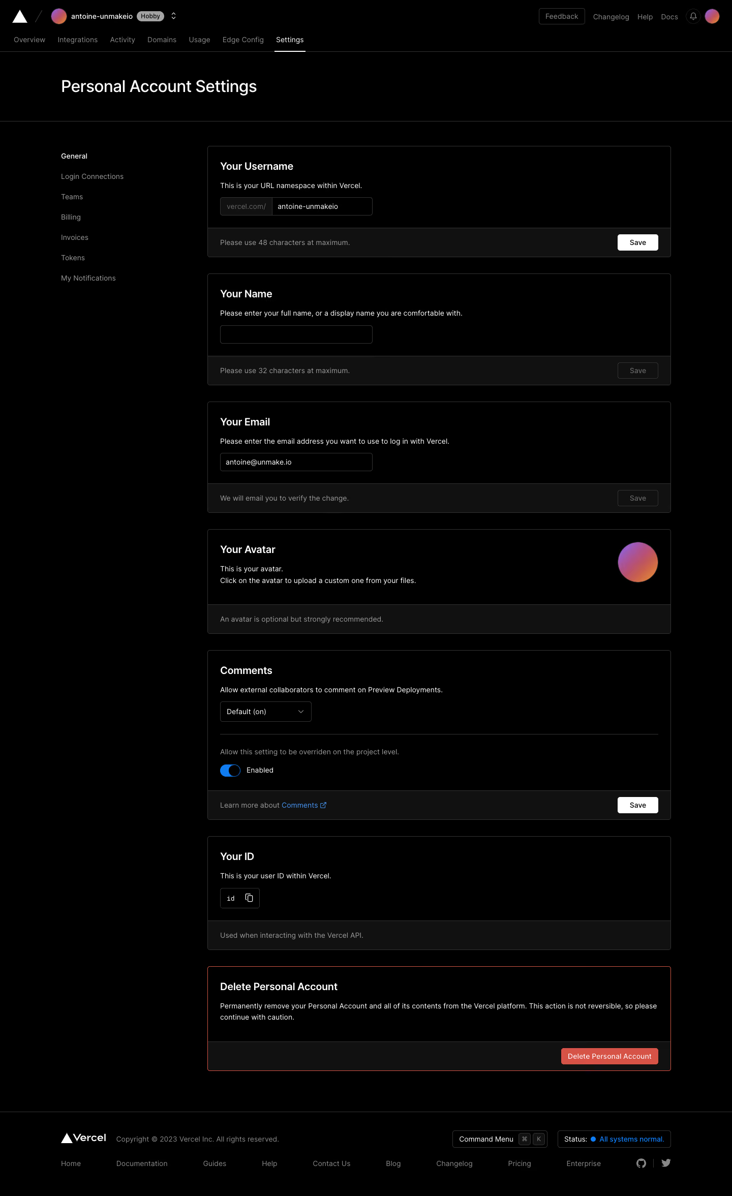
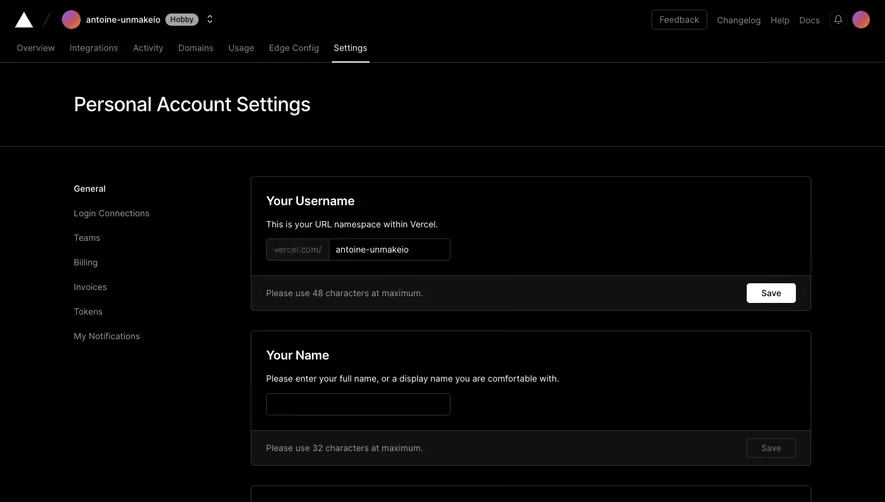
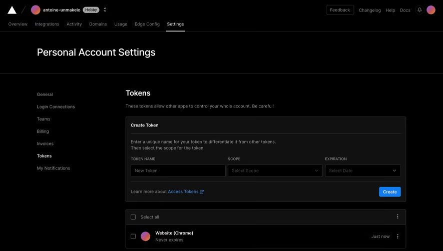
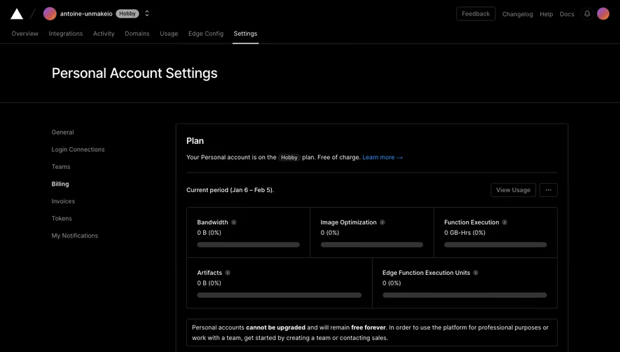
# Design from Reference: Vercel Account settings
Create an original, high-fidelity visual design inspired by the reference. Prioritize composition, typography, colors, spacing, and component styling over technical implementation.
## Reference
- **Product:** Vercel
- **Category:** Settings
- **Screenshot:** https://cdn.prod.website-files.com/5e9dc792e1210c5325f7ebbc/6acbbeb839e7f22db402874d_6acbbdf3ee81535770a28e1f_cms-48a3d552e5e98ef5b73c822a.webp
Analyze the screenshot first. If inaccessible, request it rather than guessing.
## Content
{{content.instructions}}
{{content.data}}
Preserve essential messaging and factual accuracy. Adapt structure and copy length for visual balance; never invent product claims.
## Visual Design
### Overall aesthetic
- **Character:** Monochrome dark settings with independent bordered preference cards.
### Page composition
- **Canvas:** 1440 × 2353 screenshot px. Global header/tabs, account title, left settings list, stacked preference cards, destructive final card, and footer.
### Information hierarchy
- **Priority:** Username, name, email, avatar, comments, and ID each have their own section. Red delete-account treatment isolates the destructive action.
### Typography
- **Scale:** Approximate screenshot title 32 px, card headings 20 px, body 14 px, helper 14 px. Sans serif family/CSS scale unverified.
### Colors & surfaces
- **Palette:** Sampled sRGB #000000 canvas, footer strips #111111, borders #333333, white #FFFFFF, danger #D75345, and muted #A3A3A3.
### Components
- **Details:** Approximately 4 px card corners, dark inputs, white active Save buttons, disabled-looking alternatives, prefix field, gradient avatar, blue toggle, copy control, and red danger border.
### Visual rhythm
- **Spacing:** About 30 px card gaps, 24 px internal padding, and consistent bottom helper/action strips create repeatable modules.
### Responsive
- **Adaptation:** Mobile is not shown. Move section navigation above cards and allow action footers to wrap.
### Adaptation guidance
- **Transfer:** Preserve per-setting save boundaries and separated deletion flow. Populate actual limits and account values.
Use this context to reproduce the reference's visual language: layout, typography, colors, spacing, borders, radii, and distinctive elements. The screenshot takes priority if descriptions conflict.
## Direction
{{preferences.fidelityInstructions}}
## Output
{{output.instructions}}
Deliver a polished, cohesive design with precise alignment, hierarchy, and spacing. Produce the requested visual artifact, not just a description. If unsupported, explain the limitation.