Design with AI
Generate a new design based on this screen using your own content.
# Design from Reference: Uvodo Uvodo Account Setup
Create an original, high-fidelity visual design inspired by the reference. Prioritize composition, typography, colors, spacing, and component styling over technical implementation.
## Reference
- **Product:** Uvodo
- **Category:** Account Setup
- **Screenshot:** https://cdn.prod.website-files.com/5e9dc792e1210c5325f7ebbc/6acad66dd63d2caea65c6383_6acad5fd3003494aa694e2d4_cms-e49b7ab9096e078a4e26af1c.webp
Analyze the screenshot first. If inaccessible, request it rather than guessing.
## Content
{{content.instructions}}
{{content.data}}
Preserve essential messaging and factual accuracy. Adapt structure and copy length for visual balance; never invent product claims.
## Visual Design
### Overall aesthetic
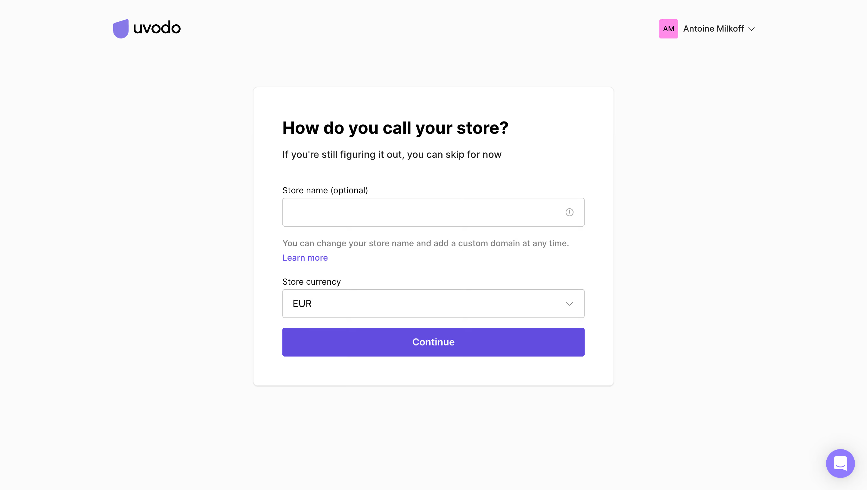
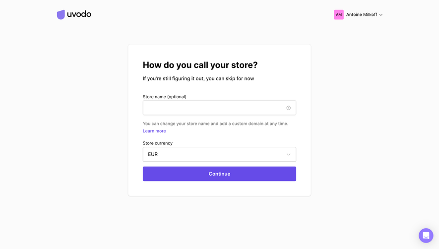
- **Style:** A minimal store-setup screen with a white form card on near-white, violet primary action, and sparse global identity controls.
- **Character:** Clear and forgiving, explicitly presenting store naming as optional.
### Page composition
- **Capture and scale:** 2880 × 1630 screenshot pixels, consistent with estimated 2× capture. Following sizes are estimated CSS pixels.
- **Header:** Logo sits left and account identity right within a broad centered frame.
- **Form:** A roughly 600 px-wide card sits above the page midpoint. It contains a question heading, reassurance sentence, optional store-name field, helper/link, currency selector, and full-width Continue.
- **Support:** A small violet chat bubble sits at bottom right.
### Information hierarchy
- **Task:** The bold question heading introduces naming, while the subtitle and helper clarify flexibility.
- **Controls:** Store name and currency are the only fields; Continue is the strongest visual action.
### Typography
- **Family:** Neutral sans serif; exact identity unverified.
- **Roles:** Heading approximately 28–30 px CSS bold; subtitle/values around 16 px; labels/helper 14–15 px.
- **Action:** Continue uses centered semibold white text around 16 px.
### Colors & surfaces
- **Foundation:** Sampled sRGB #FBFBFB defines the page and #FFFFFF the card.
- **Accent:** Sampled violet #664BE8 fills Continue; #947AFF appears in brand/support accents.
- **Ink and borders:** Black #000000 anchors headings; #EAEAEA and #C7C7C7 support card/field boundaries.
### Components
- **Card:** White rectangle with fine border, subtle bottom shadow, approximately 8 px radii, and 48 px padding.
- **Fields:** Full-width controls are roughly 48 px high with modest 3–4 px rounding. Name has a small information icon; currency has a right chevron.
- **Helper:** Muted explanatory copy and a separate violet Learn more link sit between name and currency.
- **Action:** A 48 px-high violet rectangle spans the field width.
### Visual rhythm
- **Spacing:** Use roughly 35–40 px between introduction and first label, 20 px after the name helper, and 16 px before Continue.
- **Alignment:** All card text and controls share a single left edge and common field width.
### Responsive
- **Observed state:** Desktop only.
- **Recommended reflow:** Use a fluid card with 20–24 px inner padding and preserve clear optional labeling and helper text.
### Adaptation guidance
- **Preserve:** Retain the small focused form, explicit flexibility, restrained card, and violet action.
- **Adapt:** Use actual store/currency choices and accurate helper guidance.
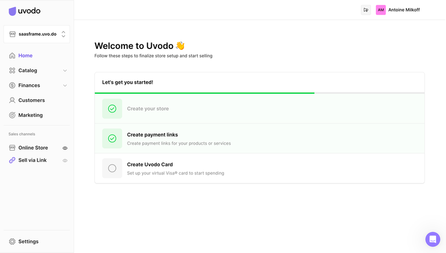
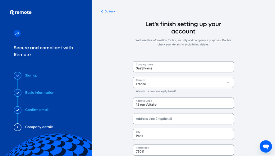
- **Avoid:** Do not copy personal account details or infer later setup states.
Use this context to reproduce the reference's visual language: layout, typography, colors, spacing, borders, radii, and distinctive elements. The screenshot takes priority if descriptions conflict.
## Direction
{{preferences.fidelityInstructions}}
## Output
{{output.instructions}}
Deliver a polished, cohesive design with precise alignment, hierarchy, and spacing. Produce the requested visual artifact, not just a description. If unsupported, explain the limitation.