Design with AI
Generate a new design based on this screen using your own content.
# Design from Reference: Userflow User Onboarding
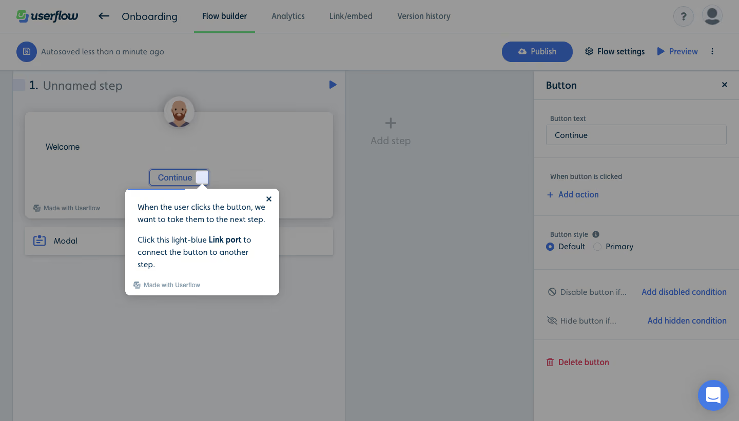
Create an original, high-fidelity visual design inspired by the reference. Prioritize composition, typography, colors, spacing, and component styling over technical implementation.
## Reference
- **Product:** Userflow
- **Category:** User Onboarding
- **Screenshot:** https://cdn.prod.website-files.com/5e9dc792e1210c5325f7ebbc/6acbca2c8313d4c6c0cc3f59_6acbc81c3f3e68cd105852d4_cms-9d4a8064a04b3497a0403c2c.webp
Analyze the screenshot first. If inaccessible, request it rather than guessing.
## Content
{{content.instructions}}
{{content.data}}
Preserve essential messaging and factual accuracy. Adapt structure and copy length for visual balance; never invent product claims.
## Visual Design
### Overall aesthetic
- **Style:** Contextual onboarding tooltip over a dimmed flow-building workspace.
- **Character:** White floating card, blue focus edge, compact navy copy, and pointer anchored to a connection port.
### Page composition
- **Canvas:** 1440 × 821 screenshot px.
- **Workspace:** Top navigation/toolbars, flow canvas left, button inspector right.
- **Tooltip:** Approximately 300 × 205 screenshot px near center-left, beneath the selected Continue button.
- **Backdrop:** Entire editor dimmed except instructional card and focus target.
### Information hierarchy
- **Primary:** Tooltip explains the next interaction.
- **Target:** Small light-blue link port next to Continue.
- **Secondary:** Inspector labels and flow builder remain visible but subdued.
### Typography
- **Family:** Compact sans serif; exact identity unverified.
- **Tooltip:** Approximately 15–16 screenshot px with 24px line-height.
- **Emphasis:** Link port phrase bold.
- **Inspector:** Approximately 14–16px.
- **Precision:** Screenshot-based estimates.
### Colors & surfaces
- **Tooltip:** #FFFFFF.
- **Dimmed canvas:** #999999, #898D90, and #939596.
- **Dimmed blue controls:** #294889.
- **Primary copy:** Dark navy; exact undimmed token unverified.
- **Shadow:** Soft gray elevation.
- **Precision:** Background samples include overlay.
### Components
- **Tooltip:** Small rounded corners, top pointer, close X, and small platform attribution.
- **Focus:** Blue outline around target button/port.
- **Editor:** Step card, add-step target, and settings sections.
- **No progression button:** Instruction points directly to the underlying control.
### Visual rhythm
- **Spacing:** Compact two-paragraph instruction with about 24px padding.
- **Anchoring:** Pointer clearly associates text with the target.
- **Contrast:** Background dimming directs attention without hiding workflow context.
### Responsive
- **Observed:** Desktop only.
- **Recommendation:** Reposition anchored card within viewport, preserve target visibility, and avoid covering the required interaction.
- **Text:** Allow wrapping rather than shrinking.
### Adaptation guidance
- **Preserve:** Action-specific guidance, visible target, and short contextual explanation.
- **Content:** Use actual control names and instructions.
- **Behavior:** Connection and progression outcomes are not demonstrated.
Use this context to reproduce the reference's visual language: layout, typography, colors, spacing, borders, radii, and distinctive elements. The screenshot takes priority if descriptions conflict.
## Direction
{{preferences.fidelityInstructions}}
## Output
{{output.instructions}}
Deliver a polished, cohesive design with precise alignment, hierarchy, and spacing. Produce the requested visual artifact, not just a description. If unsupported, explain the limitation.