Design with AI
Generate a new design based on this screen using your own content.
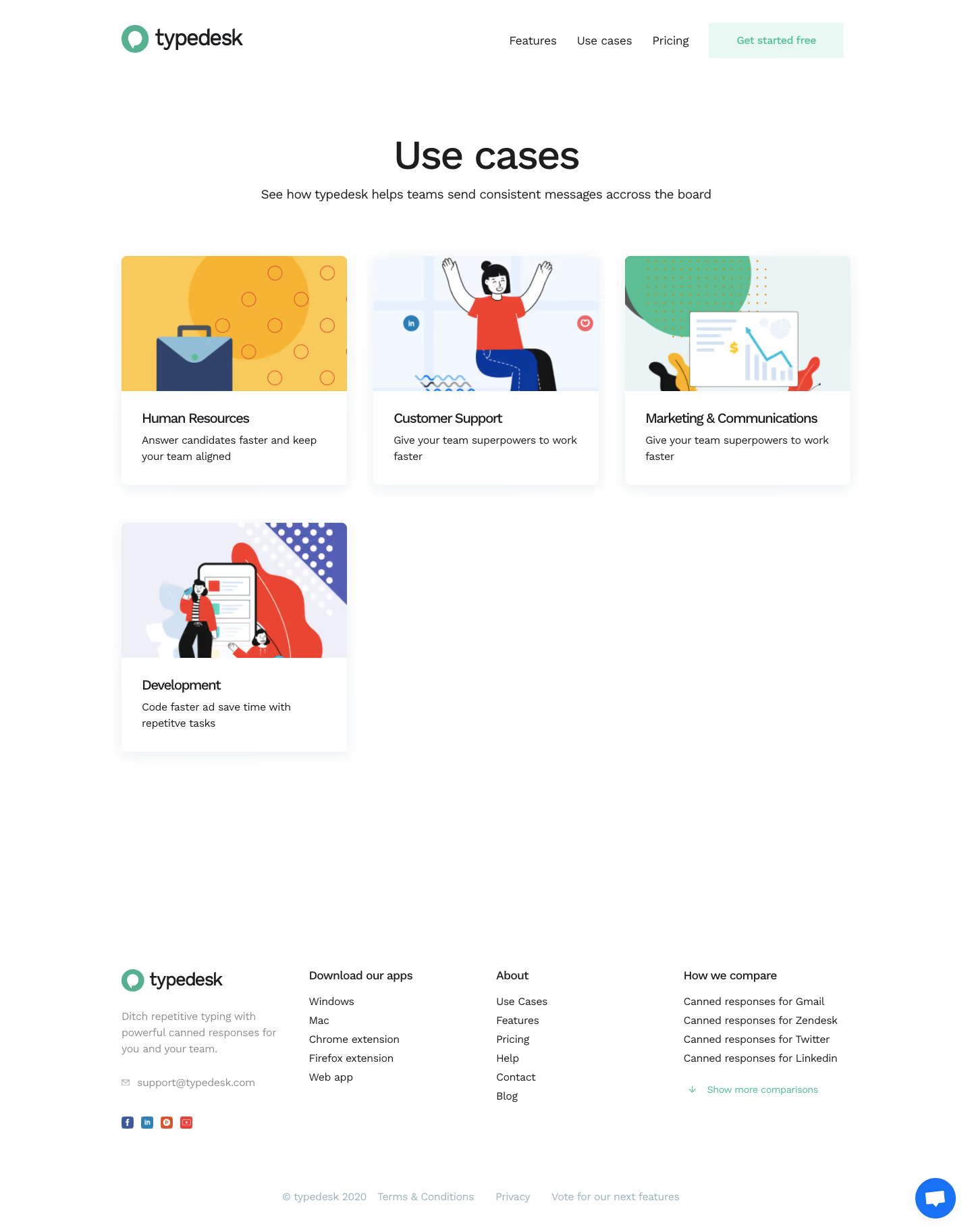
# Design from Reference: Typedesk Use Cases
Create an original, high-fidelity visual design inspired by the reference. Prioritize composition, typography, colors, spacing, and component styling over technical implementation.
## Reference
- **Product:** Typedesk
- **Category:** Use Cases
- **Screenshot:** https://cdn.prod.website-files.com/5e9dc792e1210c5325f7ebbc/6acbca89f1e28b554221d0ef_6acbc8f839e7f22db40575a2_cms-5de6622a8c5d48232f168979.webp
Analyze the screenshot first. If inaccessible, request it rather than guessing.
## Content
{{content.instructions}}
{{content.data}}
Preserve essential messaging and factual accuracy. Adapt structure and copy length for visual balance; never invent product claims.
## Visual Design
### Overall aesthetic
- **Style:** A simple use-case directory with white space, colorful illustrated cards, black sans serif typography, and mint brand accents.
- **Character:** Friendly and straightforward, with four audience categories and little supporting decoration.
### Page composition
- **Capture and scale:** 1440 × 1824 screenshot pixels. Following sizes are approximate screenshot pixels; CSS scale is unverified.
- **Header/intro:** Logo left and compact navigation/action right precede a centered Use cases heading and short subtitle.
- **Grid:** A centered approximately 1080 px frame contains three cards on the first row and one left-aligned card on the second. Categories are HR, customer support, marketing/communications, and development.
- **Footer:** A large open interval precedes four columns for brand/contact/social, apps, about, and comparisons, then a lower legal row and chat control.
### Information hierarchy
- **Browse focus:** Illustrations lead each card, followed by a short title and two-line benefit statement.
- **Conversion:** The header's pale-mint Get started free action is the only prominent signup control.
- **Footer:** Product/download/comparison links remain secondary to the category grid.
### Typography
- **Family:** Neutral sans serif; exact identity unverified.
- **Display:** Page heading approximately 54–58 px medium.
- **Cards:** Titles around 19–20 px medium; descriptions 16 px with 24 px leading.
- **Utilities:** Navigation/footer around 15–16 px; footer group labels slightly heavier.
### Colors & surfaces
- **Foundation:** Sampled sRGB #FFFFFF dominates. Pale illustration fields include #F3F8FE, #EEEFF7, and #E9F4F4.
- **Artwork:** Sampled yellow #F8CA5C/#F5B533 and coral #EA4533 enliven card artwork.
- **Brand:** Mint marks logo, header action, and comparison disclosure; exact mint hex unverified.
### Components
- **Cards:** Approximately 335 px wide with a 200 px-high illustration area and white text area beneath. Small 7–8 px radii and soft lower shadows create light separation.
- **Illustrations:** Flat colorful artwork depicts a briefcase, support person, analytics/marketing screen, and development team.
- **Footer:** Unboxed columns use muted body copy and compact social marks. A blue circular chat button sits lower right.
- **Header action:** Pale-mint rectangular action uses slight rounding and mint text.
### Visual rhythm
- **Spacing:** Use roughly 40 px grid gutters, 55 px between rows, and generous 250 px-plus whitespace before footer.
- **Alignment:** Keep card image heights and text padding consistent; do not stretch the lone second-row card.
### Responsive
- **Observed state:** Desktop only.
- **Recommended reflow:** Collapse cards to two then one column and stack footer groups, preserving illustration ratios and readable descriptions.
### Adaptation guidance
- **Preserve:** Retain the sparse illustrated category grid, mint accents, and simple white footer.
- **Adapt:** Use real audience categories and original matching illustrations.
- **Avoid:** Do not add unsupported use cases or copy product claims/contact details.
Use this context to reproduce the reference's visual language: layout, typography, colors, spacing, borders, radii, and distinctive elements. The screenshot takes priority if descriptions conflict.
## Direction
{{preferences.fidelityInstructions}}
## Output
{{output.instructions}}
Deliver a polished, cohesive design with precise alignment, hierarchy, and spacing. Produce the requested visual artifact, not just a description. If unsupported, explain the limitation.